React Spinners CSS Loaders
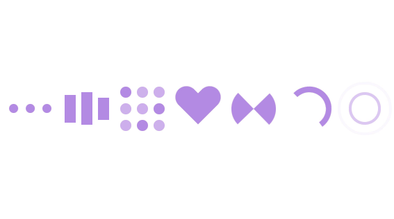
Amazing collection of React spinners components with pure css.
The React spinners are based on loading.io and from all over the web.

? List of Spinners - PropTypes and Default Props
Each component accepts a color prop, and few accepts also size prop.
The default color prop is #7f58af.
Component that accepts size prop have a default size in pixel.
| Spinner | color: string | size: number | className: string | style: object |
|---|---|---|---|---|
<Circle/> |
#7f58af |
64 |
"" |
{} |
<Default/> |
#7f58af |
80 |
"" |
{} |
<Ellipsis/> |
#7f58af |
80 |
"" |
{} |
<DualRing/> |
#7f58af |
80 |
"" |
{} |
<Facebook/> |
#7f58af |
80 |
"" |
{} |
<Grid/> |
#7f58af |
80 |
"" |
{} |
<Heart/> |
#7f58af |
80 |
"" |
{} |
<Hourglass/> |
#7f58af |
32 |
"" |
{} |
<Ring/> |
#7f58af |
80 |
"" |
{} |
<Ripple/> |
#7f58af |
80 |
"" |
{} |
<Roller/> |
#7f58af |
- | "" |
{} |
<Spinner/> |
#7f58af |
- | "" |
{} |
<Orbitals/> |
#7f58af |
- | "" |
{} |
<Ouroboro/> |
#7f58af |
- | "" |
{} |
? Installation
Using npm to install react-spinners-css:
$ npm i --save react-spinners-css
Play and install react spinners with Bit
Install specific react spinner component with bit, npm or yarn without having to install the whole project.
Using bit to play with live demo, and try the spinners before install.
set npm regisetry config(one time action):
npm config set '@bit:registry' https://node.bit.dev
and use your favorite package manager:
npm i @bit/joshk.react-spinners-css.facebook
yarn add @bit/joshk.react-spinners-css.facebook
bit import joshk.react-spinners-css/facebook
? Usage Examples
you can use a random color from jotils
//using npm or yarn
import { Circle, Heart } from 'react-spinners-css';
//using bit
import Facebook from '@bit/joshk.react-spinners-css.facebook';
import { getRandomColor } from '@bit/joshk.jotils.get-random-color'
...
render() {
   return(
     <div>
       <Circle /> //default color is #7f58af
       <Circle color="red" />
       <Circle color="#be97e8" size={200} /> //size prop is number in pixel
       <Heart color={getRandomColor()} />
       <Facebook /> //default color is #7f58af
       <Facebook color="red" />
     </div>
   )
}
? Development
You can see the components locally by cloning this repo and doing the following steps:
- Install dependencies from
package.json, run:npm install. - Run the app in the development mode, run:
npm run start.
