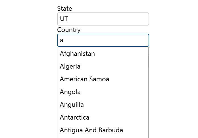
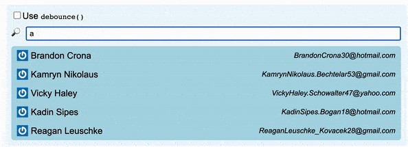
React-Autosuggestions
An accessible React component to take the pain out of creating auto-suggestion components.
Usage:
import React from 'react';
import { AutoSuggest } from 'react-autosuggestions';

const ExampleServer = () => {
    const [make, setMake] = React.useState();
    const handleSubmit = (e) => {
        e.preventDefault();
        alert(`The make selected was ${make}`)
    }
    return (
        <form onSubmit={handleSubmit}>
            <AutoSuggest
                name="Make"
                url="https://ntsb-server.herokuapp.com/api/accidents/makeList"
                handleChange={setMake}
                value={make}
            />
            <button>Submit</button>
        </form>
    )
}

const ExampleClient = () => {
    const [make, setMake] = React.useState();
    const handleSubmit = (e) => {
        e.preventDefault();
        alert(`The make selected was ${make}`)
    }
    return (
        <form onSubmit={handleSubmit}>
            <AutoSuggest
                name="Make"
                options={[
                "Acura",
                "BMW",
                "Audi",
                "Bentley",
                "Buick",
                "Cadillac",
                "Chevrolet",
                ]}
                handleChange={setMake}
                value={make}
            />
            <button>Submit</button>
        </form>
    )

}
AutoSuggest props:
| propName | Description |
|---|---|
| type | Passing "server" will tell the component to render an AutoSuggestServer component. If a type is not passed and a url argument is passed, the component infers the type to be server. If no type is passed (or a type other than "server" is passed), AutoSuggestClient component is rendered. |
| name | name used for the autosuggest input label and the ids of nested elements |
| url | endpoint to query to generate the suggestions list. Component expects the url to accept input text as a parameter, not query. Example: With "https://ntsb-server.herokuapp.com/api/accidents/makeList" as the url, if a user typed 'Bo' into the input field, a request would be sent to https://ntsb-server.herokuapp.com/api/accidents/makeList/Bo) |
| debounceTime | The amount of milliseconds to wait before sending requests to url based on input |
| styles | An object to customize the appearance of the AutoSuggest component |
| options | The array of options if the autosuggest is created using a list of items already in the application |
| handleChange | Array for updating the text in the autosuggest field |
| value | The value of the autosuggest field |
| caseInsensitive | Setting for Client version of AutoSuggest, whether to perform case-insensitive matches against the options array |
AutoSuggest Default Props
| propName | type | defaultValue |
|---|---|---|
| type | string | "" |
| name | string | "Search" |
| url | string | "" |
| debounceTime | number | 200 |
| styles | object | { |
| options | array | [] |
| handleChange | function | No default. Required prop |
| value | string | No default. Required prop |
| caseInsensitive | boolean | true |
Options argument
Valid input:
-
An array of strings
If an array of strings is passed as the options argument, the
<li/>options are given a textvalue attribute set to the value of the string and text content set to the value of the string -
An array of objects with the shape of { name, value }
If an array of objects with {name, value} is passed as the options argument, the
<li/>options will be given a name attribute set to the value of name, a textvalue attribute set to the value of value, and text content set to the value of value. -
An array of objects with the shape of { abbr, name, value }
If an array of objects with {abbr, name, value} is passed as the options argument, the
<li/>options will be given an abbr attribute set to the value of abbr, a name attribute set to the value of name, a textvalue attribute set to the value of value, and text content set to the value of value.
What is actually generated by AutoSuggest
Using our earlier example
    <form onSubmit={handleSubmit}>
        <AutoSuggest name="Make" url="https://ntsb-server.herokuapp.com/api/accidents/makeList" handleChange={setMake} value={make}/>
        <button>Submit</button>
    </form>
If the user entered "brau" into the input field, the resulting html would look like this:
<form>
    <div id="Make-announcement" class="visually-hidden" aria-live="assertive" style="position: absolute; clip: rect(0px, 0px, 0px, 0px); clip-path: inset(50%); height: 1px; width: 1px; overflow: hidden;">4 suggestions displayed.  To navigate, use up and down arrow keys.
    </div>
    <div>
        <div id="Make-searchField" role="combobox" aria-expanded="true" aria-owns="Make-input" aria-haspopup="listbox" aria-controls="Make-autosuggest-options" style="display: inline-block;">
            <label for="Make-input" style="display: block; font-size: 1.35rem;">Make
            </label>
            <input id="Make-input" type="text" class="searchfield" autocomplete="off" aria-autocomplete="both" value="brau" style="padding: 0.5rem; border: 2px solid rgb(200, 200, 200); background-color: rgb(255, 255, 255); border-radius: 6px; color: rgb(0, 0, 0); font-weight: normal; font-size: 1.35rem; margin: 0px auto; width: 19rem; outline: none;">
        </div>
        <div class="autocompleteSuggestions" id="Make-autocomplete" style="display: block; position: absolute; border: 1px solid rgb(153, 153, 153); background: rgb(255, 255, 255); width: 20rem;">
            <ul id="Make-autosuggest-options" role="listbox" style="margin: 0px; padding: 0px; list-style: none;">
                <li role="option" id="Make-suggestion0" aria-selected="false" class="auto-suggestions" style="margin: 0px; padding: 0.5rem; font-size: 1.35rem; white-space: nowrap; overflow: hidden; cursor: default;">BRAUCH
                </li>
                <li role="option" id="Make-suggestion1" aria-selected="false" class="auto-suggestions" style="margin: 0px; padding: 0.5rem; font-size: 1.35rem; white-space: nowrap; overflow: hidden; cursor: default;">BRAULT GLASAIR
                </li>
                <li role="option" id="Make-suggestion2" aria-selected="false" class="auto-suggestions" style="margin: 0px; padding: 0.5rem; font-size: 1.35rem; white-space: nowrap; overflow: hidden; cursor: default;">Brault
                </li>
                <li role="option" id="Make-suggestion3" aria-selected="false" class="auto-suggestions" style="margin: 0px; padding: 0.5rem; font-size: 1.35rem; white-space: nowrap; overflow: hidden; cursor: default;">Braunschmidt
                </li>
            </ul>
        </div>
    </div>
    <button>Submit</button>
</form>
CSS styling not configurable by style object (in case you want to override)
li:hover, li.highlighted {
    background: #110D3B;
    color: #FFF
  }
  input.loading {
    background-image: url(https://upload.wikimedia.org/wikipedia/commons/d/de/Ajax-loader.gif);
    background-position: right center;
    background-repeat: no-repeat;
  }
Features
- If no results match the text entered (whether that means the fetch request resulted in an empty list or if the options list does not include anything that starts with the text value), a paragraph tag is displayed saying "No results found"
- With an AutoSuggestServer component, if the fetch fails, a paragraph tag is displayed saying "Results could not be fetched"
- With an AutoSuggestServer component, a loading spinner is shown on the input field while the fetch request is being sent (and while the search text doesn't equal the same value as the debounced search text)
