react-health-card
An awesome health card component.

Installation
yarn add react-health-card
or
npm install react-health-card --save
Usage
import HealthCard from 'react-health-card';

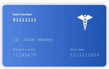
<HealthCard
  cardNumber="12345678"
  name="Jake Moxey"
  issueDate="12122020"
  issueNumber="12"
  rank="01"
  memberNumber="87654321A"
  memberNumberLength={9}
  focused="memberNumber"
  />
Available Props
| Property | Type | Default | Description |
|---|---|---|---|
| bgColorFront | string | #2053B1 |
The background color of the front of the card. |
| bgColorBack | string | #2053B1 |
The background color of the back of the card. |
| focused | string | null |
The focused card attribute. Available: null, rank, name, memberNumber, issueDate, issueNumber, cardNumber |
| isFlipped | boolean | false |
Is the card flipped? |
| logoUri | string | null |
The logo of the card. |
| logoPosition | string | front |
Position of the logo. Available: front, back |
| logoStyle | string | right: 10%; top: 10% |
Style of the logo. |
| cardNumber | string | null |
The card number. |
| cardNumberPosition | string | front |
Position of the card number. Available: front, back |
| cardNumberTitle | string | Card number |
Card number title |
| cardNumberLength | number | 8 |
Card number length |
| cardNumberStyle | string | left: 10%; top: 20% |
Style of the card number element (CSS) |
| issueDate | string | null |
The card issue date. |
| issueDatePosition | string | front |
Position of the issue date. Available: front, back |
| issueDateTitle | string | Issue date |
The issue date title. |
| issueDateFormat | string | DD/MM/YYYY |
The issue date format. |
| issueDateStyle | string | bottom: 15%; left: 65%; |
Style of the issue date element (CSS) |
| issueNumber | string | null |
The issue number. |
| issueNumberPosition | string | back |
Position of the issue number. Available: front, back |
| issueNumberTitle | string | Issue number |
Issue number title |
| issueNumberLength | number | 2 |
Issue number length |
| issueNumberStyle | string | left: 10%; bottom: 15% |
Style of the issue number element (CSS) |
| memberNumber | string | null |
The member number. |
| memberNumberPosition | string | front |
Position of the member number. Available: front, back |
| memberNumberTitle | string | Member number |
Member number title |
| memberNumberLength | number | 8 |
Member number length |
| memberNumberStyle | string | left: 10%; bottom: 15% |
Style of the member number element (CSS) |
| rank | string | null |
The card rank. |
| rankPosition | string | front |
Position of the card rank. Available: front, back |
| rankLength | number | 2 |
Card rank length |
| rankStyle | string | left: 10%; bottom: 40% |
Style of the card rank element (CSS) |
| rankTitle | string | null |
Card rank title. |
| name | string | null |
The card holder's name. |
| namePlaceholder | string | FULL NAME |
Placeholder for card holder's name. |
| namePosition | string | front |
Position of the card holder's name. Available: front, back |
| nameLength | number | 2 |
Name length |
| nameStyle | string | left: 20%; bottom: 40% |
Style of the card holder's name element (CSS) |
| showLogo | boolean | true |
Shows the health card logo. |
| showCardNumber | boolean | true |
Shows the card number. |
| showIssueDate | boolean | true |
Shows the issue date. |
| showIssueNumber | boolean | true |
Shows the issue number. |
| showMemberNumber | boolean | true |
Shows the member number. |
| showRank | boolean | true |
Shows the health card logo. |
| showName | boolean | true |
Shows the health card logo. |
| showSwipeBar | boolean | true |
Shows the swipe bar. |


