react-image-responsive
An image that is responsive to its width on the screen (can be also a background image) Works with retina displays.
Why?
Media queries only take care of the screen size and resolution, not about the actual image size.
What if your image is 300px on an iPhone and only 100px on a larger screen?
Installation
yarn add react-image-responsive
import ReactDOM from 'react-dom';
import ImageResponsive from 'react-image-responsive';
const sources = [
{ maxWidth: 100, src: 'http://placehold.it/100x100' },
{ maxWidth: 200, src: 'http://placehold.it/200x100' },
{ maxWidth: 400, src: 'http://placehold.it/400x100' },
{ maxWidth: 800, src: 'http://placehold.it/800x100' },
{ maxWidth: 1200, src: 'http://placehold.it/1200x100' }
];
ReactDOM.render(
<div className="App">
<figure>
<ImageResponsive
src="http://placehold.it/50x50"
alt="this is my image"
width="100px"
height="100px"
sources={sources}
/>
<figcaption>
This image has a fixed width of 100px, you should see a 100px image
</figcaption>
</figure>
<figure>
<ImageResponsive
src="http://placehold.it/50x50"
alt="this is my image"
width="105px"
height="100px"
sources={sources}
/>
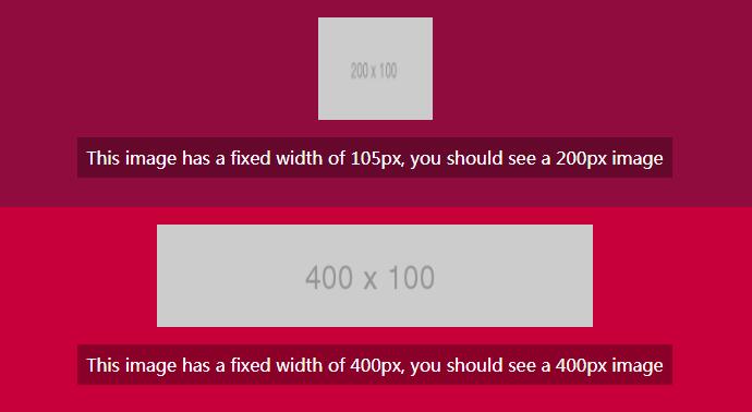
<figcaption>
This image has a fixed width of 105px, you should see a 200px image
</figcaption>
</figure>
<figure>
<ImageResponsive
src="http://placehold.it/50x50"
alt="this is my image"
width="400px"
height="100px"
sources={sources}
/>
<figcaption>
This image has a fixed width of 400px, you should see a 400px image
</figcaption>
</figure>
<figure>
<ImageResponsive
src="http://placehold.it/50x50"
alt="this is my image"
width="20%"
height="100px"
sources={sources}
/>
<figcaption>
This image has a 20% width, resize your browser to see the src adjusting
</figcaption>
</figure>
<figure>
<ImageResponsive
src="http://placehold.it/50x50"
alt="this is my image"
width="50%"
height="100px"
sources={sources}
/>
<figcaption>
This image has a 50% width, resize your browser to see the src adjusting
</figcaption>
</figure>
</div>,
document.getElementById('root')
);