unpic img ? ?
A cross-framework component for responsive, high-performance images using image CDNs.
@unpic/react • @unpic/vue • @unpic/solid • @unpic/svelte
Features
- Just an
<img>tag! No extra elements, no runtime JavaScript. Easy to style. No legacy hacks or workarounds. - Automatically generates correct srcset and sizes attributes for responsive images.
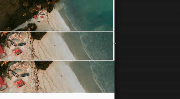
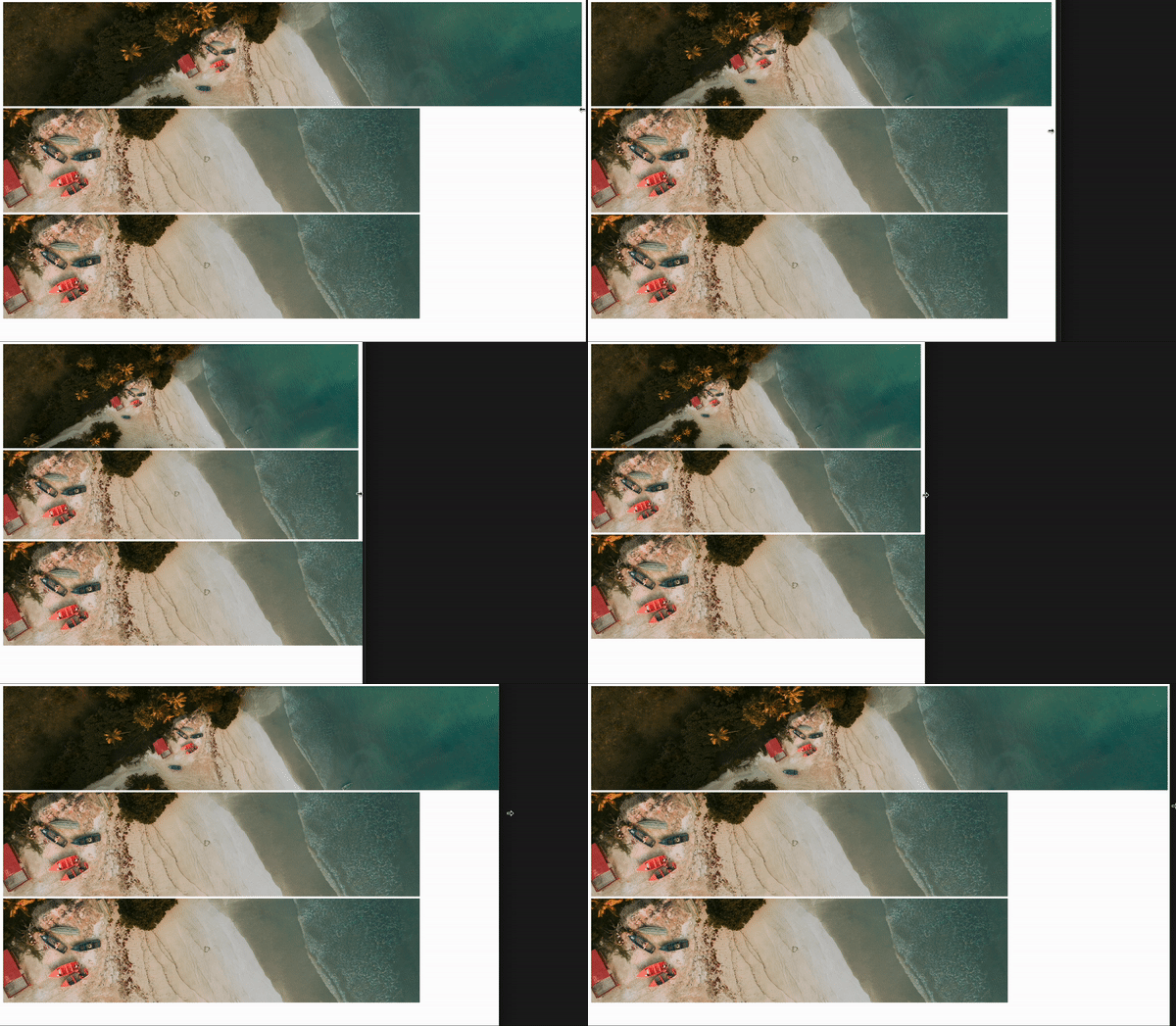
- Handles responsive resizing of images, preserving aspect ratio and avoiding layout shift.
- Uses native lazy loading and async decoding for offscreen images.
- Handles different image layouts: fixed, constrained and full width.
- Uses eager loading and high priority fetching for important images.
- Delivers modern image formats, including WebP and AVIF if supported by the browser.
- No build step or server-side rendering required for the images: uses your existing image CDN or CMS, with no additional configuration.
- Uses unpic to support most image CDNs, including Cloudinary, Imgix, and Shopify.
- Can generate a low-res background image for a blurred placeholder effect.
This library is a work in progress. It currently supports React, Vue and SolidJS.
Usage
For details of usage, see the individual framework packages:
FAQ
Why do I need this?
While it’s easy to use an <img> tag for images, if you want to follow best practices and deliver the most performant image to your users then it can take a lot of work. Some frontend frameworks will automate this for you, but they often rely on slow pre-rendering of images, or on running image optimizers on your own site. They also generate complex HTML with wrappers and spacer elements that make images hard to style.
Most images on modern websites are hosted on a CDN or CMS that can resize images on the fly and deliver them at the edge. Despite this, most web frameworks will still download and resize the image at build time or on your server, rather than using the CDN, or just uses a single source image rather than handling multiple resolutions.
This library works with any frontend framework or none, and uses your existing image CDN or CMS, with no additional configuration.
For more details, see this post.
How does this work?
This library uses unpic to detect the image CDN, and then uses the CDN’s URL API to resize and format images. It then generates the correct srcset and sizes attributes for the image. It uses new features built into modern browsers to handle lazy loading, fetch priority and decoding. It also uses pure CSS to handle responsive resizing of images, preserving aspect ratio and avoiding layout shift. Unlike most other image components, it does not use any client-side JavaScript by default, and generates just a single <img> tag without any wrapper divs or padding elements.
What HTML does this generate?
Generated HTML for a constrained image
It turns this:
<Image
  src="https://cdn.shopify.com/static/sample-images/bath_grande_crop_center.jpeg"
  layout="constrained"
  width={800}
  height={600}
  alt="Shopify"
/>
…into this:
<img
alt="Shopify"
loading="lazy"
decoding="async"
sizes="(min-width: 800px) 800px, 100vw"
srcset="
https://cdn.shopify.com/static/sample-images/bath.jpeg?crop=center&width=1600&height=2133 1600w,
https://cdn.shopify.com/static/sample-images/bath.jpeg?crop=center&width=1280&height=1707 1280w,
https://cdn.shopify.com/static/sample-images/bath.jpeg?crop=center&width=1080&height=1440 1080w,
https://cdn.shopify.com/static/sample-images/bath.jpeg?crop=center&width=960&height=1280 960w,
https://cdn.shopify.com/static/sample-images/bath.jpeg?crop=center&width=828&height=1104 828w,
https://cdn.shopify.com/static/sample-images/bath.jpeg?crop=center&width=800&height=1067 800w,
https://cdn.shopify.com/static/sample-images/bath.jpeg?crop=center&width=750&height=1000 750w,
https://cdn.shopify.com/static/sample-images/bath.jpeg?crop=center&width=640&height=853 640w
"
src="https://cdn.shopify.com/static/sample-images/bath.jpeg?width=800&height=600&crop=center"
style="
object-fit: cover;
max-width: 800px;
max-height: 600px;
aspect-ratio: 1.33333 / 1;
width: 100%;
"
/>
Props
The component accepts all the props of an <img> tag, plus the following:
layout
The resizing behaviour of the image.
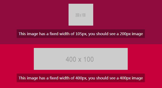
fullWidth: the image will be rendered at full width of its container. This is optimized for full-width hero images. You can setheightto a fixed value, which will mean the image will be rendered at that fixed height and scale horizontally to fill the container.constrained: the image will be rendered at a maximum ofwidthandheight, but will scale down automatically if the container is smaller, maintaining the aspect ratio.fixed: the image will be rendered at the exact size specified bywidthandheight
priority
By default, images are loaded lazily. If priority is set to true, the image will be loaded eagerly, and will be given high priority by the browser. This is useful for images that are above the fold, particularly large ones such as hero images.
background
Either an image URL, CSS gradient or CSS colour value. If set to auto, a low-resolution version of the image will be rendered as a background image, with a blurred placeholder effect. This is still loaded from the remote server, so if you can instead provide an inline base64-encoded version of the image or background colour, you should do that instead. Bear in mind that this is not removed after the image loads, so it will be visible if the image has transparency.
aspectRatio
Instead of specifying both width and height, you can specify can aspectRatio.
cdn
By default the CDN is auto-detected from the src URL. If you want to override this, you can specify a CDN object. See the unpic for supported values.
breakpoints
By default the image breakpoints used in the srcset are generated based on the layout and image size. You can override this by specifying an array of breakpoints. The breakpoints are specified as an array of numbers, representing the width of the image in pixels.
Other props
Any prop supported by <img> tags can be passed in, except srcset which is generated from src. The following props are set automatically, but can be overridden if you need to:
sizesroledecodingloadingfetchpriority
Supported CDNs
You can use any image CDN supported by unpic, including:
- Imgix, including Unsplash, DatoCMS, Sanity and Prismic
- Contentful
- Cloudinary
- Shopify
- WordPress.com and Jetpack Site Accelerator
- Bunny.net
- Storyblok
Browser support
Many of the performance features use <img> attributes that are only supported in modern browsers. However it is still an <img> tag, so it will degrade gracefully in older browsers. It uses the aspect-ratio and object-fit CSS properties, which are supported in all modern browsers but will not degrade gracefully in older browsers. This means that in older browsers the image may appear stretched or squashed if not explicitly sized. See the browser support table for more details.
License
Published under the MIT licence. © Matt Kane 2023.
