React Image Annotation
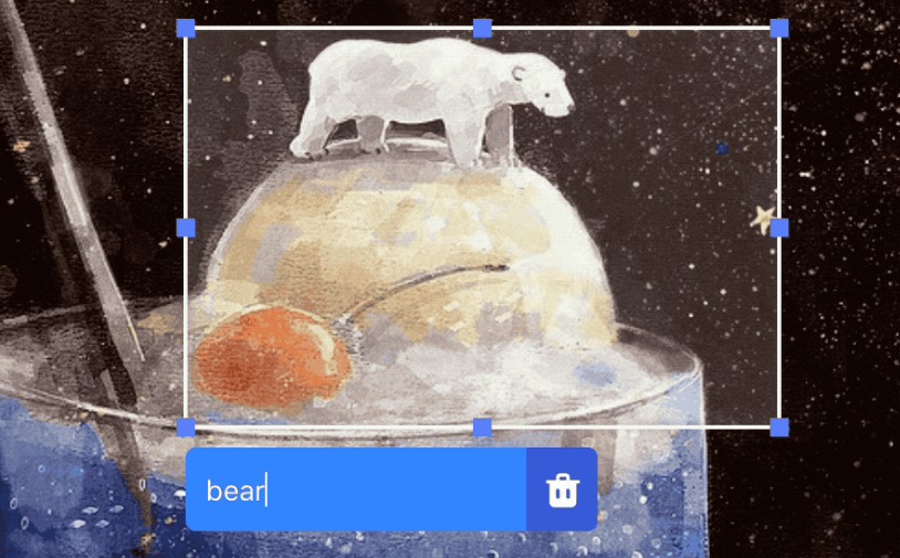
An infinitely customizable image annotation library built on React.
Installation
npm install --save react-image-annotation
# or
yarn add react-image-annotation
Usage
export default class Simple extends Component {
  state = {
    annotations: [],
    annotation: {}
  }

  onChange = (annotation) => {
    this.setState({ annotation })
  }

  onSubmit = (annotation) => {
    const { geometry, data } = annotation

    this.setState({
      annotation: {},
      annotations: this.state.annotations.concat({
        geometry,
        data: {
          ...data,
          id: Math.random()
        }
      })
    })
  }

  render () {
    return (
      <Root>
        <Annotation
          src={img}
          alt='Two pebbles anthropomorphized holding hands'

          annotations={this.state.annotations}

          type={this.state.type}
          value={this.state.annotation}
          onChange={this.onChange}
          onSubmit={this.onSubmit}
        />
      </Root>
    )
  }
}
Props
| Prop | Description | Default |
|---|---|---|
src |
Image src attribute | |
alt |
Image alt attribute | |
annotations |
Array of annotations | |
value |
Annotation object currently being created. See annotation object | |
onChange |
onChange handler for annotation object |
|
onSubmit |
onSubmit handler for annotation object |
|
type |
Selector type. See custom shapes | RECTANGLE |
allowTouch |
Set to true to allow the target to handle touch events. This disables one-finger scrolling |
false |
selectors |
An array of selectors. See adding custom selector logic | [RectangleSelector, PointSelector, OvalSelector] |
activeAnnotations |
Array of annotations that will be passed as 'active' (active highlight and shows content) | |
activeAnnotationComparator |
Method to compare annotation and activeAnnotation item (from props.activeAnnotations). Return true if it's the annotations are equal |
(a, b) => a === b |
disableAnnotation |
Set to true to disable creating of annotations (note that no callback methods will be called if this is true) |
false |
disableSelector |
Set to true to not render Selector |
false |
disableEditor |
Set to true to not render Editor |
false |
disableOverlay |
Set to true to not render Overlay |
false |
renderSelector |
Function that renders Selector Component |
See custom components |
renderEditor |
Function that renders Editor Component |
See custom components |
renderHighlight |
Function that renders Highlight Component |
See custom components |
renderContent |
Function that renders Content |
See custom components |
renderOverlay |
Function that renders Overlay |
See custom components |
onMouseUp |
onMouseUp handler on annotation target |
|
onMouseDown |
onMouseDown handler on annotation target |
|
onMouseMove |
onMouseMove handler on annotation target |
|
onClick |
onClick handler on annotation target |
Annotation object
An Annotation object is an object that conforms to the object shape
({
  selection: T.object, // temporary object for selector logic
  geometry: T.shape({ // geometry data for annotation
    type: T.string.isRequired // type is used to resolve Highlighter/Selector renderer
  }),
  // auxiliary data object for application.
  // Content data can be stored here (text, image, primary key, etc.)
  data: T.object
})
Using custom components
Annotation supports renderProps for almost every internal component.
This allows you to customize everything about the the look of the annotation interface, and you can even use canvas elements for performance or more complex interaction models.
renderSelector- used for selecting annotation area (during annotation creation)renderEditor- appears after annotation area has been selected (during annotation creation)renderHighlight- used to render current annotations in the annotation interface. It is passed an object that contains the propertyactive, which is true if the mouse is hovering over the higlightrenderComponent- auxiliary component that appears when mouse is hovering over the highlight. It is passed an object that contains the annotation being hovered over.{ annotation }renderOverlay- Component overlay for Annotation (i.e. 'Click and Drag to Annotate')
You can view the default renderProps here
Note: You cannot use :hover selectors in css for components returned by renderSelector and renderHighlight. This is due to the fact that Annotation places DOM layers on top of these components, preventing triggering of :hover
Using custom shapes
Annotation supports three shapes by default, RECTANGLE, POINT and OVAL.
You can switch the shape selector by passing the appropriate type as a property. Default shape TYPEs are accessible on their appropriate selectors:
import {
  PointSelector,
  RectangleSelector,
  OvalSelector
} from 'react-image-annotation/lib/selectors'

<Annotation
  type={PointSelector.TYPE}
/>
Adding custom selector logic
This is an Advanced Topic
The Annotation API allows support for custom shapes that use custom logic such as polygon or freehand selection. This is done by defining your own selection logic and passing it as a selector in the selectors property.
Selectors are objects that must have the following properties:
TYPE- string that uniquely identifies this selector (i.e.RECTANGLE)intersects- method that returns true if the mouse point intersects with the annotation geometryarea- method that calculates and returns the area of the annotation geometrymethods- object that can contain various listener handlers (onMouseUp,onMouseDown,onMouseMove,onClick). These listener handlers are called when triggered in the annotation area. These handlers must be reducer-like methods - returning a new annotation object depending on the change of the method
You can view a defined RectangleSelector here
Connecting selector logic to Redux/MobX
First see Selectors
You can use Selector methods to connect these method logic to your stores. This is due to the fact that selector methods function as reducers, returning new state depending on the event.


