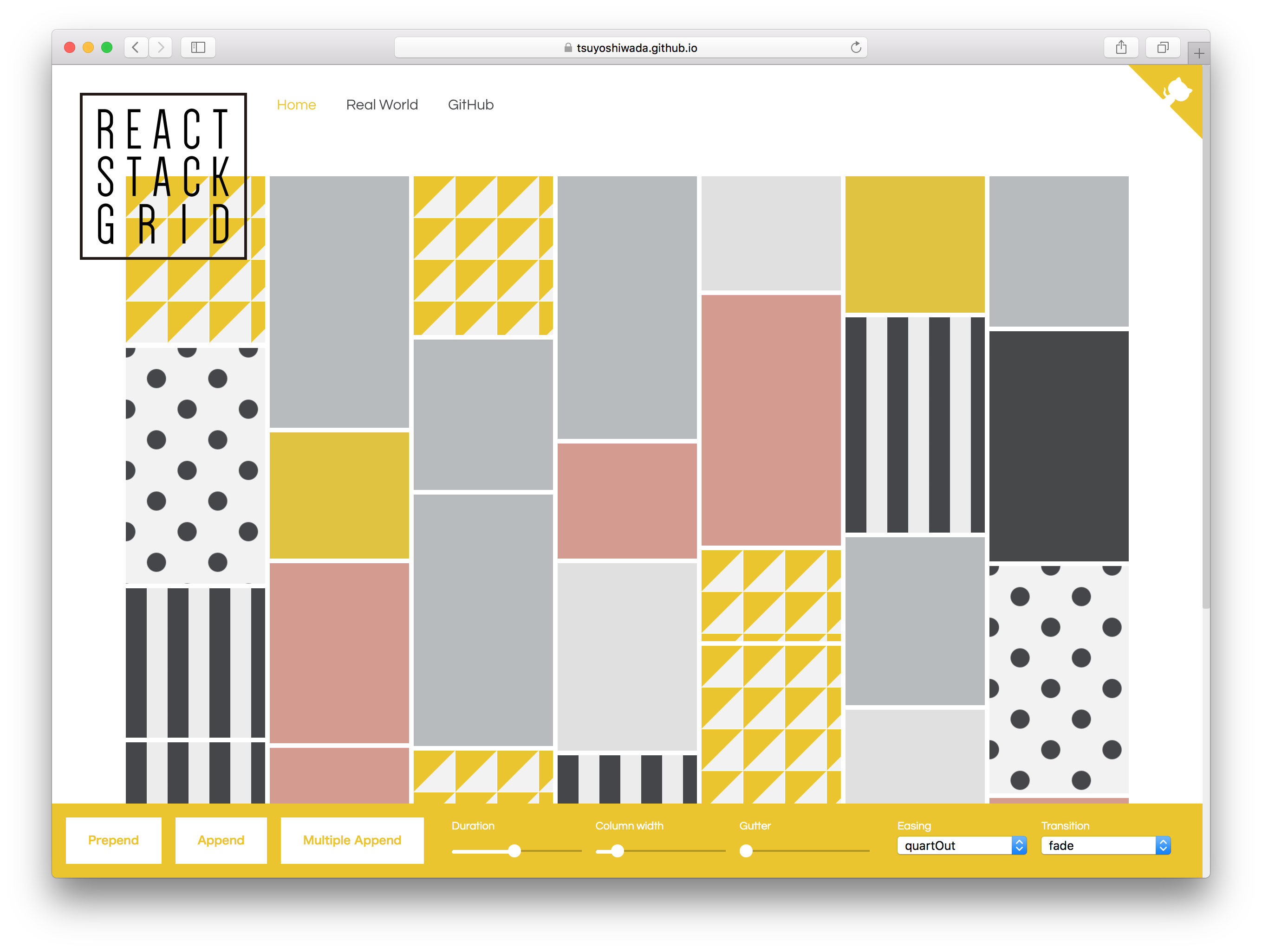
react-stonecutter
Animated grid layout component for React, inspired by Masonry.
Choose between CSS Transitions or React-Motion for animation.
Live Demo
http://dantrain.github.io/react-stonecutter/
Installation
With npm:
npm install --save react-stonecutter
Usage
A simple layout with items of equal height:
import { SpringGrid } from 'react-stonecutter';
<SpringGrid
  component="ul"
  columns={5}
  columnWidth={150}
  gutterWidth={5}
  gutterHeight={5}
  itemHeight={200}
  springConfig={{ stiffness: 170, damping: 26 }}
>
  <li key="A">A</li>
  <li key="B">B</li>
  <li key="C">C</li>
</SpringGrid>
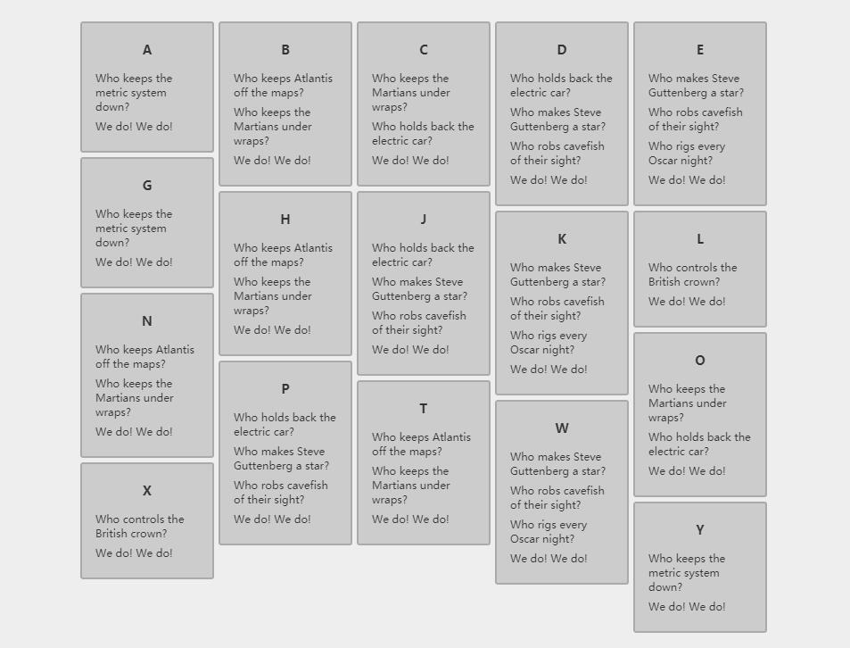
A Pinterest-style layout with varying item heights, this time using CSS transitions:
import { CSSGrid, layout } from 'react-stonecutter';
<CSSGrid
  component="ul"
  columns={5}
  columnWidth={150}
  gutterWidth={5}
  gutterHeight={5}
  layout={layout.pinterest}
  duration={800}
  easing="ease-out"
>
  <li key="A" itemHeight={150}>A</li>
  <li key="B" itemHeight={120}>B</li>
  <li key="C" itemHeight={170}>C</li>
</CSSGrid>
To render React components as children, wrap them in simple elements. This gives you full control of your markup:
<SpringGrid
  component="ul"
  // ...etc.
>
  {data.map((datum) => (
    <li key={datum.id}>
      <MyComponent datum={datum} />
    </li>
  ))}
</SpringGrid>
If you don't know the heights of your items ahead of time, use the measureItems higher-order component to measure them in the browser before layout:
import { SpringGrid, measureItems } from 'react-stonecutter';

const Grid = measureItems(SpringGrid);
<Grid
  // ...etc.
>
  <li key="A">Who controls the British crown?</li>
  <li key="B">Who keeps the metric system down?</li>
  <li key="C">We do!</li>
  <li key="D">We do!</li>
</Grid>
If your grid spans the page and you want to vary the number of columns based on the viewport width, use the makeResponsive higher-order component which makes use of enquire.js:
import { CSSGrid, measureItems, makeResponsive } from 'react-stonecutter';

const Grid = makeResponsive(measureItems(CSSGrid), {
  maxWidth: 1920,
  minPadding: 100
});
