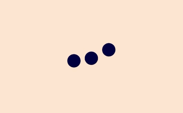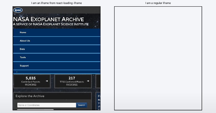
react-loading-skeleton
Create skeleton screens that automatically adapt to your app!
Make beautiful, animated loading skeletons that automatically adapt to your app.
Basic usage
Install by npm/yarn with react-loading-skeleton.
import Skeleton from 'react-loading-skeleton';

<Skeleton/> // Simple, single-line loading skeleton
<Skeleton count={5}/> // Five-line loading skeleton
Principles
Adapts to the styles you have defined
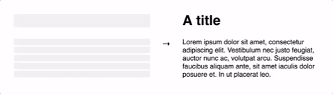
The <Skeleton> component is designed to be used directly in your components,
in place of content while it's still loading.
Unlike other libraries, rather than meticulously crafting a skeleton screen to
match the font-size, line-height or margins your content takes on,
use a <Skeleton> component to have it automatically fill the correct dimensions.
For example:
class Blogpost extends Component {
  render() {
    return (
      <div style={{ fontSize: 20, lineHeight: 2 }}>
        <h1>{this.props.title || <Skeleton />}</h1>
        {this.props.body || <Skeleton count={10} />}
      </div>
    );
  }
}
...will produce the correctly-sized skeletons for the heading and body sections
without any further configuration of the <Skeleton> component.
This ensures the loading state remains up-to-date with any changes
to your layout or typography.
Don't make dedicated skeleton screens
Instead, make components with built-in skeleton states.
In addition to keeping the styling in-sync, here are some other reasons to do this:
- Components represent all possible states it can be in - loading included.
- It allows for more flexible loading patterns - in the
Blogpostexample, it's possible to have thetitleload first, and then thebody, while having both pieces of content show loading skeletons at the right time.
Theming
Using a <SkeletonTheme> component, you can easily change the colors of all
skeleton components below it in the React hierarchy:
import Skeleton, { SkeletonTheme } from "react-loading-skeleton";

<SkeletonTheme color="#202020" highlightColor="#444">
  <p>
    <Skeleton count={3} />
  </p>
</SkeletonTheme>;
Duration
<Skeleton duration={2} />
duration: Number, defaults to 1.2
Duration is how long it takes do one cycle of the skeleton animation.
Width
width: Number | String | null, defaults to null
<Skeleton width={100} />
Width of the skeleton. Useful when the skeleton is inside an inline element with
no width of its own.