itsa-react-option
Beautiful option-list for react.Lightweight, focussable and key-responsive.
How to use:
const ReactDOM = require("react-dom"),
Component = require("itsa-react-option");
const handleChange = newChecked => {
props.checked = newChecked;
renderOptionComponent();
};
let props = {
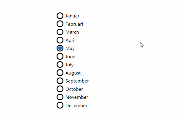
options: [
"Januari",
"Februari",
"March",
"April",
"May",
"June",
"July",
"August",
"September",
"October",
"November",
"December"
],
checked: 3,
onChange: handleChange
};
const renderOptionComponent = () => {
ReactDOM.render(
<Component {...props} />,
document.getElementById("component-container")
);
};
renderOptionComponent();
About the css
You need the right css in order to make use of itsa-react-option. There are 2 options:
- You can use the css-files inside the
css-folder. - You can use:
Component = require("itsa-react-option/lib/component-styled.jsx");and build your project withwebpack. This is needed, because you need the right plugin to handle a requirement of thescss-file.