connect-metamask-react-dapp
Build a simple React / Web3 Dapp that replicates a small portion of the Uniswap v2 interface
Today we're going to build a simple React / Web3 Dapp that replicates a small portion of the Uniswap v2 interface - specifically, we are building the "account login" button that allows users to connect to a Dapp using their MetaMask extension.
By the end of the tutorial you will have a working React app that will be able to connect to your MetaMask account, and read your address & ETH balance. If you connect with multiple accounts the interface will change to reflect the active account.
A lot of tutorials skip this basic login strategy, or use outdated libraries (which you don't find out until you're halfway through!). To avoid confusion, as of July, 2021 this tutorial & the accompanying repo uses the following tech:
- react ^17.0.2
- typescript ^4.2.1
- ethers.js ^5.4.0
- @usedapp/core ^0.4.1
- @chakra-ui/react ^1.6.5
The full repository can be found HERE.
We will be replicating (fairly closely) the look, feel, and functionality of the following "Connect to a wallet" section of the Uniswap v2 interface:


Before we get started:
You'll need MetaMask installed to get this working. If you don't already have it, start by downloading & installing the MetaMask extension for Chrome, Firefox, Brave, or Edge: https://metamask.io/download.html (be careful to triple check the URL and ensure you are downloading from a trusted website). If you haven't set up MetaMask before, follow the instructions to set up an Ethereum account.
Once you have MetaMask installed, we are ready to start coding...
Step 1: Install Our Libraries
We'll be using Create React App with a TypeScript template to build our app. We don't use a lot of TypeScript in the tutorial but it's a good way to dip your toes in if you haven't used it before.
To create the app, open up a console and execute the following instructions:
npx create-react-app YOUR_APP_NAME --template typescript
This will make a new Create React App project called simple-web3-dapp, with TypeScript pre-configured.
If you open up a copy of VSCode (or the editor of your choice) and navigate to your app folder, you'll see a React project ready to go, including index.tsx, App.tsx and a tsconfig.json file.
We won't need a lot of the template files & code, so delete all of the code in the index.tsx file and add the following code:
// index.tsx
import React from "react";
import ReactDOM from "react-dom";
import App from "./App"

ReactDOM.render(
  <React.StrictMode>
      <App />
  </React.StrictMode>,
  document.getElementById("root")
);
This gives us the most basic index.tsx file we need to begin. Next, we're going to install a few more libraries that we'll be using to create our app:
npm i @chakra-ui/react @emotion/react @emotion/styled @framer-motion @usedapp/core
Step 2: Set up useDApp
Apart from their decision to add a capital A to the name of their library, useDApp is an incredibly useful framework for "rapid DApp development", and includes some helpful hooks and seamless integration into a modern React project. To dive into everything you can do with the framework, check out their website at https://usedapp.io/. We'll only be using some basic elements of useDApp to get our web3 dapp working, but there's much more you can do with it.
In our index.tsx file, we're going to import the DAppProvider from useDApp to set up an app-wide provider that will allow us to access Ethereum accounts and prompt MetaMask to ask for permission to read addresses:
// index.tsx
import React from "react";
import ReactDOM from "react-dom";
import App from "./App"
// Import DAppProvider
import { DAppProvider } from "@usedapp/core";

ReactDOM.render(
  <React.StrictMode>
    {/*
       Wrap our app in the provider, config is required,
        but can be left as an empty object:
    */}
    <DAppProvider config={{}}>
      <App />
    </DAppProvider>
  </React.StrictMode>,
  document.getElementById("root")
);
Step 3: Set Up App.tsx and a Layout component
Next let's move to our App.tsx file, where we'll add Chakra UI to handle styling & components within our app. Chakra UI has become my favourite React component library, I find it extremely intuitive with sensible defaults and an API that makes it super-easy to override when necessary. I recommend Chakra over Tailwind because it's less verbose and easier to get started with:
// App.tsx
import { ChakraProvider } from "@chakra-ui/react";

export default function App() {
  return (
    // lets us use Chakra UI syntax across our app:
    <ChakraProvider>
      // we'll add content to our app shortly
    </ChakraProvider>
  )
}
To keep this tutorial focused, we won't be replicating the entire Uniswap navbar, so we'll just center the elements we're focused on by wrapping them in a Layout component. Inside the src directory of your project, create a components directory and inside that create a Layout.tsx file:
// Layout.tsx
import { ReactNode } from "react";
import { Flex } from "@chakra-ui/react";

type Props = {
  children?: ReactNode;
};

export default function Layout({ children }: Props) {
  return (
    <Flex
      flexDirection="column"
      alignItems="center"
      justifyContent="center"
      h="100vh"
      bg="gray.800"
    >
      {children}
    </Flex>
  )
}
The code we've added should be pretty easy to follow - we're using a Chakra Flex component, setting the height to the full page height and centering the child elements. We've also added a TypeScript type to define the child elements as a ReactNode, which lets us add individual elements, and arrays of elements, while keeping TypeScript happy and providing us with type hints elsewhere in the project.
Let's now import that Layout component into our App.tsx:
// App.tsx
import { ChakraProvider } from "@chakra-ui/react";
import Layout from "./components/Layout";

export default function App() {
  return (
    <ChakraProvider>
      <Layout>
        <p style={{ color: "white" }}>Hello, world!</p>
      </Layout>
    </ChakraProvider>
  )
}
If you run npm start you should now see a page with "Hello, world!" vertically centered. We're getting to the good stuff soon, I promise :)
Step 4: Creating our "Connect to a wallet" button
We're going to create our ConnectButton now, which is where the bulk of the magic happens. Start by creating a file called ConnectButton.tsx inside the components folder:
// ConnectButton.tsx
import { Button, Box, Text } from "@chakra-ui/react";
import { useEthers, useEtherBalance } from "@usedapp/core";

export default function ConnectButton() {
  const {activateBrowserWallet, account } = useEthers();
  const etherBalance = useEtherBalance(account);

  return account ? (
    <Box>
      <Text color="white" fontSize="md">
        {etherBalance && etherBalance} ETH
      </Text>
    </Box>
  ) : (
    <Button>Connect to a wallet</Button>
  );
}
Here we've imported the useEthers and useEtherBalance hooks from useDApp, which will enable us to connect to our MetaMask wallet. Import ConnectButton.tsx into App.tsx and place the component in between the Layout component in App.tsx:
// App.tsx
import ConnectButton from "./components/ConnectButton";
// other code

<Layout>
  <ConnectButton />
</Layout>
If you still have React running your page should have hot reloaded and you'll see this:

Great - we've got a button, but it doesn't do anything - let's add a function to handle the button click. In ConnectButton.tsx, we'll add a click handler:
// ConnectButton.tsx
export default function ConnectButton() {
  // other code

  function handleConnectWallet() {
    activateBrowserWallet();
  }

  return account ? (
    <Box>
      <Text color="white" fontSize="md">
        // etherBalance will be an object, so we stringify it
        {etherBalance && JSON.stringify(etherBalance)} ETH
      </Text>
    </Box>
  ) : (
    <Button onClick={handleConnectWallet}>
      Connect to a wallet
    </Button>
  );
}
I personally like to define named functions within my components, so we're creating the handleConnectWallet function which simply invokes the activateBrowserWallet function provided by useDApp. It might seem unnecessary at the moment, but I find that getting into the practice of defining function handlers keeps my code cleaner and easier to manage than mixing inline event handlers.
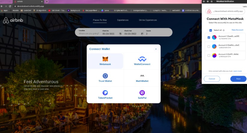
Now for the moment of truth: let's click the "Connect to a wallet button"...
If everything has gone to plan then clicking the button should have prompted MetaMask to open and give us a "Connect With MetaMask" view:

Select the account that you'd like to log in with and click "Next" in the MetaMask UI. You should then see a section asking if you will let the dapp view the addresses of your permitted accounts:

Click "Connect" and all of a sudden you'll see that the Connect Button has been replaced by some text:

This means we're connected! If you have React Dev Tools installed you can also navigate to the Components tab and look for Web3ReactContext - primary.Provider - you'll see that the context now holds a value object with an account property that matches the Ethereum account you connected with:

Ok, so we've made some progress - we're connecting to a React dapp with MetaMask, and we can see account info within our dapp's state. But, this isn't very pretty or useful. We have to do a little bit of work to display something nicer.
Step 4: Formatting & Styling our Connect Button
The etherBalance value returned by the useEtherBalance hook is giving us a BigNumber object that we need to format. Let's quickly install and then import a utility from ethers.js:
npm i @ethersproject/units
// ConnectButton.tsx
import { formatEther } from "@ethersproject/units";
Once we've done that, we can use formatEther which will convert ETH denominated in Wei into a floating point number, which we will then pass through the JavaScript method parseFloat set to 3 fixed decimal places:
// ConnectButton.tsx
<Box>
  <Text color="white" fontSize="md">
  {etherBalance && parseFloat(formatEther(etherBalance)).toFixed(3)} ETH
  </Text>
</Box
Now we should see: 0.000 ETH (or if you already have ETH you'll see your account balance). You can grab some Ethereum from the Ropsten faucet here if you want to see a nice balance :)
Now we're going to add some styles and also pull in the user account address to display it on the Connect Button's logged in state:
// ConnectButton.tsx
import { Button, Box, Text } from "@chakra-ui/react";
import { useEthers, useEtherBalance } from "@usedapp/core";
import { formatEther } from "@ethersproject/units";


export default function ConnectButton() {
  const { activateBrowserWallet, account } = useEthers();
  const etherBalance = useEtherBalance(account);

  function handleConnectWallet() {
    activateBrowserWallet();
  }

  return account ? (
    <Box
      display="flex"
      alignItems="center"
      background="gray.700"
      borderRadius="xl"
      py="0"
    >
      <Box px="3">
        <Text color="white" fontSize="md">
          {etherBalance && parseFloat(formatEther(etherBalance)).toFixed(3)} ETH
        </Text>
      </Box>
      <Button
        bg="gray.800"
        border="1px solid transparent"
        _hover={{
          border: "1px",
          borderStyle: "solid",
          borderColor: "blue.400",
          backgroundColor: "gray.700",
        }}
        borderRadius="xl"
        m="1px"
        px={3}
        height="38px"
      >
        <Text color="white" fontSize="md" fontWeight="medium" mr="2">
          // check account is defined and then slice the string
          {account &&
            `${account.slice(0, 6)}...${account.slice(
              account.length - 4,
              account.length
            )}`}
        </Text>
      </Button>
    </Box>
  ) : (
    <Button onClick={handleConnectWallet}>Connect to a wallet</Button>
  );
}
Here we've added some styles to replicate the Uniswap button, using some neat Chakra properties on the components. You'll notice that we also use the .slice string method to shorten the Ethereum account address - an Ethereum address is 42 characters long, which is a bit unwieldy for the UI, so the standard practice is to trim some of the middle characters for display. Here we show the first 6 and last 4 characters, the same as the Uniswap UI.
Let's compare our Connect Button with the Uniswap version:


We're looking pretty close, but we're missing the little avatar. Let's make another component, called Identicon.tsx, which we'll create in our components folder:
// Identicon.tsx
import { useEffect, useRef } from "react";
import { useEthers } from "@usedapp/core";
import styled from "@emotion/styled";

const StyledIdenticon = styled.div`
  height: 1rem;
  width: 1rem;
  border-radius: 1.125rem;
  background-color: black;
`;

export default function Identicon() {
  const ref = useRef<HTMLDivElement>();
  const { account } = useEthers();

  useEffect(() => {
    if (account && ref.current) {
      ref.current.innerHTML = "";
    }
  }, [account]);

  return <StyledIdenticon ref={ref as any}
}
At the moment this won't show us anything different - we're going to install a library called Jazzicon made by MetaMask themselves:
npm i @metamask/jazzicon
The Jazzicon library takes a diameter in pixels, and a JavaScript integer and returns a colorful, Cubist avatar - this is actually the exact same library and technique that the Uniswap interface uses:
// Identicon.tsx
import Jazzicon from "@metamask/jazzicon";
// ...othercode

useEffect(() => {
  if (account && ref.current) {
    ref.current.innerHTML = "";
    ref.current.appendChild(Jazzicon(16, parseInt(account.slice(2, 10), 16)));
  }
}, [account]);

return <StyledIdenticon ref={ref as any} />
NOTE: You might run into a TypeScript error here, so we'll quickly declare a module to get rid of the error. Go to the react-app-env.d.ts file (preinstalled by Create React App), and add the following module declaration:
declare module "@metamask/jazzicon" {
  export default function (diameter: number, seed: number): HTMLElement;
}
Now let's import Identicon.tsx into ConnectButton.tsx and add the Identicon component to our account button:
// ConnectButton.tsx
import Identicon from "./Identicon";

// ...other code
      <Button
        bg="gray.800"
        border="1px solid transparent"
        _hover={{
          border: "1px",
          borderStyle: "solid",
          borderColor: "blue.400",
          backgroundColor: "gray.700",
        }}
        borderRadius="xl"
        m="1px"
        px={3}
        height="38px"
      >
        <Text color="white" fontSize="md" fontWeight="medium" mr="2">
          {account &&
            `${account.slice(0, 6)}...${account.slice(
              account.length - 4,
              account.length
            )}`}
        </Text>
        // Add the newly imported Identicon component
        <Identicon />
      </Button>
Lovely! Now we should have an element that displays our Ethereum account and ETH balance along with a nice little avatar:

So let's take stock of where we are now:
- We have added the useDApp provider to our React dapp
- We can connect an Ethereum account and retrieve the address & ETH balance
- We've used Chakra to mimic the style of the Uniswap connect element
A reasonable question that might come up now is: how do we "logout" from the dapp? Notice that the useEthers hook comes with the activateBrowserWallet function. It also comes with a deactivate function that we can use to "log out" from the dapp - however, that needs to come with a bit of extra info: using the deactivate function does not actually disconnect the user from the dapp, it merely clears the state in the provider. If we "deactivate" and refresh the page, then click "Connect to a wallet" again, you'll see that the user address and balance is instantly shown, without logging back in via MetaMask.
The reason for this is that once MetaMask is connected via the permissions, it will remain connected until we explicitly disconnect via the MetaMask interface:

If you've used a lot of DeFi products you'll notice that this is the standard Web3 practice, even though it is unintuitive compared to traditional Web2-style auth. This is an ongoing issue related to MetaMask: https://github.com/MetaMask/metamask-extension/issues/8990, and while several solutions have been suggested, I personally haven't found one that works as expected. You might notice that in the Uniswap interface itself, they don't provide a "logout" button, just a way to swap wallets:

For a bit of extra fun, let's emulate that modal, which will give us a chance to see what else Chakra UI can do in terms of building interfaces.
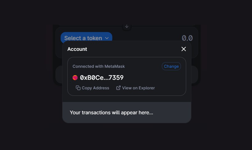
Step 5: Add an Account Modal
Let's start by creating AccountModal.tsx inside our components folder:
// AccountModal.tsx
import {
  Box,
  Button,
  Flex,
  Link,
  Modal,
  ModalOverlay,
  ModalContent,
  ModalHeader,
  ModalFooter,
  ModalBody,
  ModalCloseButton,
  Text,
} from "@chakra-ui/react";
import { ExternalLinkIcon, CopyIcon } from "@chakra-ui/icons";
import { useEthers } from "@usedapp/core";
import Identicon from "./Identicon";

export default function AccountModal() {}
We're importing a lot of components from Chakra UI here, including 6 modal component elements, and also a couple of icons.
npm i @chakra-ui/icons
Now let's flesh out the modal:
// AccountModal.tsx
export default function AccountModal() {
  const { account, deactivate } = useEthers();

    <Modal isCentered size="md">
      <ModalOverlay />
      <ModalContent
        background="gray.900"
        border="1px"
        borderStyle="solid"
        borderColor="gray.700"
        borderRadius="3xl"
      >
        <ModalHeader color="white" px={4} fontSize="lg" fontWeight="medium">
          Account
        </ModalHeader>
        <ModalCloseButton
          color="white"
          fontSize="sm"
          _hover={{
            color: "whiteAlpha.700",
          }}
        />
        <ModalBody pt={0} px={4}>
          <Box
            borderRadius="3xl"
            border="1px"
            borderStyle="solid"
            borderColor="gray.600"
            px={5}
            pt={4}
            pb={2}
            mb={3}
          >
            <Flex justifyContent="space-between" alignItems="center" mb={3}>
              <Text color="gray.400" fontSize="sm">
                Connected with MetaMask
              </Text>
              <Button
                variant="outline"
                size="sm"
                borderColor="blue.800"
                borderRadius="3xl"
                color="blue.500"
                fontSize="13px"
                fontWeight="normal"
                px={2}
                height="26px"
                _hover={{
                  background: "none",
                  borderColor: "blue.300",
                  textDecoration: "underline",
                }}

              >
                Change
              </Button>
            </Flex>
            <Flex alignItems="center" mt={2} mb={4} lineHeight={1}>
              <Identicon />
              <Text
                color="white"
                fontSize="xl"
                fontWeight="semibold"
                ml="2"
                lineHeight="1.1"
              >
                {account &&
                  `${account.slice(0, 6)}...${account.slice(
                    account.length - 4,
                    account.length
                  )}`}
              </Text>
            </Flex>
            <Flex alignContent="center" m={3}>
              <Button
                variant="link"
                color="gray.400"
                fontWeight="normal"
                fontSize="sm"
                _hover={{
                  textDecoration: "none",
                  color: "whiteAlpha.800",
                }}
              >
                <CopyIcon mr={1} />
                Copy Address
              </Button>
              <Link
                fontSize="sm"
                display="flex"
                alignItems="center"
                href={`https://ropsten.etherscan.io/address/${account}`}
                isExternal
                color="gray.400"
                ml={6}
                _hover={{
                  color: "whiteAlpha.800",
                  textDecoration: "underline",
                }}
              >
                <ExternalLinkIcon mr={1} />
                View on Explorer
              </Link>
            </Flex>
          </Box>
        </ModalBody>

        <ModalFooter
          justifyContent="end"
          background="gray.700"
          borderBottomLeftRadius="3xl"
          borderBottomRightRadius="3xl"
          p={6}
        >
          <Text
            color="white"
            textAlign="left"
            fontWeight="medium"
            fontSize="md"
          >
            Your transactions willl appear here...
          </Text>
        </ModalFooter>
      </ModalContent>
    </Modal>
}
Now we've got the layout for the modal, but no way to trigger it. Normally in a React UI I would create a UI context and wrap my app in the provider, so that I can trigger modals and sidebars via a single control point. However, we're keeping our dapp simple, so instead we're going to pass callbacks as props down from our App.tsx component.
Inside App.tsx, we'll import a handy Chakra hook called useDisclosure that abstracts away the standard (and often repeated) logic for opening and closing modals. We've already imported ChakraProvider, so we'll just add the useDisclosure hook and destructure the variables:
// App.tsx
import { ChakraProvider, useDisclosure } from "@chakra-ui/react";
import theme from "./theme";
import Layout from "./components/Layout";
import ConnectButton from "./components/ConnectButton";
import AccountModal from "./components/AccountModal";
import "@fontsource/inter";

function App() {
  // Pull the disclosure methods
  const { isOpen, onOpen, onClose } = useDisclosure();
  return (
    <ChakraProvider theme={theme}>
      <Layout>
        // Our connect button will only handle opening
        <ConnectButton handleOpenModal={onOpen} />
        // Our Account modal will handle open state & closing
        <AccountModal isOpen={isOpen} onClose={onClose} />
      </Layout>
    </ChakraProvider>
  );
}

export default App;
Since we're passing a prop to our ConnectButton, we'll have to make a slight change there to handle it:
// ConnectButton.tsx
// ...other code
type Props = {
  handleOpenModal: any;
}

// ...other code
      <Button
        // add named function to handle opening modal
        onClick={handleOpenModal}
        bg="gray.800"
        border="1px solid transparent"
        _hover={{
          border: "1px",
          borderStyle: "solid",
          borderColor: "blue.400",
          backgroundColor: "gray.700",
        }}
        borderRadius="xl"
        m="1px"
        px={3}
        height="38px"
      >
We've also added two props to AccountModal.tsx, so let's add a TypeScript type (just using "any" to keep TypeScript from complaining - not best practice) and add the handlers:
// AccountModal.tsx
// ...other code
type Props = {
  isOpen: any;
  onClose: any;
}

export default function AccountModal({ isOpen, onClose }: Props) {
  const { account, deactivate } = useEthers();

  // Add a function to handle deactivating account
  function handleDeactivateAccount() {
    deactivate();
    onClose();
  }

  return (
    // add our isOpen state and onClose handler to the Modal
    <Modal isOpen={isOpen} onClose={onClose} isCentered size="md">
    // ...other code
                <Flex justifyContent="space-between" alignItems="center" mb={3}>
              <Text color="gray.400" fontSize="sm">
                Connected with MetaMask
              </Text>
              <Button
                variant="outline"
                size="sm"
                borderColor="blue.800"
                borderRadius="3xl"
                color="blue.500"
                fontSize="13px"
                fontWeight="normal"
                px={2}
                height="26px"
                _hover={{
                  background: "none",
                  borderColor: "blue.300",
                  textDecoration: "underline",
                }}
                // Add our deactivate account handler onClick
                onClick={handleDeactivateAccount}
              >
                Change
              </Button>
            </Flex>
Now we should be able to trigger our AccountModal when we click on the logged-in ConnectButton, which will open up the modal and allow us to deactivate the account by clicking "Change".

You'll notice that if you click "Change" that we will see the logged out ConnectButton. If you click it you'll also see that we're immediately logged in - our MetaMask was never disconnected from the dapp.
And that's it for this tutorial! Hopefully it will help you feel comfortable getting started with connecting an Ethereum account to a Web3 dapp, and show you the power of combining the useDApp framework with React, alongside the power of the Chakra UI component library.
The next steps for us will be to learn how to import contracts and make transactions - let me know in the comments if that's something you'd like to learn!
Thanks for playing ;)