Color Picker Input (cpi)
Color picker library for React (default react or mui compatible)
Installation
npm install @wellbees/color-picker-input
Usage/Examples
For React:
import { useState } from 'react'
import { ColorPicker } from '@wellbees/color-picker-input'

function App() {
  const [colorValue, setColorValue] = useState('')

  return <ColorPicker
            value={colorValue}
            inputType="input"
            onChange={(color)=> setColorValue(color)}
          />
}
For @mui (v5):
import { useState } from 'react'
import { ColorPicker } from '@wellbees/color-picker-input'

function App() {
  const [colorValue, setColorValue] = useState('')

  return <ColorPicker
            value={colorValue}
            inputType="mui"
            onChange={(color)=> setColorValue(color)}
          />
}
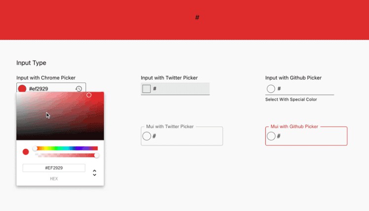
Ekran Görüntüleri

Props
| Name | Type | Default | Description |
|---|---|---|---|
| colorShowType | circle | square |
square |
Color representation shape in the input area |
| pickerType | chrome | twitter | github |
chrome |
Picker representation shape |
| specialColors | String[] | [] |
Used to define fixed colors in selectors. Available on Github and Twitter Selectors. Exam: ["#ff6961","#ffb480","#f8f38d","#42d6a4","#08cad1","#59adf6","#9d94ff","#c780e8"] |
| inputType | input | mui |
input |
Used to define ui type |
| variant | filled | outlined |
outlined |
Used to define variant |
| size | small | medium |
medium |
Used to define input padding |
| className | String | Used to define class | |
| autoFocus | Boolean | false |
Used to input focus |
| value | String | The value for component | |
| disabled | Boolean | false |
Used to input disable |
| error | Boolean | false |
Used for red warning in case of error |
| helperText | String | Used for helper text | |
| fullWidth | Boolean | false |
Used to cover the full width of the container |
| id | String | User to input id | |
| name | String | Used to input name | |
| label | String | Used to input label | |
| placeholder | String | Used to input placeholder | |
| required | Boolean | false |
Used to define input require |
| onFocus | Function | Exam: function(e) => void |
|
| onBlur | Function | Exam: function(e) => void |
|
| onClick | Function | Exam: function(e) => void |
|
| onChange | Function | Exam: function(color) => void |
Features
- Three Different Picker
- Live Color Preview
- Default React and Mui (v5) compatible
Min React Version
React: 17.0.1
Packages Used
react-color, mui, style-sheet, prop-types
Feedback
If you have any feedback, please contact us at [email protected].