react-country-region-selector
This library provides a pair of React components to display connected country and region dropdowns (pick a country, it shows the relevant regions). If you're not using React, check out the plain vanilla JS version instead. The list of countries and regions is maintained separately and found in the country-region-data repo.
Features
It's pretty versatile.
- There are two separate components (
<CountryDropdown />,<RegionDropdown>) that you can embed in your
DOM wherever you need. That sounded like a vulgar euphemism, but it wasn't, honest. - The source data used by the library is also exposed, should you need it.
- It let's you customize the list of countries that appears via a whitelist, blacklist.
- A lot of options are provided, for things like styling, event callbacks and so on.
- To keep file sizes down you have the option of creating a custom build of the library containing only a list of
those countries you want to show up. See command line options for more info.
Gotchas
- Page charset: some country names contain UTF-8 chars, so your page will need an appropriate charset to handle them.
If you see some invalid characters appearing in the dropdown, make sure you have UTF-8 specified in your page
<head>, like so:<meta charset="UTF-8"> - Return values: on an onChange event
event.target.valueis returned as the first value and the fulleventas the second.
Demo
Check out the github pages section for some examples + example
JSX code.
Installation
Using npm or yarn:
npm i react-country-region-selector
yarn add react-country-region-selector
Usage
It's very easy to use, but note that you will need to track the country and region value somewhere - either in your
component state or in a store somewhere. Here's a simple example that uses state:
import React, { Component } from 'react';

// note that you can also export the source data via CountryRegionData. It's in a deliberately concise format to
// keep file size down
import { CountryDropdown, RegionDropdown, CountryRegionData } from 'react-country-region-selector';


class Example extends Component {
  constructor (props) {
    super(props);
    this.state = { country: '', region: '' };
  }

  selectCountry (val) {
    this.setState({ country: val });
  }

  selectRegion (val) {
    this.setState({ region: val });
  }

  render () {
    const { country, region } = this.state;
    return (
      <div>
        <CountryDropdown
          value={country}
          onChange={(val) => this.selectCountry(val)} />
        <RegionDropdown
          country={country}
          value={region}
          onChange={(val) => this.selectRegion(val)} />
      </div>
    );
  }
}
Generally you don't need CountryRegionData, but should you need it, the raw data is accessible like in the above example.
Options
These are the attributes that can be passed to the two components. Note: any other attributes that aren't
specified here will be added directly to the <select> DOM element.
<CountryDropdown />
| Parameter | Required? | Default | Type | Description |
|---|---|---|---|---|
| value | Yes | "" |
string |
The currently selected country. This should either be the shortcode, or the full country name depending on what you're using for your value attribute (see the valueType option). By default it's the full country name. |
| onChange | Yes | - |
function |
Callback that gets called when the user selects a country. Use this to store the value in whatever store you're using (or just the parent component state). |
| onBlur | No | - |
function |
Callback that gets called when the user blurs off the country field. |
| name | No | "rcrs-country" |
string |
The name attribute of the generated select box. |
| id | No | "" |
string |
The ID of the generated select box. Not added by default. |
| classes | No | "" |
string |
Any additional space-separated classes you want to add. |
| showDefaultOption | No | true |
boolean |
Whether you want to show a default option. |
| priorityOptions | No | array |
[] |
Lets you target countries that should appear at the top of the dropdown. Should also be an array of country shortcodes. |
| defaultOptionLabel | No | "Select Country" |
string |
The default option label. |
| labelType | No | "full" |
string |
Either "full" or "short". This governs whether you see country names or country short codes in the dropdown. |
| valueType | No | "full" |
string |
Either "full" or "short". This controls the actual value attribute of each <option> in the dropdown. Please note, if you set this to "short" you will need to let the corresponding <RegionDropdown /> component know as well, by passing a countryValueType="short" attribute. |
| whitelist | No | [] |
array |
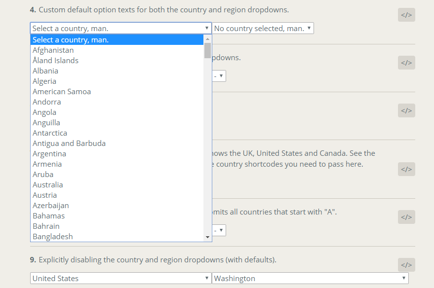
This setting lets you target specific countries to appear in the dropdown. Only those specified here will appear. This should be an array of country shortcodes. See the country-region-data repo for the data and the shortcodes. |
| blacklist | No | [] |
array |
Lets you target countries that should not appear in the dropdown. Should also be an array of country shortcodes. |
| disabled | No | false |
boolean |
Disables the country field. |
<RegionDropdown />
| Parameter | Required? | Default | Type | Description |
|---|---|---|---|---|
| country | Yes | "" |
string |
The currently selected country. |
| value | Yes | "" |
string |
The currently selected region. |
| onChange | Yes | - | function |
Callback that gets called when the user selects a region. Use this to store the value in whatever store you're using (or just the parent component state). |
| onBlur | No | - | function |
Callback that gets called when the user blurs off the region field. |
| name | No | "rcrs-region" |
string |
The name attribute of the generated select box. |
| id | No | "" |
string |
The ID of the generated select box. Not added by default. |
| classes | No | "" |
string |
Any additional space-separated classes you want to add. |
| blankOptionLabel | No | - |
string |
The label that appears in the region dropdown when the user hasn't selected a country yet. |
| showDefaultOption | No | true |
boolean |
Whether you want to show a default option. This is what the user sees in the region dropdown after selecting a country. It defaults to the defaultOptionLabel setting (see next). |
| defaultOptionLabel | No | Select Region |
string |
The default region option. |
| onChange | No | - |
function |
Called when the user selects a region. Use this to store the region value. |
| countryValueType | No | full |
string |
If you've changed the country dropdown valueType to short you will need to set this value to short as well, so the component knows what's being passed in the country property. |
| labelType | No | "full" |
string |
Either "full" or "short". This governs whether you see region names or region short codes in the dropdown. |
| valueType | No | "full" |
string |
Either "full" or "short". This controls the actual value attribute of each <option> in the dropdown. |
| disableWhenEmpty | No | false |
boolean |
Disables the region field when the user hasn't selected a country. |
| disabled | No | false |
boolean |
Disables the region field. If set to true, it overrides disableWhenEmpty |
| customOptions | No | [] |
Array<string> |
Appends a list of string to the every region dropdown, regardless of the country selected. |
Command-line
Check out the scripts section of the package.json file to see them all, but these are the highlights:
npm start- regenerate everything, plus a watcher for local development.npm build- build the dist files again. No watcher.rollup -c --config-countries=UK,US- generate a custom build of the script/distfolder containing only those
countries you specify here. This seriously reduces file size, so if you can do it, do it.