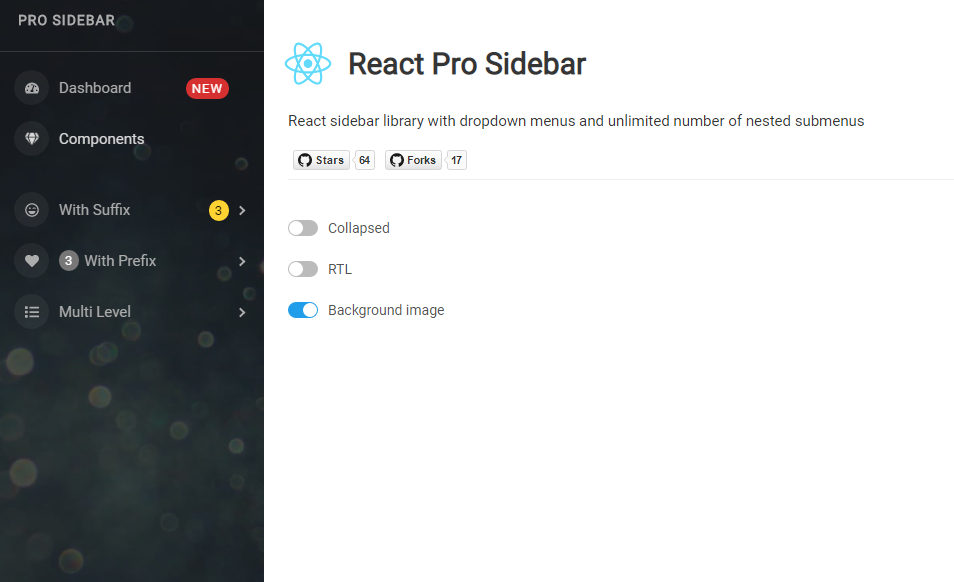
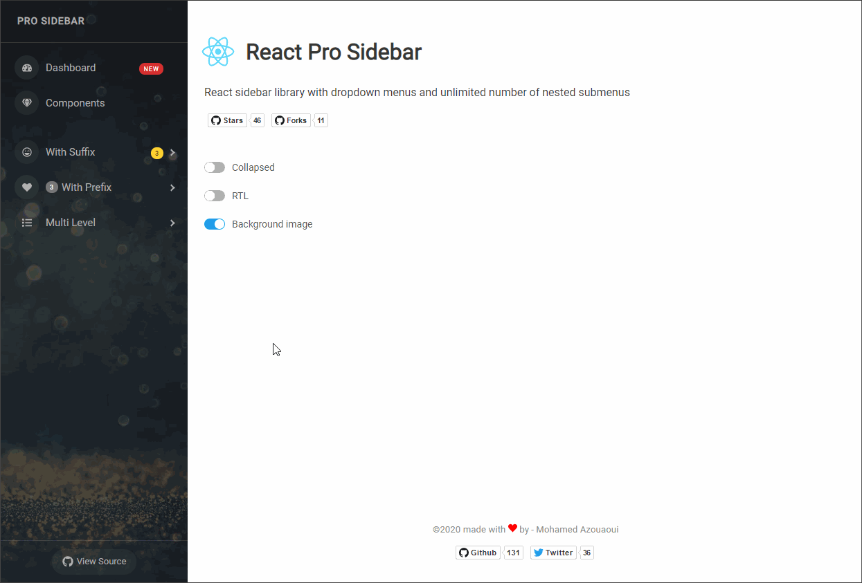
React Pro Sidebar
Customizable and responsive react sidebar library with dropdown menus and unlimited number of nested submenus.
Installation
yarn
yarn add react-pro-sidebar
npm
npm install react-pro-sidebar
Usage
import { ProSidebar, Menu, MenuItem, SubMenu } from 'react-pro-sidebar';
import 'react-pro-sidebar/dist/css/styles.css';

<ProSidebar>
  <Menu iconShape="square">
    <MenuItem icon={<FaGem />}>Dashboard</MenuItem>
    <SubMenu title="Components" icon={<FaHeart />}>
      <MenuItem>Component 1</MenuItem>
      <MenuItem>Component 2</MenuItem>
    </SubMenu>
  </Menu>
</ProSidebar>;
If you are using sass then you can import the styles.scss directly into your scss file
@import '~react-pro-sidebar/dist/scss/styles.scss';
Sidebar Layout
You can take advantage of the sidebar layout components to organize the content of your sidebar
import { ProSidebar, SidebarHeader, SidebarFooter, SidebarContent } from 'react-pro-sidebar';

<ProSidebar>
  <SidebarHeader>
    {/**
     *  You can add a header for the sidebar ex: logo
     */}
  </SidebarHeader>
  <SidebarContent>
    {/**
     *  You can add the content of the sidebar ex: menu, profile details, ...
     */}
  </SidebarContent>
  <SidebarFooter>
    {/**
     *  You can add a footer for the sidebar ex: copyright
     */}
  </SidebarFooter>
</ProSidebar>;
Custom Styling
There are sets of sass variables available which you can override to define your own styles
You need to include your override variables before importing the scss file
Your custom.scss file should look something like this
// Your variable overrides
$sidebar-bg-color: #1d1d1d;

@import '~react-pro-sidebar/dist/scss/styles.scss';
Available scss variables
$sidebar-bg-color: #1d1d1d !default;
$sidebar-color: #adadad !default;
$sidebar-width: 270px !default;
$sidebar-collapsed-width: 80px !default;
$highlight-color: #d8d8d8 !default;
$submenu-bg-color: #2b2b2b !default;
$submenu-bg-color-collapsed: #2b2b2b !default;
$icon-bg-color: #2b2b2b !default;
$icon-size: 35px !default;
$breakpoint-xs: 480px !default;
$breakpoint-sm: 576px !default;
$breakpoint-md: 768px !default;
$breakpoint-lg: 992px !default;
$breakpoint-xl: 1200px !default;
Using nested sub-menus
You can have as many nested menu-items and sub-menus as you like, and the syntax is very simple
<Menu iconShape="square">
  <SubMenu title="Components" icon={<FaGem />}>
    <MenuItem>Component 1</MenuItem>
    <SubMenu title="Sub Component 1" icon={<FaHeart />}>
      {/* you can have more nested submenus ... */}
    </SubMenu>
  </SubMenu>
</Menu>
Using React Router Dom
Here is an example on how to use react router dom in the menu item
import { Link } from 'react-router-dom';

<MenuItem icon={<FaGem />}>
  Dashboard
  <Link to="/" />
</MenuItem>;
API
| Component | Prop | Type | Description | Default |
|---|---|---|---|---|
| ProSidebar | collapsed | boolean | collapsed status of the sidebar | false |
| rtl | boolean | RTL direction | false |
|
| toggled | string | Toggle status of the sidebar when break point is enabled | false |
|
| onToggle | (value:boolean)=>{} |
Callback function called when toggled status changes, happens when overlay is clicked | - | |
| breakPoint | xs | sm | md | lg | xl |
Set break point to specify when the sidebar should be responsive | - | |
| width | number | string | Width of the sidebar | 270px |
|
| image | string | Url of the image to use in the sidebar background | - | |
| Menu | iconShape | 'square' | 'round' | 'circle' |
Shape of the menu icons | - |
| popperArrow | boolean | if true, an arrow will be displayed when sidebar collapsed to point to sub-menu wrapper |
false |
|
| MenuItem | icon | ReactNode | Icon for the menu item | - |
| active | boolean | Set active menu items | false |
|
| prefix | ReactNode | Add a prefix to the menuItem | - | |
| suffix | ReactNode | Add a suffix to the menuItem | - | |
| SubMenu | title | string | ReactNode | Title for the submenu | - |
| icon | ReactNode | Icon for submenu | - | |
| defaultOpen | boolean | Set if the submenu is open by default | false |
|
| open | boolean | Set open value if you want to control the state | - | |
| prefix | ReactNode | Add a prefix to the submenu | - | |
| suffix | ReactNode | Add a suffix to the submenu | - |