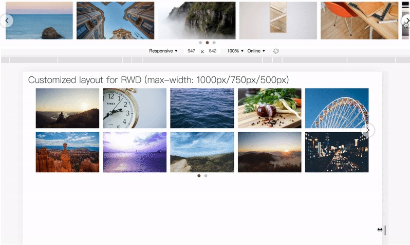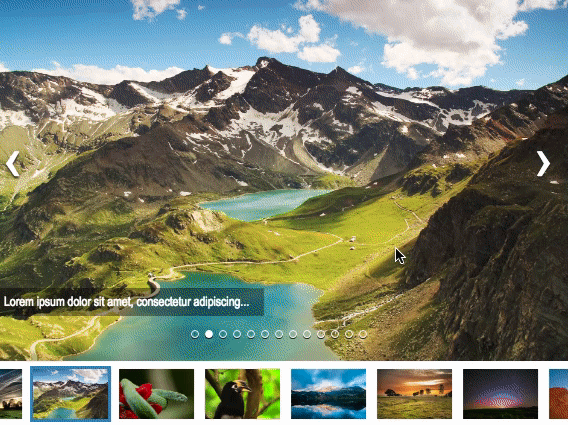
React Carousel Minimal
Easy to use, responsive and customizable carousel component for React Projects.
Installation
npm i react-carousel-minimal
Features
- Responsive
- Customizable
- Infinite loop
- Autoplay with custom duration
- Supports text caption
- Pause autoplay on hold with pause icon and customizations
- Slide number indicators
- Swipe to go to next slide on touch devices
- Custom slide background color
- Thumbnail slide indicators
Usage
import { Carousel } from 'react-carousel-minimal';
function App() {
const data = [
{
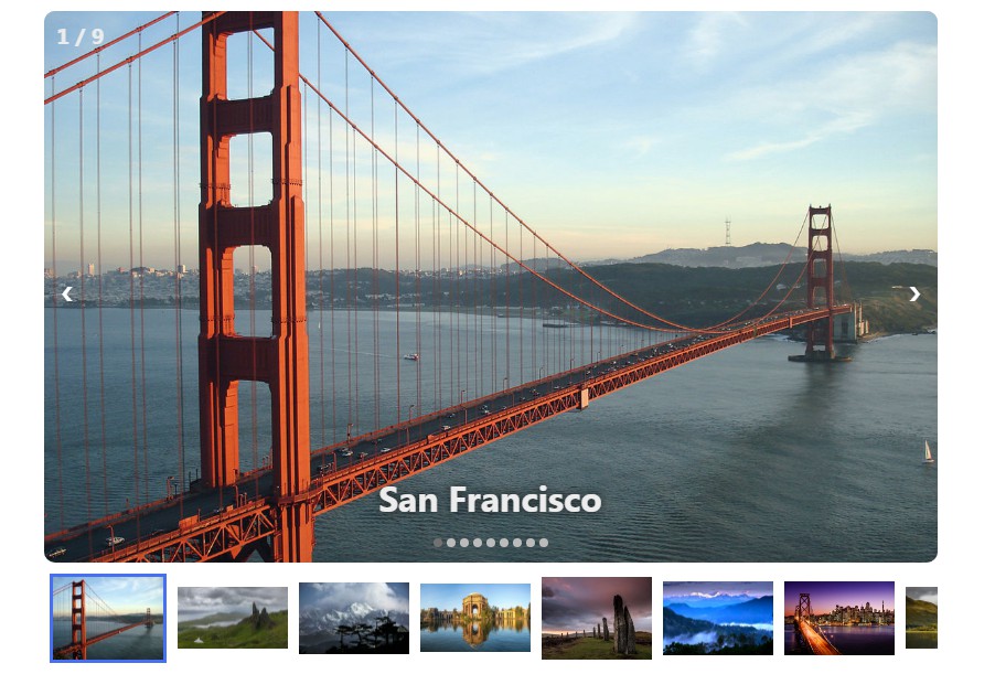
image: "https://upload.wikimedia.org/wikipedia/commons/thumb/0/0c/GoldenGateBridge-001.jpg/1200px-GoldenGateBridge-001.jpg",
caption: "San Francisco"
},
{
image: "https://cdn.britannica.com/s:800x450,c:crop/35/204435-138-2F2B745A/Time-lapse-hyper-lapse-Isle-Skye-Scotland.jpg",
caption: "Scotland"
},
{
image: "https://static2.tripoto.com/media/filter/tst/img/735873/TripDocument/1537686560_1537686557954.jpg",
caption: "Darjeeling"
},
{
image: "https://upload.wikimedia.org/wikipedia/commons/thumb/1/16/Palace_of_Fine_Arts_%2816794p%29.jpg/1200px-Palace_of_Fine_Arts_%2816794p%29.jpg",
caption: "San Francisco"
},
{
image: "https://i.natgeofe.com/n/f7732389-a045-402c-bf39-cb4eda39e786/scotland_travel_4x3.jpg",
caption: "Scotland"
},
{
image: "https://www.tusktravel.com/blog/wp-content/uploads/2020/07/Best-Time-to-Visit-Darjeeling-for-Honeymoon.jpg",
caption: "Darjeeling"
},
{
image: "https://www.omm.com/~/media/images/site/locations/san_francisco_780x520px.ashx",
caption: "San Francisco"
},
{
image: "https://images.ctfassets.net/bth3mlrehms2/6Ypj2Qd3m3jQk6ygmpsNAM/61d2f8cb9f939beed918971b9bc59bcd/Scotland.jpg?w=750&h=422&fl=progressive&q=50&fm=jpg",
caption: "Scotland"
},
{
image: "https://www.oyorooms.com/travel-guide/wp-content/uploads/2019/02/summer-7.jpg",
caption: "Darjeeling"
}
];
const captionStyle = {
fontSize: '2em',
fontWeight: 'bold',
}
const slideNumberStyle = {
fontSize: '20px',
fontWeight: 'bold',
}
return (
<div className="App">
<div style={{ textAlign: "center" }}>
<h2>React Carousel Minimal</h2>
<p>Easy to use, responsive and customizable carousel component for React Projects.</p>
<div style={{
padding: "0 20px"
}}>
<Carousel
data={data}
time={2000}
width="850px"
height="500px"
captionStyle={captionStyle}
radius="10px"
slideNumber={true}
slideNumberStyle={slideNumberStyle}
captionPosition="bottom"
automatic={true}
dots={true}
pauseIconColor="white"
pauseIconSize="40px"
slideBackgroundColor="darkgrey"
slideImageFit="cover"
thumbnails={true}
thumbnailWidth="100px"
style={{
textAlign: "center",
maxWidth: "850px",
maxHeight: "500px",
margin: "40px auto",
}}
/>
</div>
</div>
</div>
);
}
export default App;

Props
| Name | Value | Description |
|---|---|---|
| data | array | Array of carousel items, containg JSON elements of the form { image: IMAGE_PATH, caption: TEXT_CAPTION } |
| automatic | boolean | Enable auto play |
| time | number | Interval in milliseconds after which it autmatically goes to the next slide if automatic is true,defaults to 2000 |
| width | string | Width of the Carousel, eg: 600px |
| height | string | Width of the Carousel, eg: 400px |
| slideNumber | boolean | Enable slide number indicators |
| captionStyle | JSON | React style object for the captions |
| radius | string | Border radius of the slides, eg: 10px |
| slideNumberStyle | JSON | React style object for slide number indicators |
| captionPosition | string | Position of the text captions, available options:top, center, bottom |
| dots | boolean | Enable slide indicator dots |
| pauseIconColor | string | Color of the pause icon, eg: white |
| pauseIconSize | string | size of the pause icon, eg: 40px |
| slideBackgroundColor | string | Sets the slides' background color, eg: darkgrey |
| slideImageFit | string | Sets the object-fit of the slides' image,available options contain and cover |
| thumbnails | boolean | Enables thumbnail indicators |
| thumbnailWidth | string | Width of the thumbnail, defaults to 100px |