React Easy Editables
Editable fields for inline content editing.
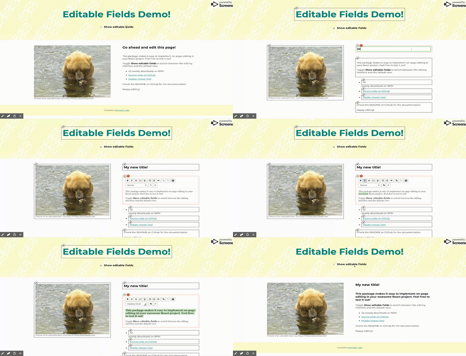
Currently the package includes the following types of editable fields:
| Content type | Editor type |
|---|---|
| Plain text | Text input |
| Paragraph | Rich text editor |
| Number | Number input |
| Image | Image uploader with preview |
| Background Image | Image uploader with preview |
| File | File uploader |
| Link | Text inputs for URL and anchor |
You can also create custom editable areas by using the generic Editable component, as demonstrated further down.
Usage
The EditablesContext uses React's context API to provide the properties showEditingControls and theme to the editable components lower in the tree.
Each of the editable fields receives a content object and an onSave function that defines the content to be displayed/edited and the callback that receives the updated content.
Example
import React from 'react';
import { EditablesContext, theme } from 'react-easy-editables';

import PlainText from 'react-easy-editables';

class App extends React.Component {
  state = {
    showEditingControls: true,
    theme: theme,
    title: { text: "Editable title" },
  }

  handleSave = text => {
    this.setState({ title: { text } })
  }

  render() {
    const { title, ...rest } = this.state;

    return(
      <EditablesContext.Provider value={ {...rest} }>
        <h1>
          <PlainText content={title} onSave={this.handleSave} />
        </h1>
      </EditablesContext.Provider>
    );
  }
}
Theme
You can update the appearance of the editable fields by updating the theme object. These are the defaults:
export const theme = {
  primaryColor: "#FF6C45",
  fontFamily: "sans-serif",
  fontSize: 14,
  editContainer: {
    backgroundColor: "rgba(255,255,255,0.3)",
    border: "1px solid black",
    position: "relative",
    padding: "8px",
  },
  editContainerHighlight: {
    backgroundColor: "rgba(255,255,255,0.9)",
    border: "1px solid #FF6C45",
    zIndex: "2500",
  },
  actions: {
    position: "absolute",
    left: "4px",
    top: "-10px",
    display: "flex",
    alignItems: "center",
    zIndex: "99",
  },
  button: {
    border: "1px solid #000",
    color: "black",
    backgroundColor: "#fff",
    height: "18px",
    width: "18px",
    borderRadius: "30px",
    cursor: "pointer",
    display: "flex",
    justifyContent: "center",
    alignItems: "center",
    marginRight: "4px",
    "&:hover": {
      backgroundColor: "grey"
    }
  },
  saveButton: {
    backgroundColor: "#FF6C45",
  },
  cancelButton: {
    backgroundColor: "#FF6C45",
  },
  icon: {
    fontSize: "14px"
  }
};
Custom editable fields
You can create custom editable fields by using the generic Editable component. The Editable component does the following:
- reads from
contextwhether or not to show the editing controls - renders the content wrapped in the editing controls or just the content according to the
showEditingControlsproperty on thecontext - toggles the
isEditingstate which then renders the editor component - passes a content object to the editor component
- passes the updated content object from the editor component back to the parent component when the save button is clicked
Example
import React from "react";
import Editable from "./Editable";
import PlainTextEditor from "react-easy-editables";

const EditableFeatureCard = props => {
  const handleSave = field => newContent => {
    props.updateContent(field, newContent);
  };

  const { content } = props;

  return (
    <div className="col-md-3 col-sm-12 service-sub text-center">
      <i className="icon-tools  icon-extra-large fast-yellow-text margin-seven no-margin-lr no-margin-top"></i>
      <span className="text-medium font-weight-600 letter-spacing-2 text-uppercase black-text margin-one no-margin-lr no-margin-top display-block alt-font">
        <Editable
          editor={PlainTextEditor}
          content={{ text: content.header }}
          handleSave={ handleSave("header") }
        >
          {content.header}
        </Editable>
      </span>

      <Editable
        editor={PlainTextEditor}
        content={{ text: content.description }}
        handleSave={ handleSave("description") }
      >
        <p className="text-medium width-80 center-col">{content.description}</p>
      </Editable>
    </div>
  );
};

export default EditableFeatureCard;
Component API
EditableText
import { EditableText } from "react-easy-editables"
Props
| Name | Type | Description |
|---|---|---|
content |
object (required) | The content to be displayed or edited, in the shape { text: string } |
onSave |
func (required) | Callback function when editor is saved, receives the content object as the only argument |
onDelete |
func | Callback function when editable field is deleted. The delete button only renders if this prop is present. |
classes |
string | String to be applied as the className property on the text and input. |
EditorProps |
object | Props to be passed to the PlainTextEditor component that is rendered in editing mode. |
EditableTextArea
import { EditableTextArea } from "react-easy-editables"
Props
| Name | Type | Description |
|---|---|---|
content |
object (required) | The content to be displayed or edited, in the shape { text: string }. The string can include newline /n characters. |
onSave |
func (required) | Callback function when editor is saved, receives the content object as the only argument |
onDelete |
func | Callback function when editable field is deleted. The delete button only renders if this prop is present. |
classes |
string | String to be applied as the className property on the text and input. |
EditorProps |
object | Props to be passed to the TextAreaEditor component that is rendered in editing mode, ex. rows, cols, etc. |
EditableParagraph
import { EditableParagraph } from "react-easy-editables"
Props
| Name | Type | Description |
|---|---|---|
content |
object (required) | The content to be displayed or edited, in the shape { text: string }. The string can be HTML. |
onSave |
func (required) | Callback function when editor is saved, receives the content object as the only argument |
onDelete |
func | Callback function when editable field is deleted. The delete button only renders if this prop is present. |
classes |
string | String to be applied as the className property on the text and input. |
EditorProps |
object | Props to be passed to the RichTextEditor component that is rendered in editing mode. Under the hood it's the RichTextEditor from react-rte so check the documentation to see which additional props you can use. |
EditableNumber
import { EditableNumber } from "react-easy-editables"
Props
| Name | Type | Description |
|---|---|---|
content |
object (required) | The content to be displayed or edited, in the shape { text: number } |
onSave |
func (required) | Callback function when editor is saved, receives the content object as the only argument |
onDelete |
func | Callback function when editable field is deleted. The delete button only renders if this prop is present. |
classes |
string | String to be applied as the className property on the text and input. |
EditorProps |
object | Props to be passed to the NumberEditor component that is rendered in editing mode. |
EditableLink
import { EditableLink } from "react-easy-editables"
Props
| Name | Type | Description |
|---|---|---|
content |
object (required) | The content to be displayed or edited, in the shape { anchor: string, link: string } |
onSave |
func (required) | Callback function when editor is saved, receives the content object as the only argument |
onDelete |
func | Callback function when editable field is deleted. The delete button only renders if this prop is present. |
classes |
string | String to be applied as the className property on the link and editor component. |
EditorProps |
object | Props to be passed to the LinkEditor component that is rendered in editing mode. Since the editor has two inputs for the anchor text and the url, you can define props for each input via the EditorProps object. i.e. { anchor: object, link: object } |
EditableImageUpload
import { EditableImageUpload } from "react-easy-editables"
Props
| Name | Type | Description |
|---|---|---|
content |
object (required) | The content to be displayed or edited, in the shape { anchor: string, link: string } |
onSave |
func (required) | Callback function when editor is saved, receives the content object as the only argument |
onDelete |
func | Callback function when editable field is deleted. The delete button only renders if this prop is present. |
showCaption |
bool | Displays caption below image and enables caption editor if true |
maxSize |
number | Maximum size allowed for the uploaded image, in bytes. The default is 2097152, or 2MB. |
styles |
object | Styles to be applied to the image container and the image itself, i.e { container: {}, image: {} |
classes |
string | String to be applied as the className property on the image and editor components. |
EditorProps |
object | Props to be passed to the ImageUploadEditor component that is rendered in editing mode. Since the editor has two inputs for the image upload and the caption, you can define props for each input via the EditorProps object. i.e. { image: object, caption: object } |
EditableFileUpload
import { EditableFileUpload } from "react-easy-editables"
Props
| Name | Type | Description |
|---|---|---|
content |
object (required) | The content to be displayed or edited, in the shape { anchor: string, link: string } |
onSave |
func (required) | Callback function when editor is saved, receives the content object as the only argument |
onDelete |
func | Callback function when editable field is deleted. The delete button only renders if this prop is present. |
maxSize |
number | Maximum size allowed for the uploaded file, in bytes. The default is 2097152, or 2MB. |
classes |
string | String to be applied as the className property on the file and editor components. |
EditorProps |
object | Props to be passed to the FileUploadEditor component that is rendered in editing mode. |
EditableBackgroundImage
import { EditableBackgroundImage } from "react-easy-editables"
Props
| Name | Type | Description |
|---|---|---|
content |
object (required) | The content to be displayed or edited, in the shape { anchor: string, link: string } |
onSave |
func (required) | Callback function when editor is saved, receives the content object as the only argument |
onDelete |
func | Callback function when editable field is deleted. The delete button only renders if this prop is present. |
maxSize |
number | Maximum size allowed for the uploaded file, in bytes. The default is 2097152, or 2MB. |
classes |
string | String to be applied as the className property on the image and editor components. |
styles |
object | Styles to be applied to the image |
EditorProps |
object | Props to be passed to the ImageUploadEditor component that is rendered in editing mode, i.e. { image: object } |
Editable
The generic Editable component allows you to create custom editable fields. It renders the EditorWrapper when the showEditingControls is true, and its children otherwise. The EditorWrapper shows the editor controls, and when the "edit" button is clicked it renders the editor component passed in through the Editor prop.
import { Editable } from "react-easy-editables"
Props
| Name | Type | Description |
|---|---|---|
Editor |
component (required) | The editor component to be rendered when editing mode is toggled |
content |
object (required) | The content to be displayed or edited |
handleSave |
func (required) | Callback function when editor is saved, receives the content object as the only argument |
children |
node (required) | Children to be rendered within the component |
EditorProps |
number | Props to be passed to the editor component |
onDelete |
func | Callback function when editable field is deleted. The delete button only renders if this prop is present. |
classes |
string | String to be applied as the className property on the editor components. |
fullWidth |
bool | When true, the editor wrapper takes up the full width of its container and editing controls are moved within the wrapper. |
disableDelete |
bool | When true, the delete button is removed, even if the onDelete function is present |
isContentClickTarget |
bool | Should the element itself be a click target to start editing - defaults to true. When false, the edit button must be clicked to start editing. |
