JSXFields
JSXFields is a library for creating form field elements in React with a function call instead of writing raw JSX. This is useful in a setting where you want to generate forms dynamically according to user input such as with a form building application like Wufoo.
JSXFields uses form field generating functions to generate an HTML (specifically JSX) form element, for use either when creating a form to show a preview of the form you are building as you work, editing a form to load back in the form data and reconstruct the preview, or when simply viewing a form.
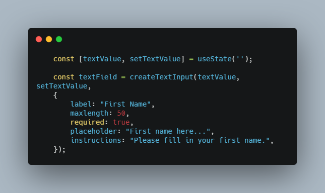
To use the functions, you call the appropriate function for the type you want to build, and provide a state variable and state setting callback to manage the input value. If you wish to have any control over the details of the field, such as its label, whether it is required, or a placeholder, you can pass in an options object as a third argument to the function. A simple example would look like this:
	const [textValue, setTextValue] = useState('');

	const textField = createTextInput(textValue, setTextValue,
	{
		label: "First Name",
		maxlength: 50,
		required: true,
		placeholder: "First name here...",
		instructions: "Please fill in your first name.",
	});
This call would create a simple single line text input field and label with the options specified, and return the JSX that represents it. Combining together these kinds of function calls enable you to build full forms from JS function calls.
Available Methods
JSXFields defines 6 form field generator functions for different input types. To create the appropriate input type, call the corresponding function.
All methods require at least two parameters, a state and a state setter. Additional arguments are given as object key value pairs that can change or add to the field, for example to make the field label appear on the left instead the default top:
createTextInput(inputValue, setInputValue, { labelPlacement: “left”, <insertAdditionalArgsHere> })
createTextInput()
Create a single line text input, this uses the same input type as html input elements with type “text”.
Example:
createTextInput(inputValue, setInputValue)
createMultiLineText()
Creates a multi-line text input, this uses the textarea html element.
Example:
createMultiLineText(multiLineTextValue, setMultiLineTextValue)
createSelectField()
Creates a select dropdown field, this uses the select html element.
In order to get the choices you want to be shown, you have to use the choices object key otherwise the default of [“First Choice”, “Second Choice”, “Third Choice”] will be used.
Example:
createSelectField(selectFieldValue, setSelectFieldValue, {
	 choices: [“Seattle, WA”, “Portland, OR”, “Los Angeles, CA”, “Chicago, IL”],
 instructions: “Please select a city.“.
})
createMultipleChoice()
Creates a multiple choice field, this uses the same input type as the html element with the type of radio.
In order to get the choices you want to be shown, you have to use the choices object key otherwise the default of [“First Choice”, “Second Choice”, “Third Choice”] will be used.
Example:
createMultipleChoice(multipleChoiceValue, setMultipleChoiceValue, {
	choices: [“Yes”, “No”, “Maybe”, “I don’t know”]
})
createCheckboxField()
Creates a checkbox field, this uses the same input type as the html element with the type of checkbox.
In order to get the choices you want to be shown, you have to use the choices object key otherwise the default of [“First Choice”, “Second Choice”, “Third Choice”] will be used.
Example:
createCheckboxField(checkboxFieldValue, setCheckboxFieldValue, {
	choices: [“Dogs”, “Cats”, “Hamsters”, “Ferrets”, “Fish”, “Turtles”]
})
createNumericInput()
Creates a numeric input field, this uses the same input type as the html element with the type of number.
Example:
createNumericInput(numericInputValue, setNumericInputValue)
The Options Object
The options object is the optional third argument that you can give to any of the generator functions to determine how the field is created. If you do not pass an options object or only pass a portion of the possible options, the default options will be used with any user specified keys overwriting the defaults. An overview of possible keys and default values is given below:
const options  = {
	label:  "Untitled",
	maxLength:  255, // Used with text inputs to determine a maximum number of characters
	required:  false,
	size:  "m", // Used with text inputs to determine their width
	placeholder:  "",
	instructions:  "", // If not empty creates a blurb of grey text to the right of the field
	labelPlacement:  "top",
	preStyled:  true, // Enables or disables some default styles given to fields
	choices: ['First Choice', 'Second Choice', 'Third Choice'], // Used to determine the available options with selects, multiple choices, and checkboxes.
	name:  "name", // Used with multiple choice fields to make only one selectable
	min:  0, // Used with numeric fields to set the minimum value
	max:  99, // Used with numeric fields to set the maximum value
};