react-editext
Editable Text Component for React Applications.
Install
npm install --save react-editext
Or with yarn:
yarn add react-editext
Usage
EdiText is highly customizable. You can see more examples here. Here is a basic usage:
import React, { Component } from 'react'
import EdiText from 'react-editext'
class Example extends Component {
onSave = val => {
console.log('Edited Value -> ', val)
}
render () {
return (
<div className="container">
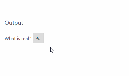
<EdiText
type="text"
value='What is real? How do you define real?'
onSave={this.onSave}
/>
</div>
)
}
}
You can customize almost everything based on your needs. Please navigate to Props section. I mean, just scroll down.
Props
| Prop | Type | Required | Default | Note |
|---|---|---|---|---|
| value | string | Yes | '' |
Value of the content and input [in edit mode] |
| type | string | Yes | text | Input type. Possible options are: text, number, email, textarea, date, datetime-local, time, month, url, week, tel |
| hint | node | No | '' |
A simple hint message appears at the bottom of input element. Any valid element is allowed. |
| onSave | function | Yes | Function will be called when save button clicked. value is passed to cb. |
|
| inputProps | object | No | Props to be passed to input element. Any kind of valid DOM attributes are welcome. | |
| viewProps | object | No | Props to be passed to div element that shows the text. You can specify your own styles or className |
|
| validation | function | No | Pass your own validation function. takes one param -> value. It must return true or false |
|
| validationMessage | node | No | Invalid Value | If validation fails this message will appear |
| onValidationFail | function | No | Pass your own function to track when validation failed. See Examples page for the usage. | |
| onCancel | function | No | Function will be called when editing is cancelled. | |
| saveButtonContent | node | No | '' |
Content for save button. Any valid element is allowed. Default is: ✓ |
| cancelButtonContent | node | No | '' |
Content for cancel button. Any valid element is allowed. Default is: ✕ |
| editButtonContent | node | No | '' |
Content for edit button. Any valid element is allowed. Default is: ✎ |
| saveButtonClassName | string | No | Custom class name for save button. | |
| cancelButtonClassName | string | No | Custom class name for cancel button. | |
| editButtonClassName | string | No | Custom class name for edit button. | |
| viewContainerClassName | string | No | Custom class name for the container in view mode.See here |
|
| editContainerClassName | string | No | Custom class name for the container in edit mode. Will be set to viewContainerClassName if you set it and omit this. See here |
|
| mainContainerClassName | string | No | Custom class name for the top-level main container. See here | |
| hideIcons | bool | No | false |
Set it to true if you don't want to see default icons on action buttons. See Examples page for more details. |
| buttonsAlign | string | No | after |
Set this to before if you want to locate action buttons before the input instead of after it. See here. |
| editOnViewClick | bool | No | false |
Set it to true if you want clicking on the view to activate the editor. |
| editing | bool | No | false |
Set it to true if you want the view state to be edit mode. |
| onEditingStart | function | No | Function that will be called when the editing mode is active. See here |