React Selection Highlighter
A React component for highlighting text selections within text and HTML content. This package not only facilitates highlighting but also offers the ability to save selections to a database, allowing for reconstruction of highlights and popovers at a later stage.
Installation
You can install the package via npm:
npm install react-selection-highlighter
Quick Start
To quickly get started with React Selection Highlighter, follow these steps:
-
Install the package via npm:
npm install react-selection-highlighter -
Import the necessary components into your React application:
import React from 'react' import { Highlighter, SelectionProvider } from 'react-selection-highlighter' -
Define the text or HTML content you want to highlight:
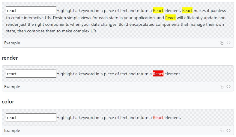
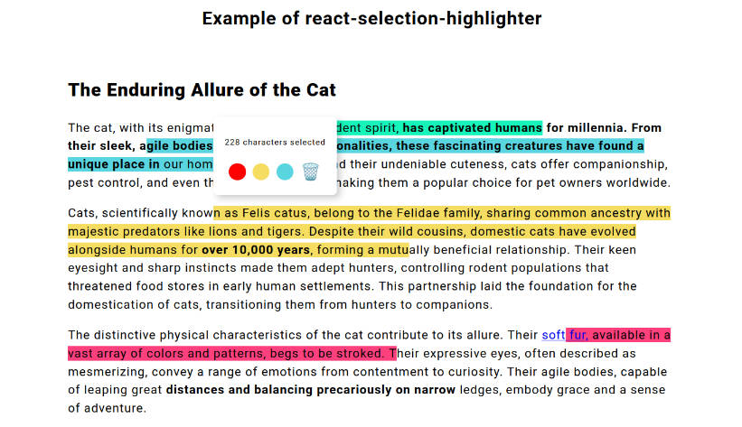
const text = `<h2 style="text-align: start" data-pm-slice="1 1 []"><strong>The Enduring Allure of the Cat</strong></h2><p style="text-align: start">The cat, with its enigmatic gaze and independent spirit, <strong>has captivated humans for millennia. From their sleek, agile bodies to their playful personalities, these fascinating creatures have found a unique place in</strong> our homes and hearts. Beyond their undeniable cuteness, cats offer companionship, pest control, and even therapeutic benefits, making them a popular choice for pet owners worldwide.</p><p style="text-align: start">Cats, scientifically known as Felis catus, belong to the Felidae family, sharing common ancestry with majestic predators like lions and tigers. Despite their wild cousins, domestic cats have evolved alongside humans for <strong>over 10,000 years</strong>, forming a mutually beneficial relationship. Their keen eyesight and sharp instincts made them adept hunters, controlling rodent populations that threatened food stores in early human settlements. This partnership laid the foundation for the domestication of cats, transitioning them from hunters to companions.</p><p style="text-align: start">The distinctive physical characteristics of the cat contribute to its allure. Their <a target="_blank" rel="noopener noreferrer nofollow" href="https://en.wikipedia.org/wiki/Cat">soft fur,</a> available in a vast array of colors and patterns, begs to be stroked. Their expressive eyes, often described as mesmerizing, convey a range of emotions from contentment to curiosity. Their agile bodies, capable of leaping great <strong>distances and balancing precariously on narrow</strong> ledges, embody grace and a sense of adventure.</p>` -
Add default classnames to your css file. If you are providing your own classes make sure you have styles for those classes.
.relative { position: relative; } .body { background-color: black; } .bg-lightgreen { background-color: #15f5ba; } .bg-red { background-color: #ff407d; } .select-none { user-select: none; } .bg-yellow { background-color: #f5dd61; } .bg-blue { background-color: #59d5e0; } -
Implement the
Highlightercomponent within aSelectionProvider:const SimpleHighlighter = () => { return ( <SelectionProvider> <Highlighter htmlString={text} /> </SelectionProvider> ) } export default SimpleHighlighter
Props
| Prop | Default Value | Required | Description |
|---|---|---|---|
htmlString |
true | The HTML content as a string. | |
minSelectionLength |
10 | Minimum length of the text selection required for highlighting. | |
maxSelectionLength |
Maximum length of the text selection allowed for highlighting. | ||
className |
Additional class name for the root div element. | ||
PopoverChildren |
Default popover component | Custom component to render inside the popover. | |
PopoverClassName |
Class name for the popover element. | ||
selectionWrapperClassName |
bg-lightgreen select-none relative |
Class name for the selection wrapper element. | |
disablePopover |
false |
Boolean flag to disable the popover functionality. | |
onClickHighlight |
Function to handle click events on highlighted text. | ||
onClick |
Function to handle click events on the root div element. |
Customization
You have the flexibility to fully customize the appearance and behavior of the Highlighter component by passing additional props.
For instance, to customize the highlighting behavior and appearance, you can provide props such as minSelectionLength, maxSelectionLength, PopoverClassName, PopoverChildren, and disablePopover.It's important to note that when providing a custom class name, all default class names for respective elements will be removed.
useSelections Hook
The useSelections custom hook provides powerful functionality for managing selections within your React application. This hook is designed to streamline the process of handling text selections, allowing you to easily(selection is added automatically when user selects content) update, and remove selections, as well as access the current list of selections.
For example, you can dynamically update the className of specific selections using this hook. Additionally, you have the flexibility to store selections locally using browser storage mechanisms or persist them to a backend server for long-term storage and retrieval.
const { removeSelection, selections, setSelections, updateSelection } = useSelections()