Hamburger-Menu-React-JS
In this project, let's build a Hamburger Menu app by applying the concepts we have learned till now.
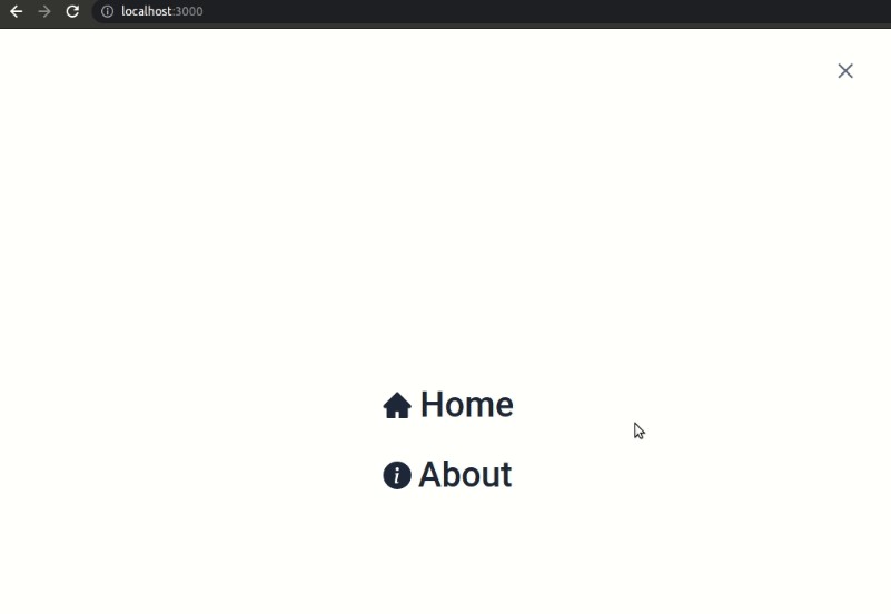
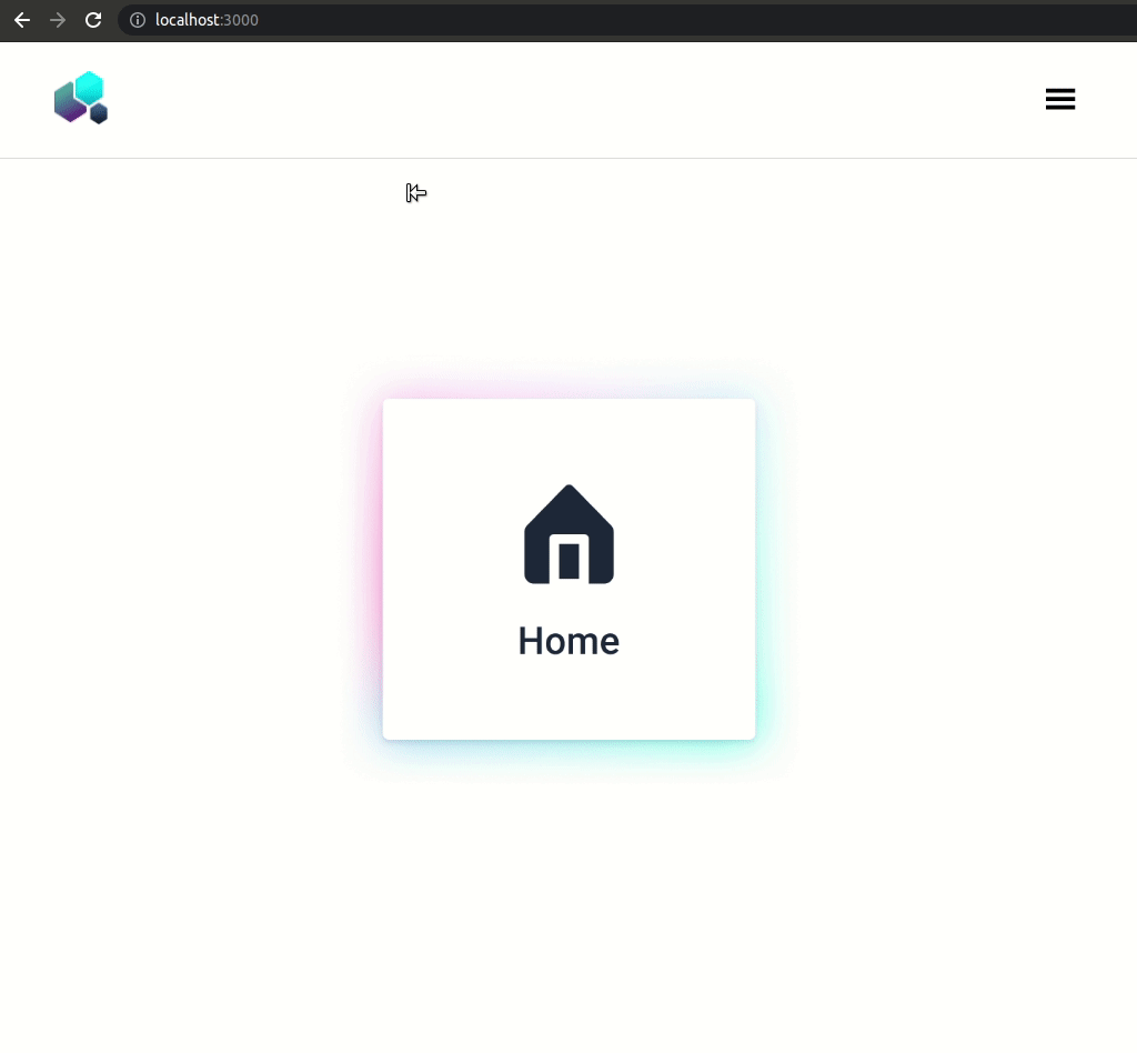
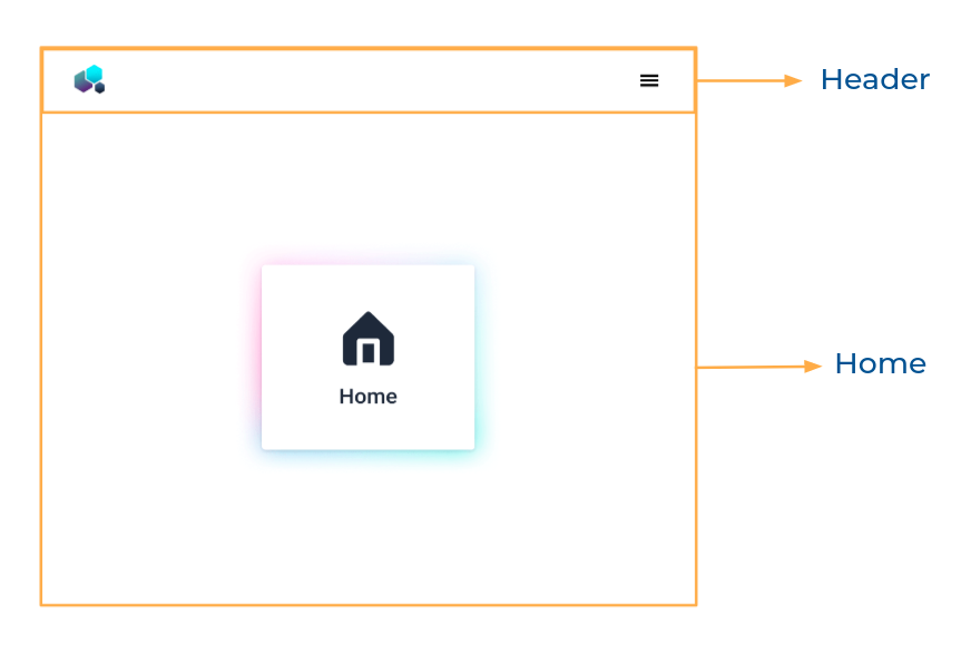
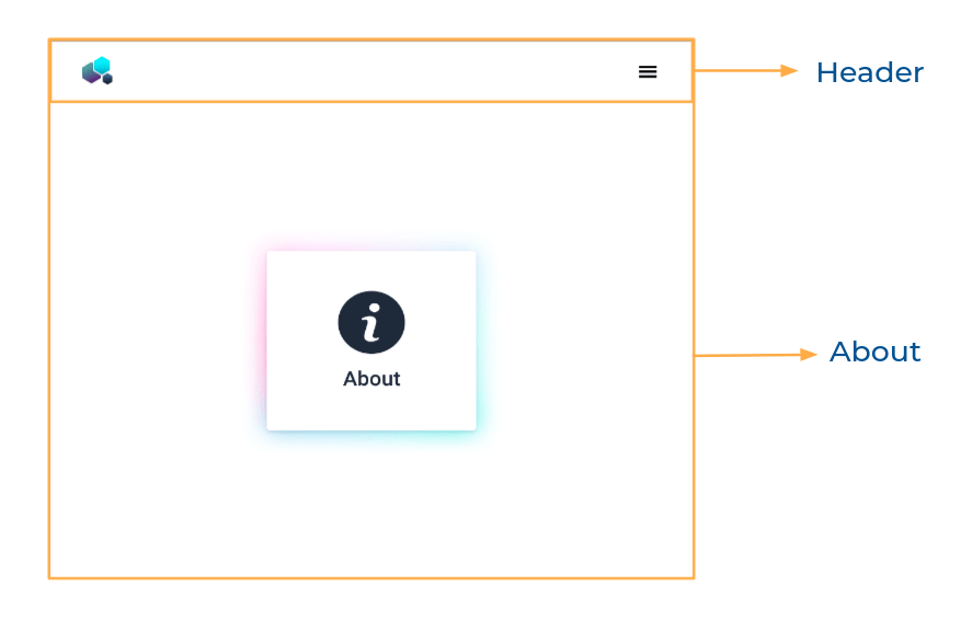
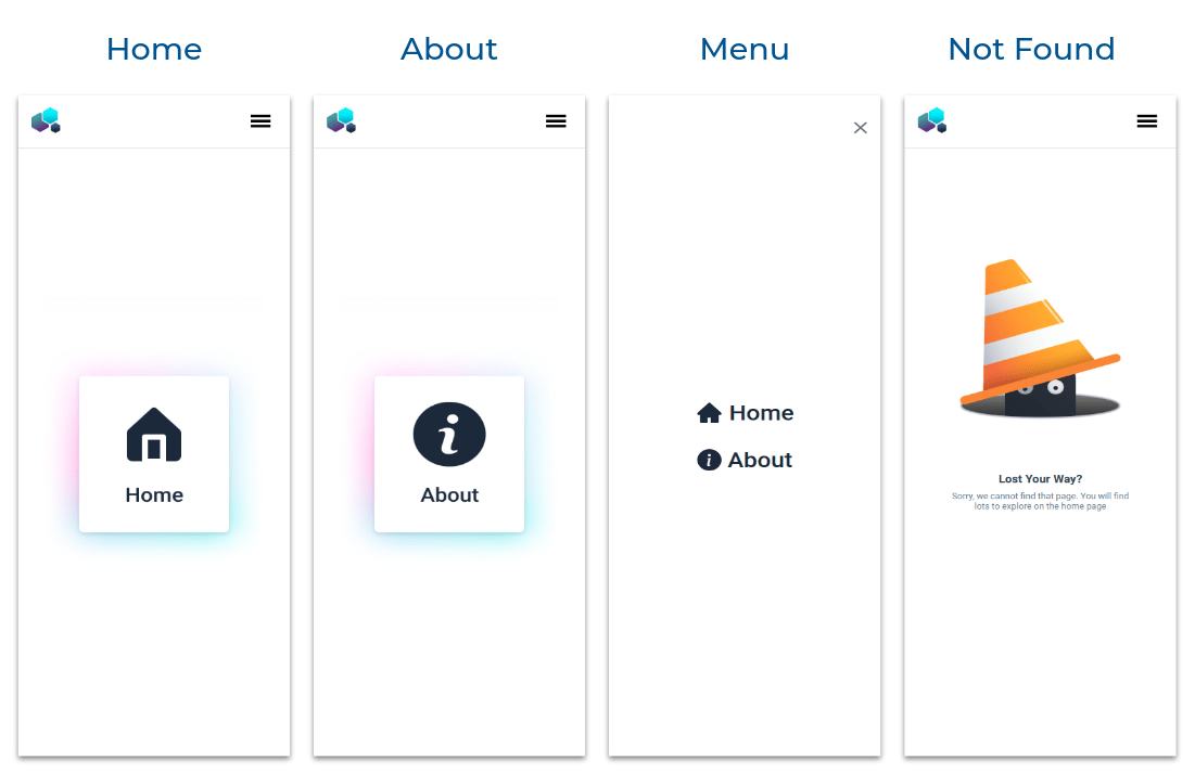
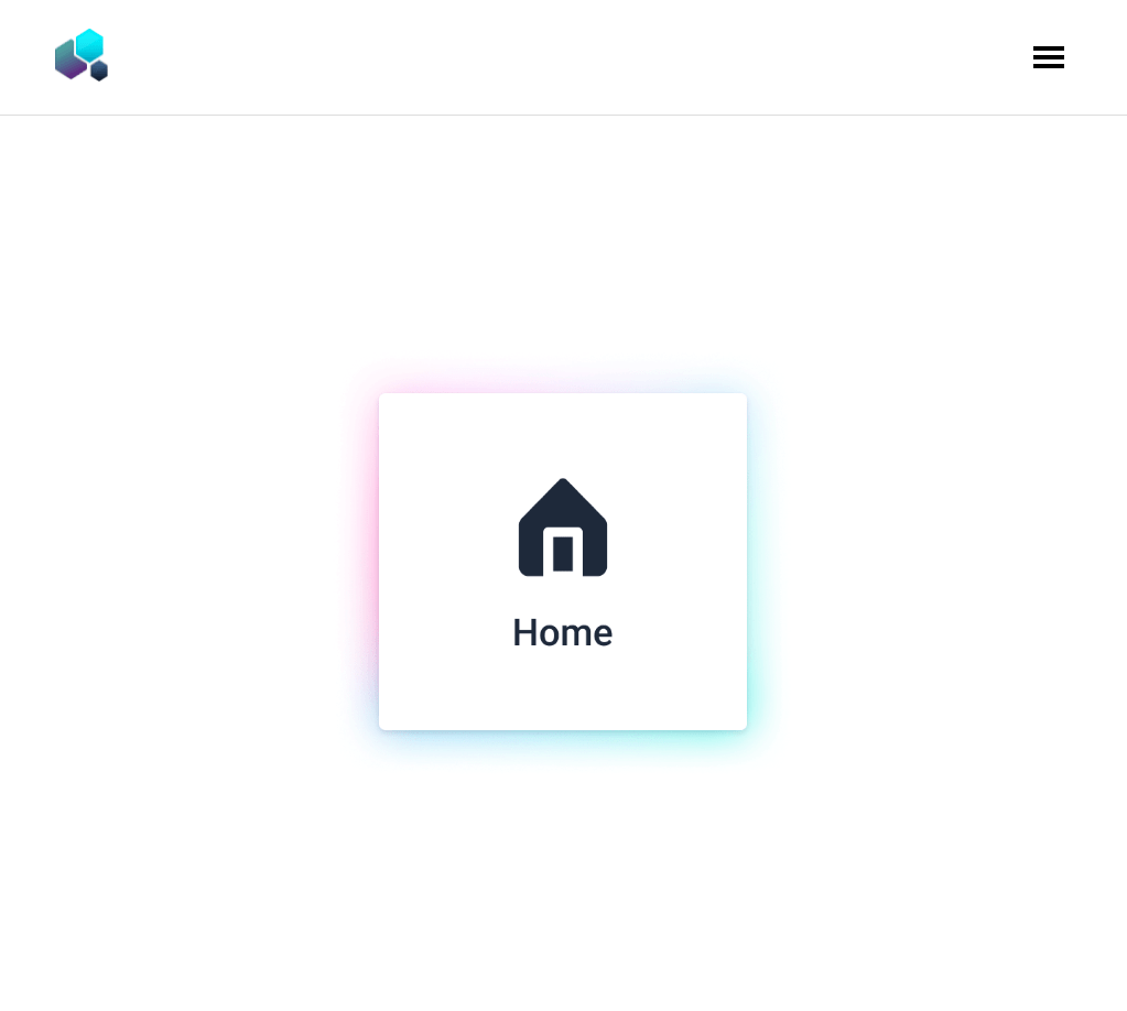
Refer to the image below:
Design Files
Click to view
- Extra Small (Size < 576px) and Small (Size >= 576px)
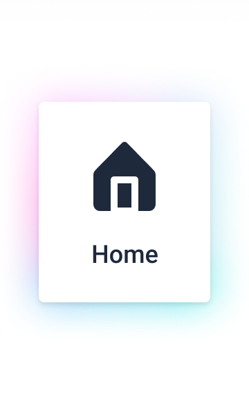
- Medium (Size >= 768px), Large (Size >= 992px) and Extra Large (Size >= 1200px) - Home
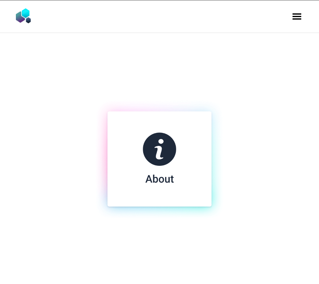
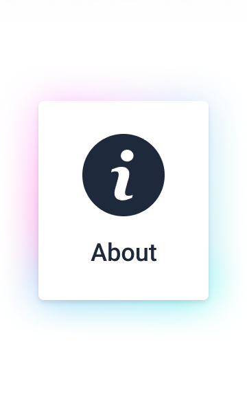
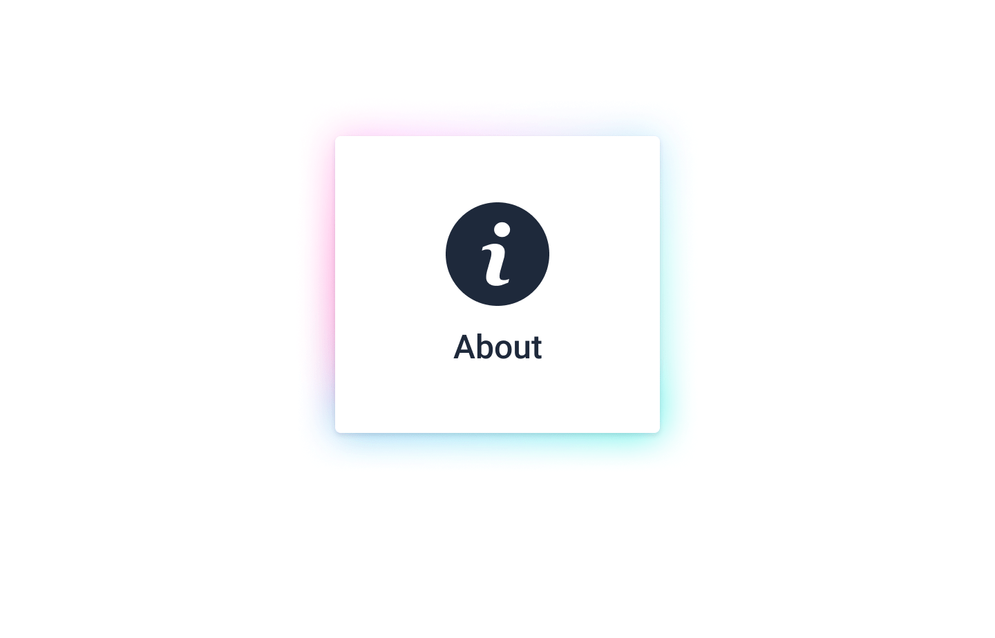
- Medium (Size >= 768px), Large (Size >= 992px) and Extra Large (Size >= 1200px) - About
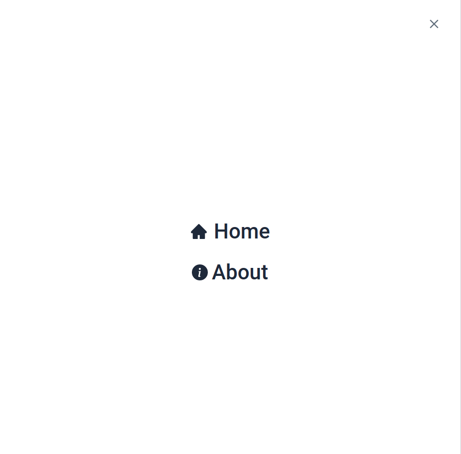
- Medium (Size >= 768px), Large (Size >= 992px) and Extra Large (Size >= 1200px) - Menu
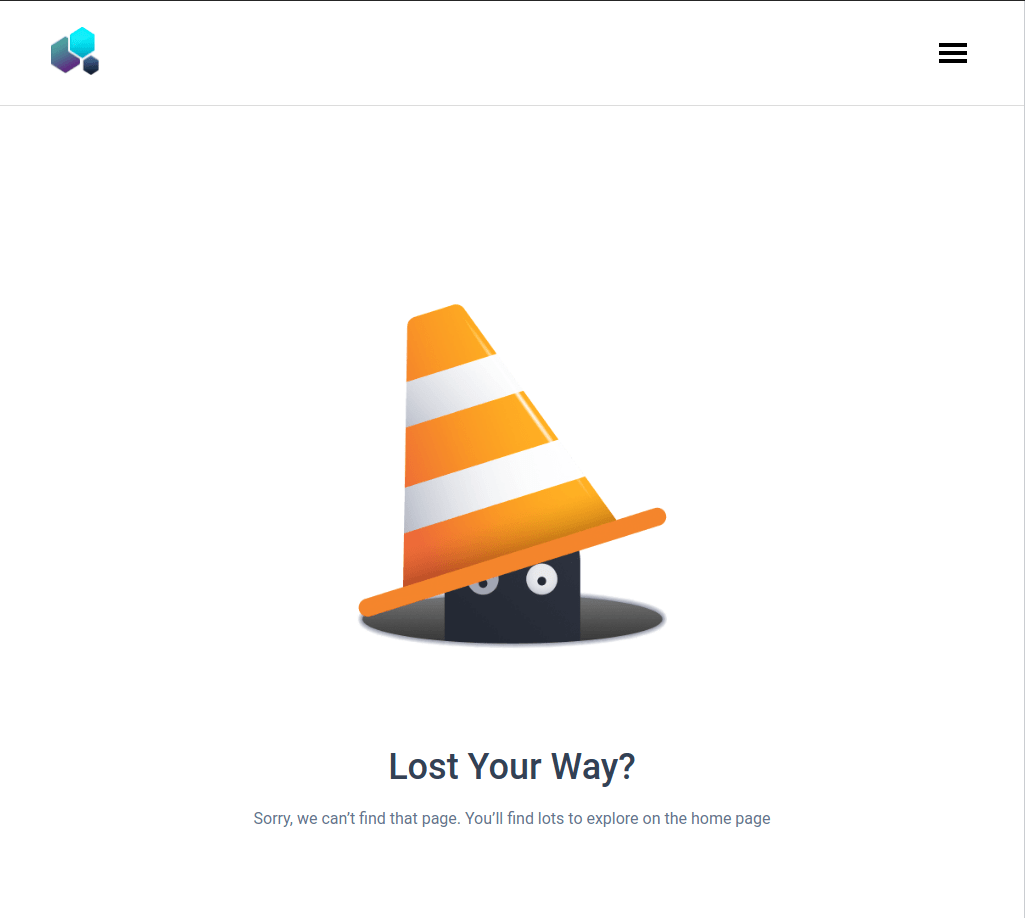
- Medium (Size >= 768px), Large (Size >= 992px) and Extra Large (Size >= 1200px) - Not Found
Set Up Instructions
Click to view
- Download dependencies by running
npm install - Start up the app using
npm start
Completion Instructions
Functionality to be added
The app must have the following functionalities
- Initially, the Home Route should be displayed
- When hamburger icon button in the header is clicked, then the popup should be opened
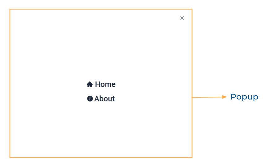
- When the Home is clicked, then the page should be navigated to the Home Route
- When the About is clicked, then the page should be navigated to the About Route
- When the close button is clicked, then the popup should be closed
- When the website logo in the Header is clicked, then the page should be navigated to the Home Route
Components Structure
Implementation Files
Use these files to complete the implementation:
src/App.jssrc/components/Header/index.jssrc/components/Header/styledComponents.jssrc/components/Header/index.csssrc/components/Home/index.jssrc/components/Home/styledComponents.jssrc/components/About/index.jssrc/components/About/styledComponents.jssrc/components/NotFound/index.jssrc/components/NotFound/styledComponents.js
Quick Tips
Click to view
To build this project, take a look at the React Popup reading material
- To style popup content use
.popup-contentclass
<Popup
  modal
  trigger={
    //write code here
  }
  className="popup-content"
>
  //write code here
</Popup>
Important Note
Click to view
The following instructions are required for the tests to pass
HomeRoute should consist of/in the URL pathAboutRoute should consist of/aboutin the URL path- No need to use the
BrowserRouterinApp.jsas we have already included inindex.js - Styled Components should be used for styling purposes
- The hamburger icon button should have the
data-testidas hamburgerIconButton - The close button in the popup should have the
data-testidas closeButton - Roboto should be applied as
font-familyfor Home and About links in Popup GiHamburgerMenufrom react-icons should be used for Hamburger Icon in the HeaderIoMdClosefrom react-icons should be used for Close Icon in the PopupAiFillHomefrom react-icons should be used for Home Icon in the PopupBsInfoCircleFillfrom react-icons should be used for About Icon in the Popup
Resources
Image URLs
- https://assets.ccbp.in/frontend/react-js/hamburger-menu-website-logo.png alt should be website logo
- https://assets.ccbp.in/frontend/react-js/home-sm-img.png alt should be home
- https://assets.ccbp.in/frontend/react-js/home-lg-img.png alt should be home
- https://assets.ccbp.in/frontend/react-js/about-sm-img.png alt should be about
- https://assets.ccbp.in/frontend/react-js/about-lg-img.png alt should be about
- https://assets.ccbp.in/frontend/react-js/not-found-img.png alt should be not found
Colors
Hex: #dcdcdc
Hex: #ffffff
Hex: #616e7c
Font-families
- Roboto
Things to Keep in Mind
- All components you implement should go in the
src/componentsdirectory.- Don't change the component folder names as those are the files being imported into the tests.
- Do not remove the pre-filled code
- Want to quickly review some of the concepts you’ve been learning? Take a look at the Cheat Sheets.