calendar-blocks
Flexible, customizable React calendar / date-picker primitives.
- Compose your own Calendar UI easily with keyboard navigation
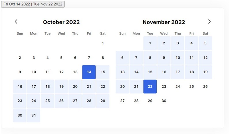
- Supports single-date and range selection
- Exposes internal state via context (write your own controls!)
- Highly in-depth attributes for full styling control
A low-level library
Let’s get off on the right foot – this isn’t an out-of-the-box date picker. The functionality works with very little code, but it won’t look pretty! On the flip side, since there’s few assumptions about rendering, you’ve got full control. You don’t even have to make it a grid if you don’t want to.
So I can show you some ‘basic’ example code like this:
const DatePicker = () => {
  // which month / year are we looking at?
  const [{ month, year }, setViewInfo] = useState<{
    month: number;
    year: number;
  }>({
    month: now.getMonth(),
    year: now.getFullYear(),
  });
  // what date is selected?
  const [value, setValue] = useState<Date | null>(null);
  // what days should we render?
  const days = useCalendarDayGrid(month, year);

  return (
    // the calendar manages selection state and reports changes
    <Calendar
      displayMonth={month}
      displayYear={year}
      value={value}
      onChange={setValue}
      onDisplayChange={setViewInfo}
    >
      {/* we render the days ourselves, some will be null (see docs) */}
      {days.map((date) =>
        date ? (
          <StyledDay value={date} key={date.toISOString()} />
        ) : (
          <CalendarEmptyDay />
        )
      )}
    </Calendar>
  );
};
But you should know this won’t look like a calendar. It’ll just be a list of buttons for each day in the month!
But it’s also not hard to make a grid in modern CSS. For inspiration, check out the Storybook examples.
Display state vs. selection state
This library separates state into ‘display’ and ‘selection.’ Display state is what determines which days the user sees. Selection state tracks the date or range of date’s they’ve selected. If you’re using this as a date picker, selection state is your value/onChange equivalent – but you still need to track display state.
There’s not a whole lot to it though. Display state is month and year – and selection state is value. Those are the 3 values you need to track.
Day element attributes
The CalendarDay component applies all kinds of data attributes to the rendered button, so you can do some heavy style customization.
Here’s a list:
data-selected: whether the day is selecteddata-highlighted: whether the user is highlighting the day (via focus or hover)data-today: whether the day is todaydata-date-number: The visual date number (1-31)data-day-number: The day of the week as an index (0-6)data-day-first: If this is the first day of the monthdata-day-last: If this is the last day of the monthdata-top-row: If this day is in the first row on the calendar griddata-bottom-row: If this day is in the last row on the calendar griddata-first-column: If this day is in the first column on the calendar griddata-last-column: If this day is in the last column on the calendar griddata-first-week: If this day is in the first week of the monthdata-last-week: If this day is in the last week of the monthdata-range-start: If this day is the start of a range selectiondata-range-end: If this day is the end of a range selectiondata-in-range: If this day is in the range selection but not the start or enddata-weekend: If this day is a weekend
TODO
- Better docs
- Internationalization
- Helpers for rendering days which fall outside the current month