react-view-slider
Not another carousel; a simpler component that animates horizontal slide transitions between steps of a wizard or levels of a drilldown.
Usage
npm install --save react-view-slider
import React from 'react'
import ReactDOM from 'react-dom'
import ViewSlider from 'react-view-slider'
// This function renders the view at the given index.
// At minimum you should pass the key, ref, style, and className props to the returned element.
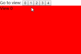
const renderView = ({index, key, ref, style, className, active, transitionState}) => (
<div key={key} ref={ref} style={style} className={className}>
<h3>View {index}</h3>
<p>I am {active ? 'active' : 'inactive'}</p>
<p>transitionState: {transitionState}</p>
</div>
)
// activeView specifies which view should currently be showing. Whenever you change it, ViewSlider will make the
// view at the new activeView horizontally slide into view.
ReactDOM.render(
<ViewSlider
renderView={renderView}
numViews={3}
activeView={0}
animateHeight
/>,
document.getElementById('root')
)
Props
renderView: (props: ViewProps) => React.Element<any> (required)
This function renders each view. ViewSlider will call it with the following props:
index: number- the index of the view (starting at 0)key: number- the key you should pass to the returned elementref: (c: HTMLElement) => any- the ref you should pass to the returned elementstyle: Object- the style you should pass to the returned elementactive: boolean- whether the view should currently be showingtransitionState: 'in' | 'out' | 'entering' | 'leaving'- the view's transition state
At minimum you should pass the key, ref, style, and className props to the returned element.
numViews: number (required)
The number of views present. ViewSlider will only render all views when transitioning; when idle, it will
only render the active view.
activeView: number (required)
The index of the view that should be showing. Whenever you change this, ViewSlider will animate a horizontal slide
transition to the view at the new index.
keepViewsMounted: boolean (default: false)
If true, ViewSlider will keep all views mounted after transitioning, not just the active view.
You may want to use this if there is a noticeable lag while other views mount at the beginning of a transition.
However, it disables height animation and will cause the height of ViewSlider to be the max of all views' heights,
so you will get best results if you also use fillParent={true}.
animateHeight: boolean (default: true)
If truthy, ViewSlider will animate its height to match the height of the view at activeView.
transitionDuration: number (default: 500)
The duration of the transition between views.
transitionTimingFunction: string (default: 'ease')
The timing function for the transition between views.
prefixer: Prefixer
If given, overrides the inline-style-prefixer used to autoprefix inline styles.
fillParent: boolean (default: false)
If truthy, ViewSlider will use absolute positioning on itself and its views to fill its parent element.
className: string
Any extra class names to add to the root element.
style: Object
Extra inline styles to add to the root element.
viewportClassName: string
Any extra class names to add to the inner "viewport" element.
viewportStyle: Object
Extra inline styles to add to the inner "viewport" element.
rootRef: (node: ?HTMLDivElement) => any
The ref to pass to the root <div> element rendered by ViewSlider.
viewportRef: (node: ?HTMLDivElement) => any
The ref to pass to the viewport <div> element rendered inside the root <div> by ViewSlider.
withTransitionContext
import ViewSlider from 'react-view-slider/lib/withTransitionContext'
This works exactly like ViewSlider except that it renders its views within a TransitionContext component from
react-transition-context with the given transitionState. This is useful for doing things like focusing an <input>
element after one of the views has transitioned in.
SimpleViewSlider
This is a wrapper for ViewSlider that takes a single child element. It renders the ViewSlider with the child's key
(converted to a number) as the activeView and caches past child elements by key.
Example
import SimpleViewSlider from 'react-view-slider/lib/simple'

ReactDOM.render(
  <SimpleViewSlider>
    <div key={0}>
      This is view 0
    </div>
  </SimpleViewSlider>,
  document.getElementById('root')
)

// Rendering a child with a different key will trigger the transition.
ReactDOM.render(
  <SimpleViewSlider>
    <div key={1}>
      This is view 1
    </div>
  </SimpleViewSlider>,
  document.getElementById('root')
)
If you want to use SimpleViewSlider with react-transition-context,
use react-view-slider/lib/simpleWithTransitionContext.