react-time-ago
International higly customizable relative date/time formatter for React (both for past and future dates).
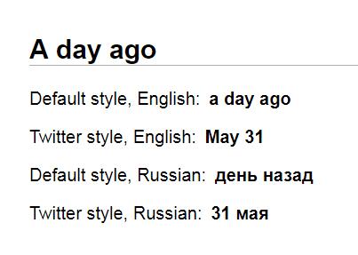
Formats a date/timestamp to:
- just now
- 5m
- 15 min
- 25 minutes
- an hour ago
- 1 mo.
- 5 years ago
- … or whatever else
Usage
npm install react-time-ago --save
# (installs "javascript-time-ago" as a dependency)
import TimeAgo from 'javascript-time-ago'

// Load locale-specific relative date/time formatting rules.
import en from 'javascript-time-ago/locale/en'
import ru from 'javascript-time-ago/locale/ru'

// Add locale-specific relative date/time formatting rules.
TimeAgo.locale(en)
TimeAgo.locale(ru)
LastSeen.js
import React from 'react'
import TimeAgo from 'react-time-ago'

export default function LastSeen({ date }) {
  return (
    <div>
      Last seen:
      <TimeAgo>{date}</TimeAgo>
    </div>
  )
}
<TimeAgo/> React component refreshes itself as the time goes by.
Customization
TimeAgo component accepts a timeStyle property which can be one of
Tooltip
The default component exported from this library comes prepackaged with a <Tooltip/> component which displays itself "on mouse over" on desktops and "on touch down" on mobile devices. The behaviour of the tooltip is similar to that of the HTML title attribute which displays a tooltip "on mouse over". The difference that the custom tooltip also displays itself "on touch down" on mobile devices while the HTML title attribute doesn't handle mobile users in any way. That was the primary reason for going with the custom <Tooltip/> component instead of the HTML title attribute. The other reason is the requirement for custom design.
The tooltip text is a verbose date label. If Intl is supported (which is the case for all modern web browsers) then Intl.DateTimeFormat is used for formatting the label ("Thursday, January 11, 2018, 9:53:00 PM"). Otherwise, it falls back to date.toString().
import TimeAgo from 'react-time-ago'

// Tooltip CSS styles:
import 'react-time-ago/Tooltip.css'
// Also make sure that `document.body` has no `margin`
// otherwise tooltip `left` and `top` positions will be slightly off.

// Shows a verbose date tooltip on mouse over and on touch down.
<TimeAgo>{date}</TimeAgo>
If the prepackaged <Tooltip/> component doesn't fit the bill then any other custom <Tooltip/> component may be used (see ./source/WithTooltip.js).
Finally, one can use bare react-time-ago without any <Tooltip/> component:
import { TimeAgo } from 'react-time-ago'
// Shows a verbose date tooltip on mouse over
// (via HTML `title` attribute).
<TimeAgo>{date}</TimeAgo>
Future
When given future dates it produces the corresponding output, e.g. "in 5 minutes", "in a year", etc.
Props
// Preferred locale.
// E.g. 'ru-RU'.
locale : PropTypes.string,

// Preferred locales (ordered).
// E.g. `['ru-RU', 'en-GB']`.
locales : PropTypes.arrayOf(PropTypes.string),

// The `date` (or `timestamp`).
// E.g. `new Date()` or `1355972400000`.
children : PropTypes.oneOfType
([
  PropTypes.instanceOf(Date),
  PropTypes.number
])
.isRequired,

// Date/time formatting style.
// E.g. 'twitter', 'time', or an object.
// See `javascript-time-ago` docs for more info.
timeStyle,

// Whether HTML `tooltip` attribute should be set
// to verbosely formatted date (is `true` by default).
tooltip : PropTypes.bool.isRequired,

// An optional function returning what will be output in the HTML `title` tooltip attribute.
// (by default it's (date) => new Intl.DateTimeFormat(locale, {…}).format(date))
formatVerboseDate : PropTypes.func,

// `Intl.DateTimeFormat` format for the HTML `title` tooltip attribute.
// Is used when `formatVerboseDate` is not specified.
// By default outputs a verbose date.
verboseDateTimeFormat : PropTypes.object,

// How often to update all `<TimeAgo/>`s on a page.
// (once a minute by default)
updateInterval : PropTypes.number,

// Set to `false` to disable automatic refresh as time goes by.
tick : PropTypes.bool,

// React Component to wrap the resulting `<time/>` React Element.
// Receives `verboseDate` and `children` properties.
// `verboseDate` can be used for displaying verbose date label
// in an "on mouse over" (or "on touch") tooltip.
// See "./source/WithTooltip.js" for usage example.
container : PropTypes.func,

// CSS `style` object.
// E.g. `{ color: white }`.
style : PropTypes.object,

// CSS class name
className : PropTypes.string