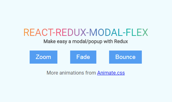
REACT-REDUX-MODAL-FLEX
Make easy a modal/popup with Redux.
Features
- Responsive
- Easy custom
animationeffect by Animate.css
Installation
To install the stable version you can use:
$ yarn add react-redux-modal-flex
Example
Step 1:
rootReducer.js
import { combineReducers } from 'redux';
import { reducer as modal } from 'react-redux-modal-flex';
import todos from './todos';

export default combineReducers({
  todos,
  modal: modal({
    classContent: 'modal-content',
    animation: 'zoomIn',
    duration: 200,
    mask: true,
    /* initial state, see API reference */
  }),
});
Step 2:
App.js
import Modal from 'react-redux-modal-flex';

class App extends React.Component {
  render() {
    return (
      <Router>
        <div className="App">
          <Switch>
            <Route path="/" exact component={Home} />
            <Route path="/auth" component={Auth} />
          </Switch>
          <Modal />
        </div>
      </Router>
    );
  }
}
Step 3:
Any Container you want to use
import { connect } from 'react-redux';
import { actions as ModalActions } from 'react-redux-modal-flex';

class LoginModal extends React.Component {
  render() {
    return (
      <form>
        <div>
          <label>Username</label>
          <input type="text" name="username" />
        </div>
        <div>
          <label>Password</label>
          <input type="password" name="password" />
        </div>
      </form>
    );
  }
}

class Auth extends React.Component {
  render() {
    return (
      <div>
        <h3>Auth</h3>
        <button
          onClick={() =>
            this.props.toggleModal({
              component: LoginModal,
              ok: {
                text: 'Login',
                action: () => alert('submit form'),
              },
            })
          }
        >
          Open modal login
        </button>
      </div>
    );
  }
}

export default connect(null, { toggleModal: ModalActions.toggleModal })(Auth);
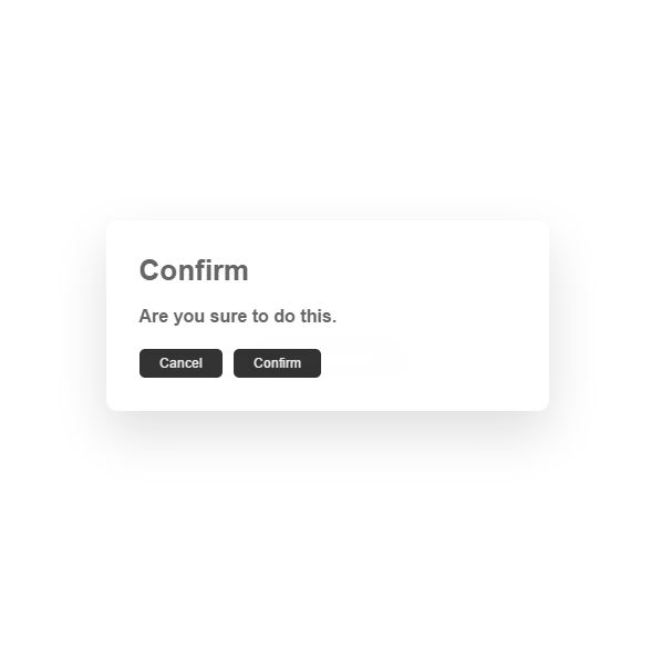
API
- initState: you can overwrite default initial state
const initState = {
  classContent: 'modal-content',
  animation: 'zoomIn',
  duration: 300,
  mask: true,
  closeByMask: true,
  component: ModalDefault,
  title: 'This is a title',
  closeBtn: true,
  textCancel: 'Cancel',
  ok: {
    text: 'OK',
    classOk: 'modal-btn-ok',
    disabled: false,
    action: () => console.log('OK clicked'),
  },
};
- API
import Modal, {
  reducer as modal,
  actions as ModalActions,
} from 'react-redux-modal-flex';
const { toggleModal, modifyOkModal } = ModalActions;
<Modal />is component, using in ourApp.jsreducerusing in ourrootReducer.jsyou can custom default initial state
export default combineReducers({
  todos,
  modal: modal({
    textCancel: 'Close',
    title: 'My default title',
  }),
});
toggleModalandmodifyOkModalis action
Usage
- Open Modal by action
toggleModal(options)options: is object and look like theinitStateabove- Example:
...
render() {
  return (
    <button onClick={() => this.props.toggleModal({
      textCancel: 'Hide',
      component: () => <div>content modal</div>,
      title: 'My title',
      ok: {
        text: 'Login',
        action: () => alert('click OK')
      }
    })}>Click me</button>
  );
}
...
- Close Modal
toggleModal(false)or any value excepted object - Modify button
OK:modifyOkModal(options)usage liketoggleModal- Example:
onClick={() => this.props.modifyOkModal({
  text: 'Sign up',
  disabled: true
})}
- Hide
Headerif thetitleis null - Hide
Cancelbutton if thetextCancelis null - Hide
Okbutton ifok: {text: null} - Hide Footer if the
CancelandOkare hidden