Material UI Image
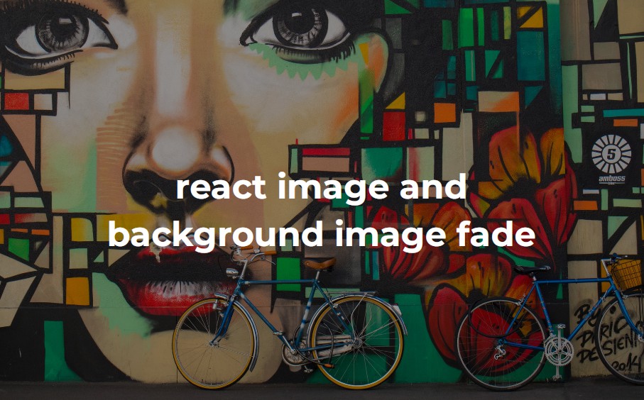
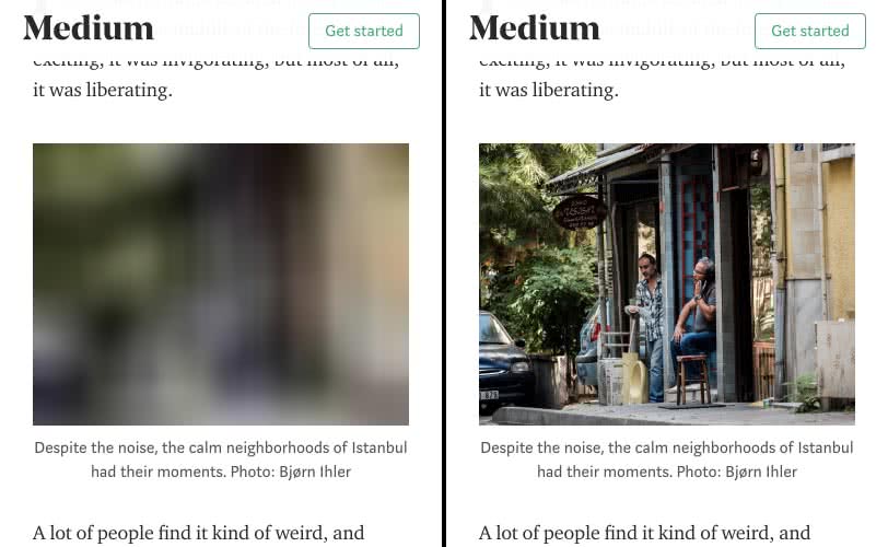
Images are ugly until they're loaded. Materialize it with material image! It will fade in like the material image loading pattern suggests.

Installation
npm install material-ui-image
Note: This is the version for Material-UI 1.0.0-rc.0 or later. If you are using Material-UI 1.0.0-beta, you should update to the latest version. If you are still using Material-UI 0.x, you can use our [legacy version][legacy].
Usage
Use this component just like a regular img tag.
import Image from 'material-ui-image'

// ...

render() {
  return (
    <div>
      <Image
        src="http://loremflickr.com/300/200"
      />
    </div>
  )
}
Material UI Image Properties
| Name | Type | Default | Description |
|---|---|---|---|
| src* | string |
Specifies the URL of an image. | |
| aspectRatio | float |
(1/1) | Specifies the aspect ratio of the image. |
| color | string |
white | Override the background color. |
| disableError | bool |
false | Disables the error icon if set to true. |
| disableSpinner | bool |
false | Disables the loading spinner if set to true. |
| disableTransition | bool |
false | Disables the transition if set to true. |
| errorIcon | node |
Override the error icon. | |
| imageStyle | object |
{ width: 'inherit', height: 'inherit' } | Override the inline-styles of the image. |
| loading | node |
Override the loading component. | |
| onClick | func |
Fired when the user clicks on the image happened. | |
| style | object |
Override the inline-styles of the root element. |
* required property


