revo-dropdown
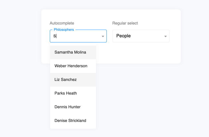
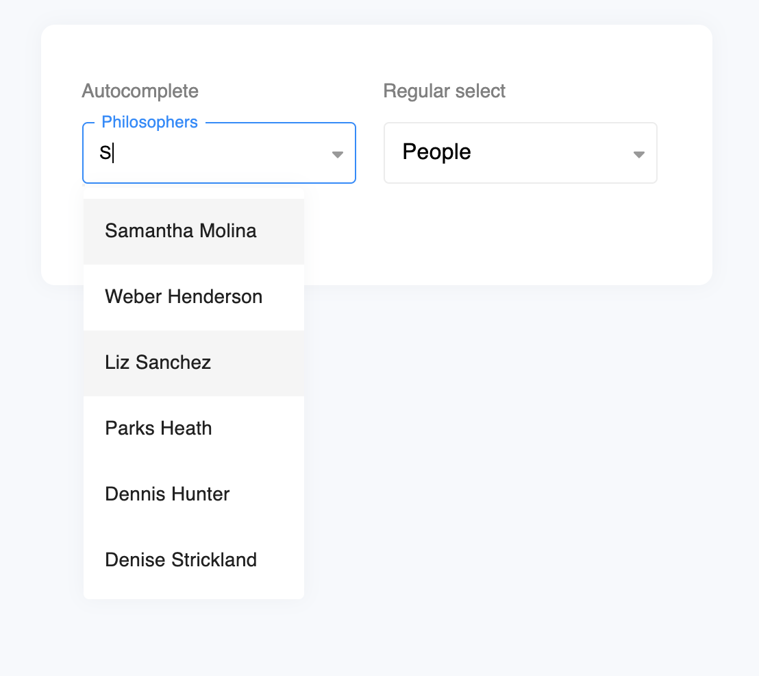
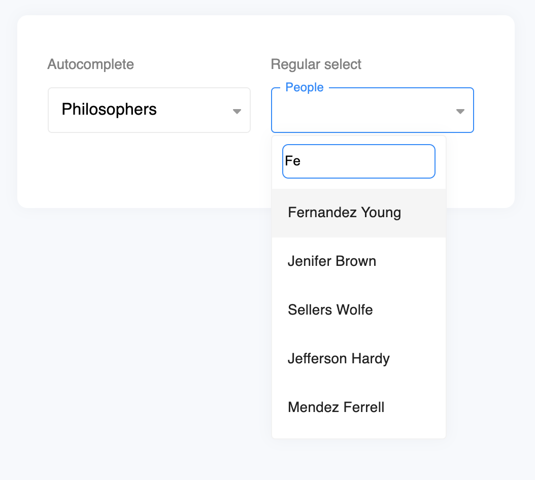
Minimalistic dropdown webcomponent. After long search we couldn't find any cross platform and had to build our own inspired by the latest trends.
Autocomplete |
Regular select |
|---|---|
 |
 |
Getting Started
To start building a new web component using Stencil, clone this repo to a new directory:
git clone https://github.com/revolist/revodropdown.git revo-dropdown
cd revo-dropdown
git remote rm origin
and run:
npm install
npm start
To build the component for production, run:
npm run build
To run the unit tests for the components, run:
npm test
Need help? Check out docs here.
Script tag
- Put a script tag similar to this
<script src='https://unpkg.com/revo-dropdown@latest/dist/revo-dropdown.js'></script>in the head of your index.html - Then you can use the element anywhere in your template, JSX, html etc
API
Properties
| Property | Attribute | Description | Type | Default |
|---|---|---|---|---|
appendTo |
append-to |
Where to append element | "body" \| "current" |
'body' |
autoClose |
auto-close |
Should dropdown autoclose on changeValue | boolean |
true |
dataId |
data-id |
Define object mapping for id/value | string |
undefined |
dataLabel |
data-label |
Define object mapping for labels | string |
undefined |
filter |
filter |
Filter criteria | "contains" \| "start" |
'contains' |
hasFilter |
has-filter |
boolean |
true |
|
placeholder |
placeholder |
Placeholder text | string |
'Select' |
source |
-- | Define object mapping for id/value | any[] |
undefined |
value |
value |
Selected value | any |
undefined |
Events
| Event | Description | Type |
|---|---|---|
changeValue |
When value changed | CustomEvent<{ val: any; originalEvent?: MouseEvent; }> |
close |
Before element close, can be prevented | CustomEvent<any> |
open |
Before element open, can be prevented | CustomEvent<any> |
Methods
doChange(val: any, originalEvent?: MouseEvent) => Promise<void>
Change value
Returns
Type: Promise<void>
doClose() => Promise<void>
Close dropdown
Returns
Type: Promise<void>
doOpen() => Promise<void>
Open dropdown
Returns
Type: Promise<void>
Dependencies
Depends on
Graph
graph TD;
  revo-dropdown --> revo-list
  style revo-dropdown fill:#f9f,stroke:#333,stroke-width:4px
