preact-charts
preact based charting library. Written with d3-maths, and TypeScript!
Install via npm using: npm install preact-charts.
The goal of this project is to be as light as possible adding some easy chart support to the preact ecosystem.
I have tried my best to limit the required dependencies to only the sections of d3 that are needed, while also not attempting to replicate already implemented code.
I hope that this library of components will be as developer friendly as possible, including easy ways for developers to style the charts as they wish.
The below documentation will include some TypeScript syntax. If you are new to TypeScript or don't use it, optional props are declared with a ?:.
Features / RoadMap
Version 1.0
- [x] Basic charting.
- [x] Implemented css-in-js solution
- [x] Switch from typestyle to goober
- [ ]
Implement build using microbundle - [ ] Transition from hard-typed colour array to procedurally generated colours
- [ ] Further componentize charts to prevent code duplication
Current Charts
Difference Chart
Will display a vertical bar chart with a y-axis that is centered at 0 on the x-axis.
Props:
interface DiffBarProps {
    name: string;
    data: Array<{name: string, value: number}>;
    height?: number; // default 800
    width?: number; // default 600
    margin?: Margin; // default {top: 25, right: 25, bottom: 50, left: 25}
    ticks?: number; // default 8
}
Usage:
import { h, Component } from 'preact';
import { DifferenceChart } from 'preact-charts';
const data: Array<{name: string, value: number}> = [...];
...
<DifferenceChart name='differenceChart' data={data}/>
Grouped Bar Chart
Props:
interface GroupedBarProps {
    name: string;
    data: GroupedDataObject;
    groups: string[];
    legendReference: {[key: string]: string};
    height?: number; // default 500
    width?: number; // default 500
    margin?: Margin; // default {top: 25, right: 25, bottom: 75, left: 50}
    ticks?: number; // default 6
}
Where:
interface GroupedDataObject {
    [key: string]: Array<{name: number | string, value: number}>;
}
Prop legendReference is an object where the keys are the same as the keys of the input data. The value is what will be displayed on the chart legend.
Usage:
import { h, Component } from 'preact';
import { GroupedBar, GroupedDataObject } from 'preact-charts';
const data: GroupedDataObject = {...};
...
<GroupedBar name='groupedBar1' data={data} groups={Object.keys(data)} legendReference={chartLegendReference}/>
Horizontal Bar Chart
This chart is the same as the GroupedBar, but is displayed with horizontal bars.
Props:
interface HorizontalBarProps {
    name: string;
    data: GroupedDataObject;
    groups: string[];
    legendReference: {[key: string]: string};

    height?: number; // default 800
    width?: number; // default 600
    margin?: Margin; // default {top: 25, right: 25, bottom: 25, left: 150}
    ticks?: number; // default 6
}
Usage:
import { h, Component } from 'preact';
import { HorizontalBar, GroupedDataObject } from 'preact-charts';
const data: GroupedDataObject = {...};
...
<HorizontalBar name='hozBar' data={data} groups={Object.keys(data)} legendReference={chartLegendReference}/>
Histogram
Props:
interface HistogramProps {
    name: string;
    x: string;
    data: DataArray;
    height?: number; // default 250
    width?: number; // default 350
    margin?: Margin; // default {top: 25, right: 25, bottom: 75, left: 50}
    ticks?: number; // default 8
    barColour?: string; // default steelblue
    barOutline?: string; // default black
}
x should be a key in data. Will display a histogram of the data with that key.
Usage:
import { h, Component } from 'preact';
import { Histogram, DataArray } from 'preact-charts';
const data: DataArray = [...];
...
<Histogram name='histogram' x={Object.keys(data[0])[0]} data={data}/>
LineScatter
Props:
interface LineScatterProps {
    name: string;
    x: string;
    y: string;
    data: DataArray[];
    height?: number; // default 500
    width?: number; // default 500
    margin?: Margin; // default {top: 25, right: 25, bottom: 75, left: 75}
    radius?: number; // default 5
    labels?: boolean; // default false
    legendReference?: string[];
}
Input data is an array of data arrays. Each inner array will be displayed as a group of dots connected by a line.
legendReference is an array where legendReference[index] === data[index]. The index of legendReference relate to the index of the data.
LineScatter has a built in zoom functionality. Allowing user to select a portion of the chart and the axis will scale to that selection.
Double clicking the chart will cause the zoom to reset.
Usage:
import { h, Component } from 'preact';
import { LineScatter, DataArray } from 'preact-charts';
const data: DataArray[] = [...];
...
<LineScatter name='linescatter' data={data} x='dataKey1' y='dataKey2' labels={true} legendReference={legendRef}/>
ScatterPlot
Props:
interface ScatterPlotProps {
    name: string;
    x: string;
    y: string;
    data: DataArray;
    height?: number; // default 500
    width?: number; // default 500
    margin?: Margin; // default {top: 25, right: 25, bottom: 75, left: 75}
    radius?: number; // default 5
    labels?: boolean; // default false
    dotFill?: string; // default steelblue
    dotBorder?: string; // default whitesmoke
}
The radius of the displayed circles can be changed. labels is a boolean determining if axis labels should be presented.
ScatterPlot also has a built in zoom functionality. Allowing user to select a portion of the chart and the axis will scale to that selection.
Double clicking the chart will cause the zoom to reset.
Usage:
import { h, Component } from 'preact';
import { ScatterPlot, DataArray } from 'preact-charts';
const data: DataArray = [...];
...
<ScatterPlot name='scatter' data={data} x='dataKey1' y='dataKey2' labels={true}/>
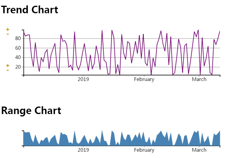
RangeChart
Props:
interface RangeChartProps {
    name: string;
    y: string;
    data: TimestampArray;
    height?: number; // default 200
    width?: number; // default 1000
    margin?: Margin; // default {top: 25, right: 25, bottom: 75, left: 75}
    lineColour?: string; // default steelblue
    fillColour?: string; // default steelblue
    onBrush?: (extent: Date[]) => void;
    brushColour?: string; // default darkgoldenrod
}
Input data requires a key called timestamp which is a parsed date. onBrush is called when the chart has been brushed.
This allows for data filtering based on returned time extents. onBrush gets the argument of extent which is an array of length 2, which is [start, end]
Usage:
import { h, Component } from 'preact';
import { RangeChart, TimestampArray } from 'preact-charts';
const data: TimestampArray = [...];
...
<RangeChart name='rangechart' y={yKey} data={data} onBrush={this.handleRangeBrush}/>

this.handleRangeBrush = (extent: Date[]) => {
    const brushStart = extent[0];
    const brushEnd = extent[1];
    // do something with brush extents
}
TrendChart
Props:
interface TrendChartProps {
    name: string;
    x: string;
    y: string;
    data: TimestampArray;
    height?: number; // default 200
    width?: number; // default 1000
    margin?: Margin; // default {top: 25, right: 25, bottom: 75, left: 75}
    lineColour?: string; // default lightblue
    extent?: Date[];
    tooltip?: boolean; // default true
    axisControl?: boolean; // default true
    contolColour?: string; //default goldenrod
}
Allows you to pass an extent, as generated by the RangeChart onBrush to filter the presented data. Allows choice of x-axis key, which must still be a date.
Line colour is customizable.
Tooltip being on will display a circle with the related data displayed when hovering over the chart. The chosen point is the closet to the current mouse location.
Axis control being true will display plus and minus buttons at the top and bottom of the y-axis. Allowing the users to have control over the y-axis.
TrendChart is also allowed to have <Flag /> child components, which will be displayed on the chart and can be interacted with.
Usage:
import { h, Component } from 'preact';
import { TrendChart, Flag, TimestampArray } from 'preact-charts';
const data: TimestampArray = [...];
const flags: EventsData[] = [...];
...
<TrendChart name='trend1' data={data} y={yKey} x='timestamp' lineColour='cyan' extent={state.rangeExtent}>
    {
        // optional flag addition
        flags.map((flag) => <Flag isClicked={isFlagClicked} {...flag} onClick={this.handleFlagClick}/>)
    }
</TrendChart>

this.handleFlagClick = (e: number) => {
    // e is the flagID number
}
Other Components
Flag
Props:
interface FlagProps extends EventsData {
    onClick: (flagID: number) => void;
    isClicked: boolean;
}
These are the flag props required from the user, the rest are passed through in TrendChart.
onClick is a function when the flag is clicked.
The flags do not manage their own state and should be told when they should stay in the clicked state. Clicked flags will have a green topper.
Flags will be displayed as a rectangle with over the extent of [start, end]
Types Reference
export interface Margin {
    top: number;
    right: number;
    bottom: number;
    left: number;
}

export interface NumberObject {
    [key: string]: number;
}

export type DataArray = NumberObject[];

export interface GroupedDataObject {
    [key: string]: Array<{name: number | string, value: number}>;
}

export interface DataObject {
    [key: string]: number | string | Date;
}

export interface TimestampData extends DataObject {
    timestamp: Date;
}

export type TimestampArray = TimestampData[];

export interface EventsData {
    idx: number;
    event: number;
    start: string | Date;
    end: string | Date;
    type: string;
    sub_type: string | null;
    comment: string | null;
}
Features
This is a note on some features that are included:
I use resize observer to ensure that the charts will resize on window resize. This requires a browser that implements this feature or a polyfill.
This also means that the charts will always fill their parent container. So placing them in sized divs is important.
Chart names should be unique, they are used for things like chart clipPath IDs.