react-bootstrap-button-loader
Bootstrap Button with Spinner feature.

Versioning
- v2 supports React Bootstrap v1.0.0+
- v1 supports React Bootstrap v0.x.x
Demo
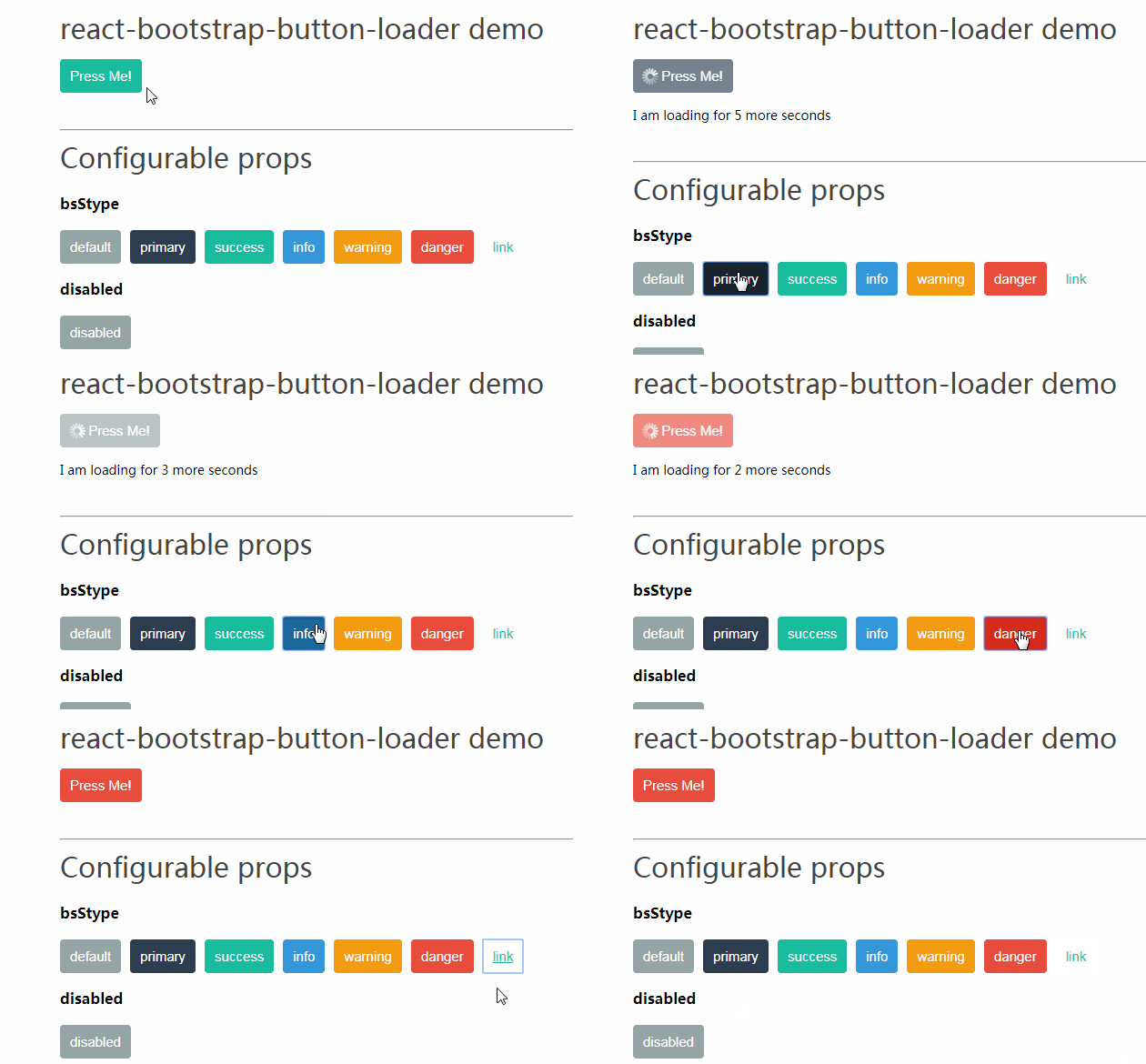
Demo and playground are available here
Usage Example
import Button from 'react-bootstrap-button-loader';

<Button loading={this.state.loading}>Press me!</Button>
Configurable Props
Note: All props are optional.
~bsStyle: string, default: null~
Bootstrap style, supported values: default, primary, success, info, warning, danger, link.
Deprecated in a favor of variant
disabled: boolean, default: false
Set this prop true to disable button.
Note: button in loading state is disabled and this behavior is not overridable even if false value is explicitly provided.
loading: boolean, default: false
This prop controls Button loading state.
While loading, Button is disabled and icon provided via props is replaced with Spinner.
icon: node, default: null
Buttons with icons are better!
Provided icon is shown if Button is not in a loading state. Otherwise Spinner is rendered.
spinAlignment: string, default 'left'
Controls spinAlignment, supported values: 'left' and 'right'
spinColor: string, default: '#fff'
Spinner color for loading state.
While white color used by default works fine for most cases, for different bootstrap themes and bsStyles it might be better to use other colors instead.
variant: string, default: 'primary'
Bootstrap style, supported values: primary, secondary, success, info, warning, danger, link, light, dark.
