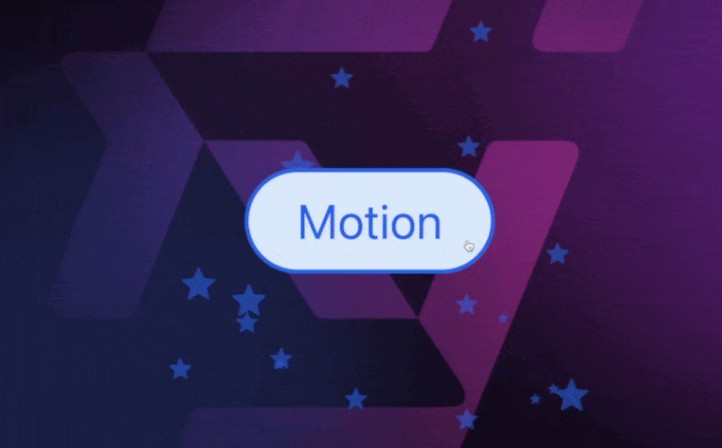
like-button-celebration
Like-button-celebration designed to add animated buttons for liking, unliking, upvoting, and custom interactions to your blogs, articles, and web content. With this library, you can easily integrate interactive buttons that celebrate user clicks, adding delightful animations to your web applications.
Install
npm install --save like-button-celebration party-js
Usage
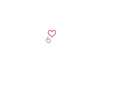
Heart Like button
import React, {useState} from 'react'
import { HeartLike } from 'like-button-celebration'

const App = () => {
    const [liked, SetLiked] = useState(user.liked)
  return (
    <>
        <HeartLike
        //set the State of the Button. ie. Liked or Not
        Active={liked}  // Default true
        />
    </>
    )
}

export default App
The HeartLike component is designed for heart-shaped like buttons and provides various customization options. Here’s a breakdown of the props it accepts, along with their usage and default values:
-
Active(boolean, optional, default:true): Determines the initial state of the button. Set totruefor a liked state andfalsefor an unliked state. -
IconWidth(string, optional, default:'24'): Specifies the width of the heart icon. -
IconHeight(string, optional, default:'24'): Specifies the height of the heart icon. -
Image(string, optional): URL of an image to use as the Animation Particles. When provided, it will replace the default Square and Circle particles. -
Speed(object, optional): An object withMinandMaxproperties to control the animation speed. For example:Speed={{ Min: 100, // Minimum animation speed in milliseconds Max: 400, // Maximum animation speed in milliseconds }}
-
Spread(number, optional, default: 50): Controls the spread of confetti particles when the button is clicked. -
Count(object, optional): An object with Min and Max properties to control the number of confetti particles. For example:Count={{ Min: 20, // Minimum number of confetti particles Max: 50, // Maximum number of confetti particles }}
example
     <HeartLike
        Active={true}
        IconWidth="32"
        IconHeight="32"
        Image="https://example.com/custom-heart-icon.png"
        Speed={{
          Min: 200,
          Max: 600,
        }}
        Spread={70}
        Count={{
          Min: 30,
          Max: 60,
        }}
        Fill="blue"
      />
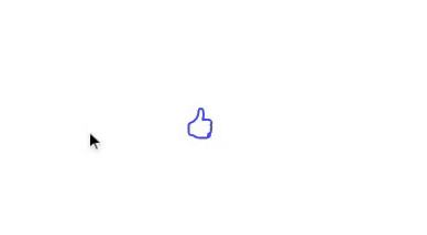
Thumbs Up Like
Props same as Above Heart Like Button.
Example
import React, {useState} from 'react'
import { ThumbLike } from 'like-button-celebration'

const App = () => {
    const [liked, SetLiked] = useState(user.liked)
    return
    (
    <div>
        <ThumbLike
                Active={true}
                IconWidth="32"
                IconHeight="32"
                Image="https://example.com/custom-thumb-icon.png"
                Speed={{
                Min: 200, // Minimum animation speed in milliseconds (optional, default: 100)
                Max: 600, // Maximum animation speed in milliseconds (optional, default: 400)
                }}
                Spread={70} // Control the spread of confetti particles (optional, default: 50)
                Count={{
                Min: 30, // Minimum number of confetti particles (optional, default: 20)
                Max: 60, // Maximum number of confetti particles (optional, default: 50)
                }}
                Fill="blue"
            />
    </div>
    )
}

export default App
Custom Button with Celebration Animation
Remember, The BeforeClick and AfterClick props are required, and they determine the content to display before and after clicking the button.
Example
import React from 'react';
import { CustomButton } from 'like-button-celebration'

function App() {
  return (
    <div>
      <CustomButton
        // Required
        BeforeClick={<div>Click Me!</div>}
        AfterClick={<div>Clicked!</div>}

        // Optional
        Image="https://example.com/custom-icon.png"
        Speed={{
          Min: 200,
          Max: 600,
        }}
        Spread={70}
        Count={{
          Min: 30,
          Max: 60,
        }}

      />
    </div>
  );
}

export default App;
License
MIT © mayurjadhav2002
Feedback
If you have any feedback, please reach out to us at [email protected]
Contributing
Contributions are always welcome!
See contributing.md for ways to get started.
Please adhere to this project’s code of conduct.