React Iconly Icons
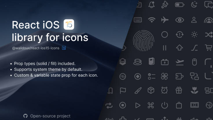
react-iconly is a collection of simply beautiful open source icons for React.js. Each icon is designed on a 24x24 grid with an emphasis on simplicity, consistency and readability.
Sets
- Bold
- Bulk
- Light Border
- Broken
- Two Tone
Installation
yarn add react-iconly
or
npm i react-iconly
Usage
import React from 'react';
import { Home } from 'react-iconly';

const App = () => {
  return <Home />
};

export default App;
You can also wrap your app inside a IconlyProvider component, this will make all the icons that are within the context use the Provider properties
If you set specific props for each Icon the Provider properties will be overwritten
import React from 'react';
import { IconlyProvider, Home, Notification } from 'react-iconly';

const App = () => {
  return (
    <IconlyProvider set="bulk" primaryColor="blueviolet" secondaryColor="blue" stroke="bold" size="xlarge">
      <Home />
      <Notification primaryColor="yellow" />
    </IconlyProvider>
  )
};

export default App;
Icons can be configured with inline props:
<Home set="two-tone" primaryColor="blueviolet" secondaryColor="blue" stroke="bold" size="xlarge"/>
You can also include the whole icon pack:
import React from 'react';
import * as Iconly from 'react-iconly';

const App = () => {
  return <Iconly.Home set="bulk" primaryColor="blueviolet" secondaryColor="blue" stroke="bold" size="xlarge"/>
};

export default App;
Custom style example
import React from 'react';
import { Send } from 'react-iconly';

const App = () => {
  return <Send style={{ transform: 'rotate(45deg)' }} primaryColor="red" stroke="bold" size="xlarge"/>
};

export default App;
Props
| Prop | Type | Default | Note |
|---|---|---|---|
label |
string |
String to use as the aria-label for the icon. Use an empty string when you already have readable text around the icon,like text inside a button. | |
filled |
boolean |
false |
Set de icons sets to 'bold'. |
primaryColor |
string |
currentColor |
Primary colour for icons. |
secondaryColor |
string |
currentColor |
Secondary colour for two-tone and bulk icons set. |
size |
number |
small medium large xlarge |
medium |
set |
light bold two-tone bulk broken |
light |
Iconly set option. |
stroke |
light regular bold |
regular |
Sets the line stroke for light and two-tone icons set. |
style |
object |
Custom styles property. |
