React AwesomeButton UI Component
React button component. With a 3D UI, progress, social and share enabled. RAB is a 60fps, light weight, performant, production ready react UI button component.
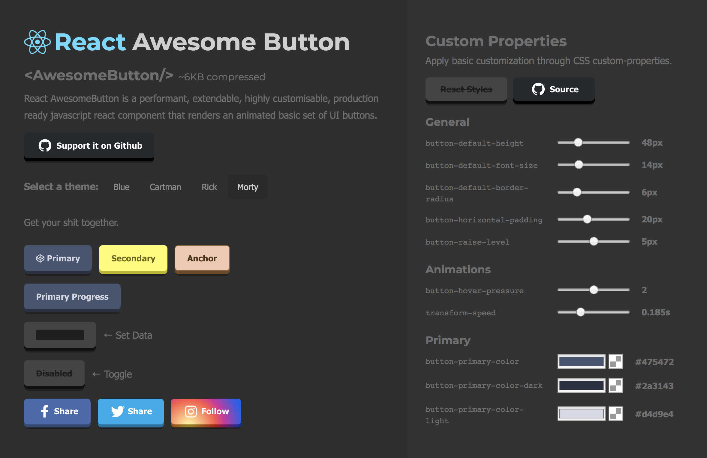
react-awesome-button is a performant, extendable, highly customisable, production ready React Component that renders an animated set of 3D UI buttons. Bundled together with a social share and progress enabled components.
Key Features
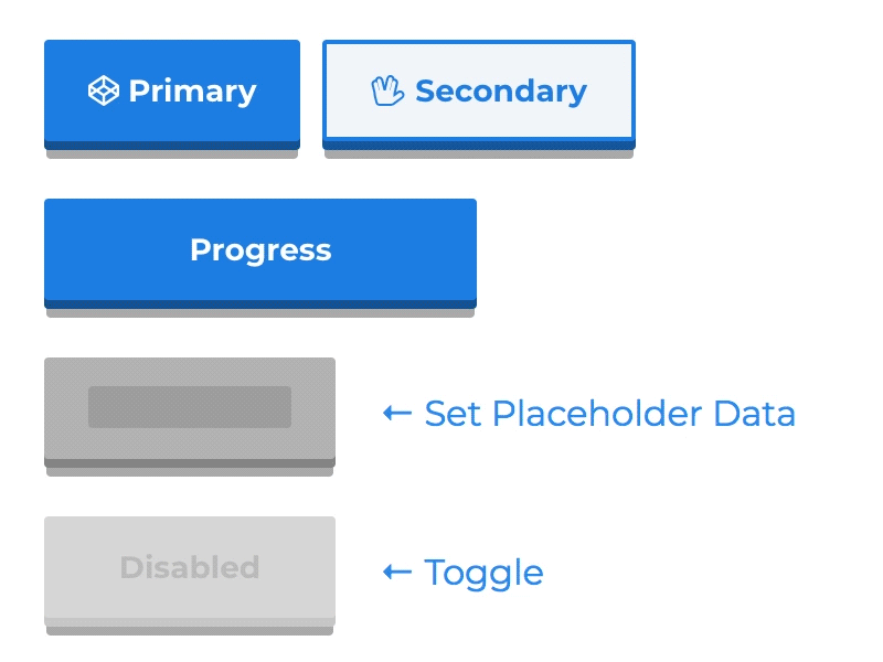
- 60fps 3D animated button
- Animated progress button
- Social icons and network specific share methods
- OnPress ripple effect
- Look and feel customisable and extendable in two ways: via CSS custom properties or SASS variables and lists (scss config file).
- Use it with CSSModules or **Plain CSS
Live demo
Checkout the live demo with the CSS customizer at my web portfolio page.
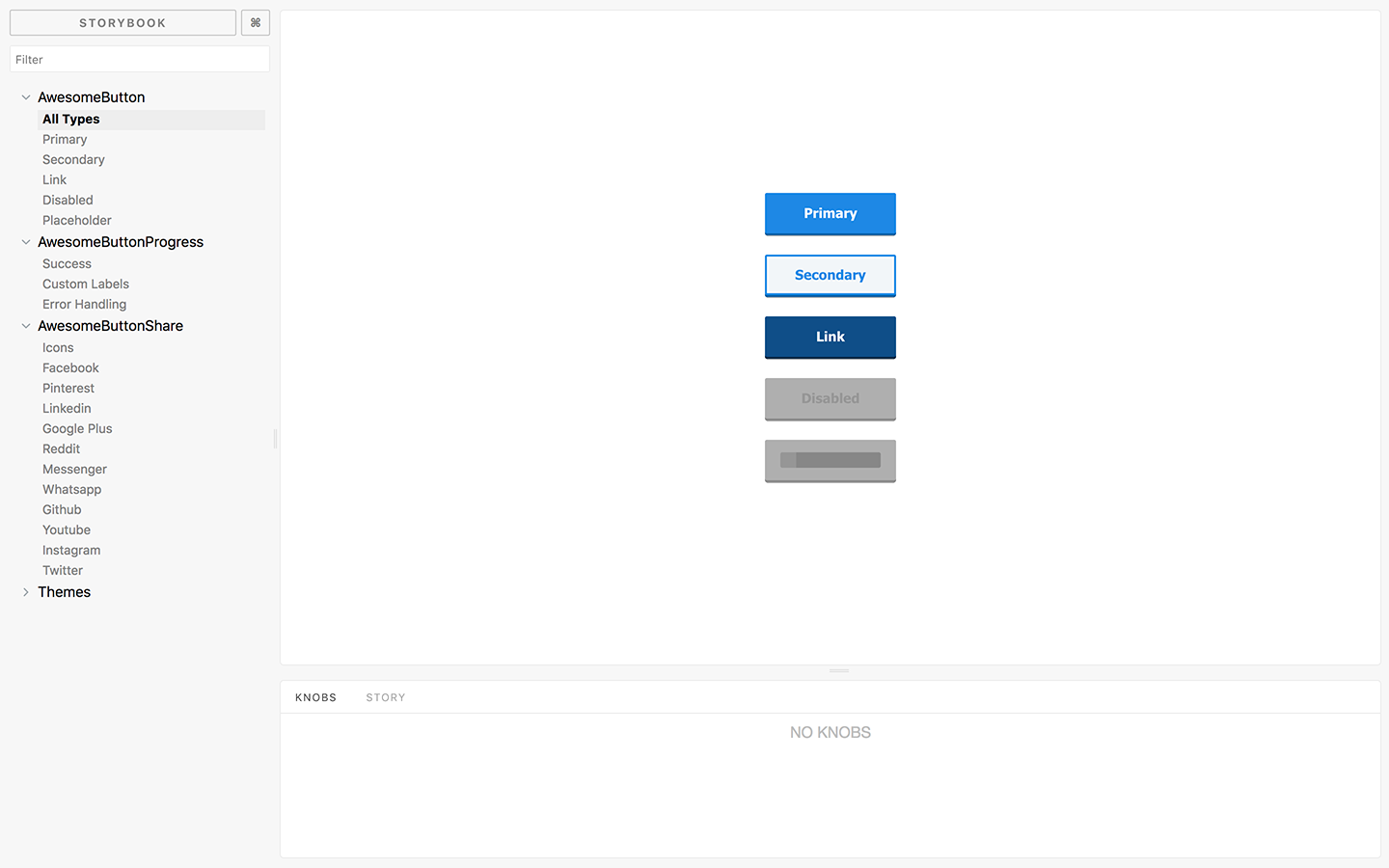
Storybook
Checkout the Storybook at my web portfolio page.
Installation
npm install --save react-awesome-button
Styling with plain CSS and CSS Modules
Plain CSS
import { AwesomeButton } from "react-awesome-button";
import "react-awesome-button/dist/styles.css";

function Button() {
  return <AwesomeButton type="primary">Button</AwesomeButton>;
}
CSS Modules
import { AwesomeButton } from "react-awesome-button";
import AwesomeButtonStyles from "react-awesome-button/src/styles/styles.scss";

function Button() {
  return (
    <AwesomeButton cssModule={AwesomeButtonStyles} type="primary">
      Button
    </AwesomeButton>
  );
}
AwesomeButton rendered with a button tag
Renders the component with a Button tag and an onPress prop called on animation release.
Checkout this example live on the storyboard.
import { AwesomeButton } from "react-awesome-button";
import AwesomeButtonStyles from "react-awesome-button/src/styles/styles.scss";

function Button() {
  return (
    <AwesomeButton
      cssModule={AwesomeButtonStyles}
      type="primary"
      ripple
      onPress={() => {
        // do something
      }}
    >
      Button
    </AwesomeButton>
  );
}
AwesomeButton rendered with an anchor tag
Render the component with an anchor tag setting the href and target attributes.
Checkout this example live on the storyboard.
import { AwesomeButton } from "react-awesome-button";
import AwesomeButtonStyles from "react-awesome-button/src/styles/styles.scss";

function Button() {
  return (
    <AwesomeButton
      cssModule={AwesomeButtonStyles}
      type="primary"
      href="https://google.com"
      target="_blank"
    >
      Button
    </AwesomeButton>
  );
}
AwesomeButton props
| Attribute | Type | Default | Description |
|---|---|---|---|
| type | string |
primary |
Render a specific button type, styled by the .scss type list |
| size | string |
auto |
Render a specific button size, styled by the .scss size list |
| element | node |
null |
Overwrites the default container element renderer, useful for using it with react-router Link component. |
| disabled | bool |
false |
Should render a disabled button |
| visible | bool |
true |
Should the button be visible |
| ripple | bool |
false |
Should render the animated ripple effect |
| onPress | function |
null |
Default click/press function |
| href | string |
null |
Forces the button to be rendered on an anchor container and sets the href to the specified value |
| target | string |
null |
When used together with href renders an anchor with a specific target attribute |
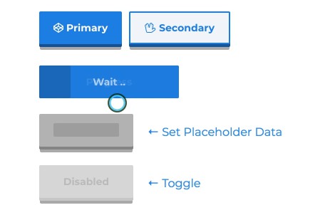
AwesomeButtonProgress basic example
Checkout this example live on the storyboard.
  import { AwesomeButtonProgress } from 'react-awesome-button';
  import AwesomeButtonStyles from 'react-awesome-button/src/styles/styles.scss'

  function Button() {
    return (
      <AwesomeButtonProgress
        cssModule={AwesomeButtonStyles}
        type="primary"
        onPress={next => {
          // do a sync/async task then call `next()`
        }}
      >
        Button
      </AwesomeButton>
    );
  }
AwesomeButtonProgress specific props
Being a wrapper on the AwesomeButton component, it accepts its props plus the following ones.
| Attribute | Type | Default | Description |
|---|---|---|---|
| loadingLabel | string |
Wait .. |
Progress button loading label text |
| resultLabel | string |
Success |
Progress button success label text |
| releaseDelay | number |
500 | Delay for releasing the button after the progress animation |
| fakePress | boolean |
false |
When set to true triggers a fake button press |
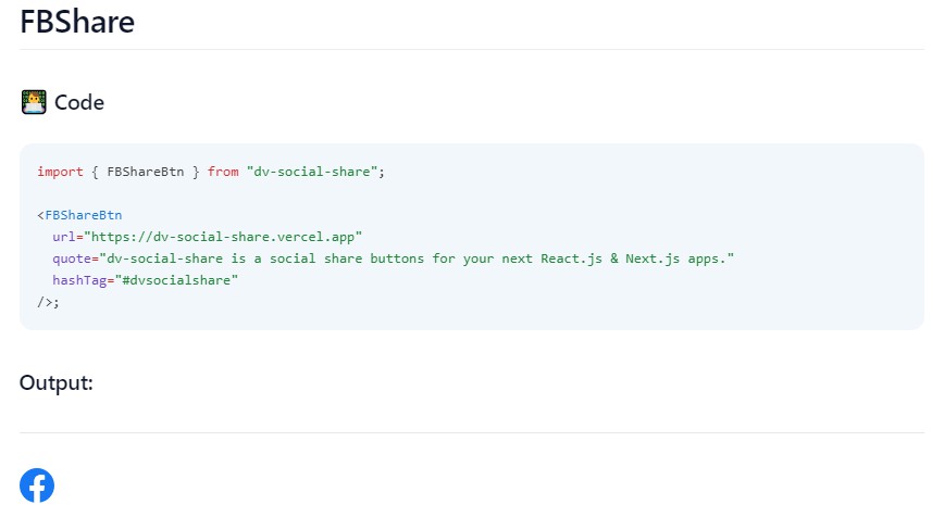
AwesomeButtonSocial basic example
Checkout this example live on the storyboard.
  import { AwesomeButtonSocial } from 'react-awesome-button';
  import AwesomeButtonStyles from 'react-awesome-button/src/styles/styles.scss'

  function Button() {
    return (
      <AwesomeButtonSocial
        cssModule={AwesomeButtonStyles}
        type="facebook"
        url="https://caferati.me"
      >
        Button
      </AwesomeButton>
    );
  }
AwesomeButtonSocial specific props
Being a wrapper on the AwesomeButton component, it accepts its props plus the following ones.
| Attribute | Type | Default | Description |
|---|---|---|---|
| type | string |
primary |
Render a specific button type. Bundled with Facebook, Instagram, Twitter, Github, Youtube, Linkedin, Pinterest, Reddit, Messenger, Whatsapp and Google Plus (RIP) types and share methods |
| icon | bool |
false |
Should render the social icon relative to the button type |
| iconHeight | number |
23 |
Rendered icon height |
| icon | number |
30 |
Rendered icon width |
| url | string |
null |
Url string to be used on the sharer |
| image | string |
null |
Image url to be rendered on the sharer |
| message | string |
null |
Message string to be rendered on the share post |
| phone | string |
null |
Phone number to be used when using the Whatsapp sharer |
| user | string |
null |
Username to be redirected to when using the Messenger sharer |