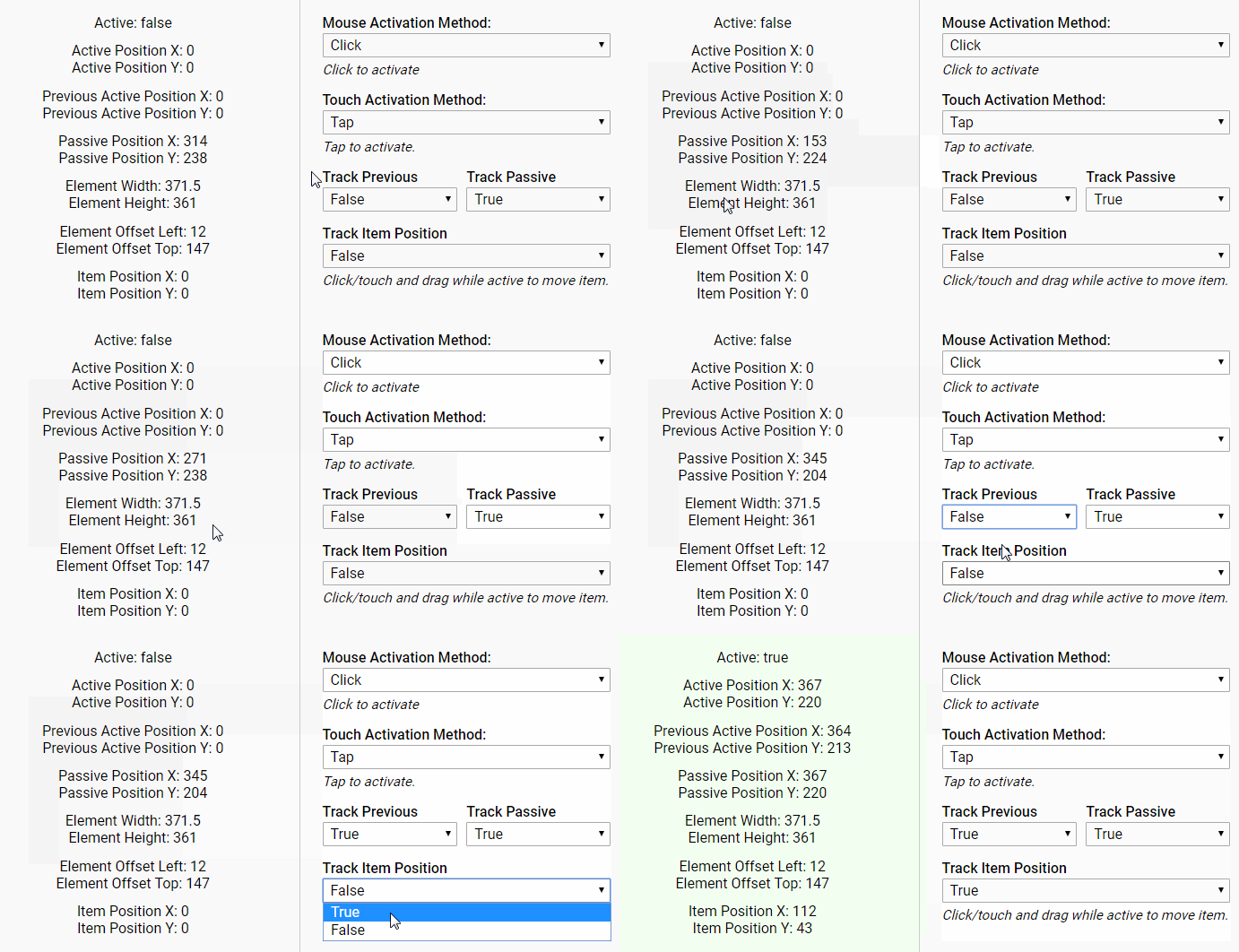
react-loadcon
React component to manipulate the favicon, as a loading or progress indicator, for now. The idea of "Favicon as DOM" is under construction.
Why bother?
When it comes to a huge file loading or download in a tab, a tiny progress indicator on favicon could be an interesting but also considerate UX experience. The idea comes from a long time ago and has been realized by so many open-source developers, and it comes back to me when try to solve this good first issue for the Mozilla Send.
So here is React-LoadCon for React community, now this tiny project can only use canvas to draw dynamic images and replace the tag, which is extremely tedious, but it plans to be a more general tool to offer Favicon as DOM. dom-to-img could be introduced to simplify the covert process.
? Installation
npm install --save react-loadcon
or
yarn add react-loadcon
Usage
Put <LoadCon /> anywhere, even in your SSR components (LoadCon would only trigger after componentDidMount).
<LoadCon percentage={this.state.percentage} />
Full example with async function, and show Success or Exception afterwards.
  import React, { Component } from 'react'
  import LoadCon from 'react-loadcon'

  export default class ExampleComponent extends Component {
    state = {
      percentage: 0,    // isRequired
      status: 'normal', // oneOf(['normal', 'active', 'exception', 'success'])
      type: 'pie',      // oneOf(['pie', 'donut'])
    }

    componentDidMount () {
      this.apiCall()
    }

    apiCall = () => {
      this.setState({ status: 'active' })
      fetch(url)
        .then(res => return res.json())
        .then(data => {
          // normal loading
          this.setState({ status: 'normal' })

          // loading with success
          this.setState({ status: 'success' })
          setTimeout(() => {
            this.setState({ status: 'normal' })
          }, 1500)
        })
        .catch(e => {
          this.setState({ status: 'exception' })
          setTimeout(() => {
            this.setState({ status: 'normal' })
          }, 1500)
        })
    }

    render () {
      return (
        <LoadCon
          percentage={this.state.percentage}
          status={this.state.status}
          type={this.state.type}
        />
      )
    }
  }
Props
| OPTION | TYPE | DEFAULT | DESCRIPTION |
|---|---|---|---|
| percentage | number |
0 |
the percentage of loading progress for LoadCon |
| type | oneOf(['pie', 'donut']) |
pie |
the theme of LoadCon, now has PieCon and DonutCon, and more themes will be added soon |
| status | oneOf(['normal', 'active', 'exception', 'success']) |
normal |
load status of LoadCon, normal reset to default favicon, active set LoadCon according to the type prop, exception set ErrorCon and success set SuccessCon. |
| color | string |
#25c639 |
color of loading indicator in hash format. |
| background | string |
#eee |
color of background in hash format. |
| shadow | string |
#fff |
color of 2 pixals border in hash format |
| donutWidth | number |
8 |
width of DonutCon indicator. |


