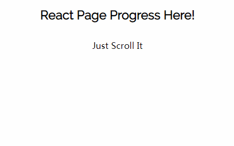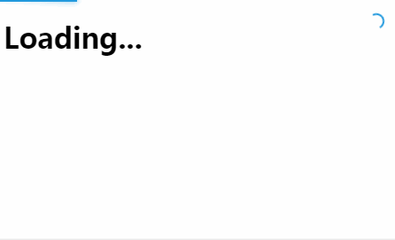
react-nprogress
A React primitive for building slim progress bars.
Background
This is a React port of rstacruz's nprogress module. It exposes an API that encapsulates the logic of nprogress and renders nothing, giving you complete control over rendering.
Usage
Render Props
import Bar from './Bar'
import Container from './Container'
import React from 'react'
import Spinner from './Spinner'
import { NProgress } from '@tanem/react-nprogress'
import { render } from 'react-dom'

render(
  <NProgress isAnimating>
    {({ animationDuration, isFinished, progress }) => (
      <Container animationDuration={animationDuration} isFinished={isFinished}>
        <Bar animationDuration={animationDuration} progress={progress} />
        <Spinner />
      </Container>
    )}
  </NProgress>,
  document.getElementById('root')
)
Container, Bar and Spinner are custom components. NProgress doesn't render anything itself, it just calls the render function and renders that:
<NProgress>
  {({/* parameters here */}) => (/* your render code here */)}
</NProgress>
HOC
import Bar from './Bar'
import Container from './Container'
import React from 'react'
import Spinner from './Spinner'
import { render } from 'react-dom'
import { withNProgress } from '@tanem/react-nprogress'

const Inner = ({ animationDuration, isFinished, progress }) => (
  <Container animationDuration={animationDuration} isFinished={isFinished}>
    <Bar animationDuration={animationDuration} progress={progress} />
    <Spinner />
  </Container>
)

const Enhanced = withNProgress(Inner)

render(<Enhanced isAnimating />, document.getElementById('root'))
Live Examples
- Original Design: Source | Sandbox
- HOC: Source | Sandbox
- React Router: Source | Sandbox
- Reach Router: Source | Sandbox
- Next Router: Source | Sandbox
- UMD Build (Development): Source | Sandbox
- UMD Build (Production): Source | Sandbox
API
Props
animationDuration- Optional Number indicating the animation duration inms. Defaults to200.incrementDuration- Optional Number indicating the length of time between progress bar increments inms. Defaults to800.isAnimating- Optional Boolean indicating if the progress bar is animating. Defaults tofalse.minimum- Optional Number between0and1indicating the minimum value of the progress bar. Defaults to0.08.
Render Props Example
<NProgress
  animationDuration={300}
  incrementDuration={500}
  isAnimating
  minimum={0.1}
>
  {({ animationDuration, isFinished, progress }) => (
    <Container animationDuration={animationDuration} isFinished={isFinished}>
      <Bar animationDuration={animationDuration} progress={progress} />
      <Spinner />
    </Container>
  )}
</NProgress>
HOC Example
const Inner = ({ animationDuration, isFinished, progress }) => (
  <Container animationDuration={animationDuration} isFinished={isFinished}>
    <Bar animationDuration={animationDuration} progress={progress} />
    <Spinner />
  </Container>
)

const Enhanced = withNProgress(Inner)

<Enhanced
  animationDuration={300}
  incrementDuration={500}
  isAnimating
  minimum={0.1}
/>
Installation
$ npm install @tanem/react-nprogress
There are also UMD builds available via unpkg:
- https://unpkg.com/@tanem/react-nprogress/umd/react-nprogress.development.js
- https://unpkg.com/@tanem/react-nprogress/umd/react-nprogress.production.min.js
For the non-minified development version, make sure you have already included:
For the minified production version, make sure you have already included: