react-malibu
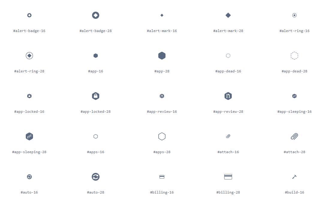
React components for using the Malibu SVG spritesheet.
Setup
yarn add @heroku/react-malibu- Make sure that the purple3 stylesheet is included in your website, or the fills will not work.
import { MalibuSprites, MalibuIcon } from '@heroku/react-malibu'- Profit!
Development
Clone the repo, then yarn install. If you want to see the demo server, run yarn start and visit http://localhost:3000 to browse the icons.
You cannot currently publish to NPM using yarn, because there are bugs.
See more in CONTRIBUTING.md.
Usage
This package offers two components: <MalibuSprites> and <MalibuIcon>.
<MalibuSprites>
Put this component on your page only once, it fetches and displays the entire spritesheet.
By default this will load the product sprites. To load the marketing sprites, add the set property.
<MalibuSprites set='marketing'/>
<MalibuIcon>
Use this component to instantiate an icon.
<MalibuIcon name='add-badge-16' size={20} fillClass='dark-gray' extraClasses='foo bar baz'/>
Properties
name(required): the name of the icon. See the full list at https://hk-malibu.herokuapp.com/.size(default: undefined): the desired rendering size in pixels. Note that most icons come in-16and-28pixel variants. Choose the appropriate variant for the scale you wish to render at — for example, if you're rendering an icon at 12px, use the-16icon as the base and12as thesize. If you do not specify a size, the icon's native size will be used.fillClass(default: purple): the desired icon fill. Must be one ofpurpledark-grayredorangegreenblue
extraClasses(optional): a string containing space-separated classnames to apply to the rendered<svg>element.
