React DatePicker
Flexible, Reusable, Mobile friendly DatePicker Component.

? Intro
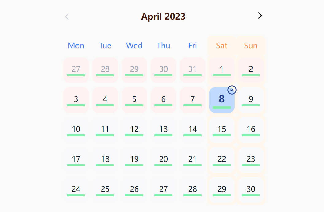
DatePicker

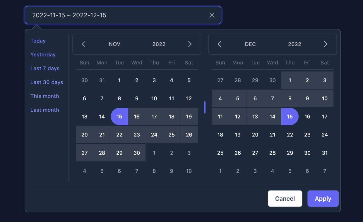
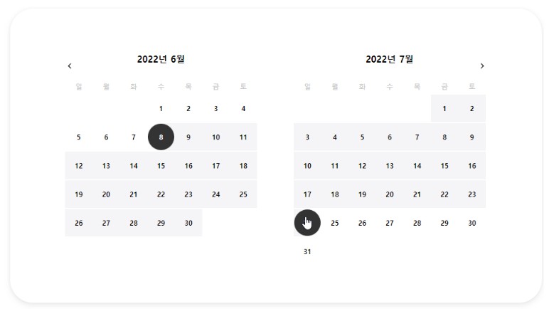
RangeDatePicker

TimePicker


✨ Major Component
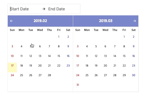
- RangeDatePicker
- DatePicker
- Standalone Calendar
- TimePicker
The components that you can use are as follows: If you want to configure the DatePicker yourself, you can configure it any way you want through the Default Calendar component.
? Built With
- TypeScript
- Sass
- React
? Dependency
Moment is a javascript library for Parse, validate, manipulate, and display dates and times. this component use moment library to globalize and control date. You can check the locale list through this link.
? Installation
yarn add @y0c/react-datepicker
# or
npm install --save @y0c/react-datepicker
? Examples
Simple DatePicker
// import Calendar Component
import React, { Component } from 'react';
import { DatePicker } from '@y0c/react-datepicker';
// import calendar style
// You can customize style by copying asset folder.
import '@y0c/react-datepicker/assets/styles/calendar.scss';

// Please include the locale you want to use.
// and delivery props to calendar component
// See locale list https://github.com/moment/moment/tree/develop/locale
import 'moment/locale/ko';

class DatePickerExample extends Component {

  onChange = (date) => {
    console.log(date);
  }

  render() {
    return (
      <DatePicker locale="ko" onChange={this.onChange}/>
    )
  }
}
You can find more Exmaples and Demo in story book link
? Themeing
- Copy this project asset folder under scss file
- Override scss variable you want(_variable.scss)
( red theme examples )
// red_theme.scss
$base-font-size: 12px;
$title-font-size: 1.3em;

// override scss variable
$primary-color-dark: #e64a19;
$primary-color: #ff5722;
$primary-color-light: #ffccbc;
$primary-color-text: #ffffff;
$accent-color: #ff5252;
$primary-text-color: #212121;
$secondary-text-color: #757575;
$divider-color: #e4e4e4;
$today-bg-color: #fff9c4;

// import mixin
@import "../node_modules/@y0c/react-datepicker/assets/styles/_mixin.scss";
// import app scss
// if you want other style customize
// app.scss copy & rewrite !
@import "../node_modules/@y0c/react-datepicker/assets/styles/app.scss";
if you want custom css rewrite app.scss file
Try this example!
⚙️ Local Development
This component is managed by a storybook which is combined with develop environment and documentation. If you want develop in local environment, clone project and develop through a storybook
# clone this project
git clone https://github.com/y0c/react-datepicker.git
# install dependency
yarn
# start storybook
yarn run storybook
Open your browser and connect http://localhost:6006