react-fonticonpicker
React FontIconPicker Component to pick icon or SVG from a selection.
A react version of fontIconPicker. This is rewritten and is not a wrapper around jQuery version.
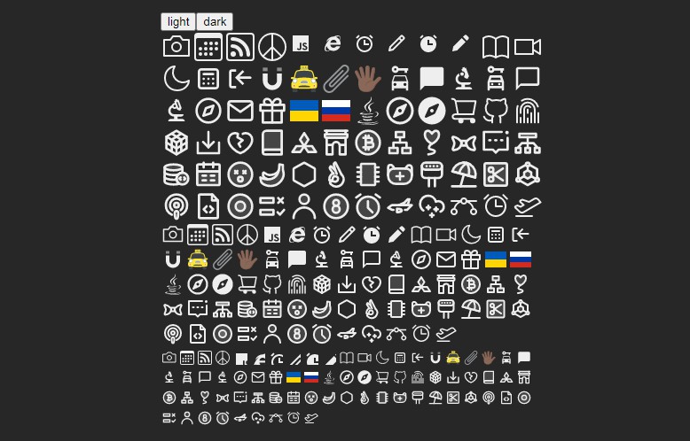
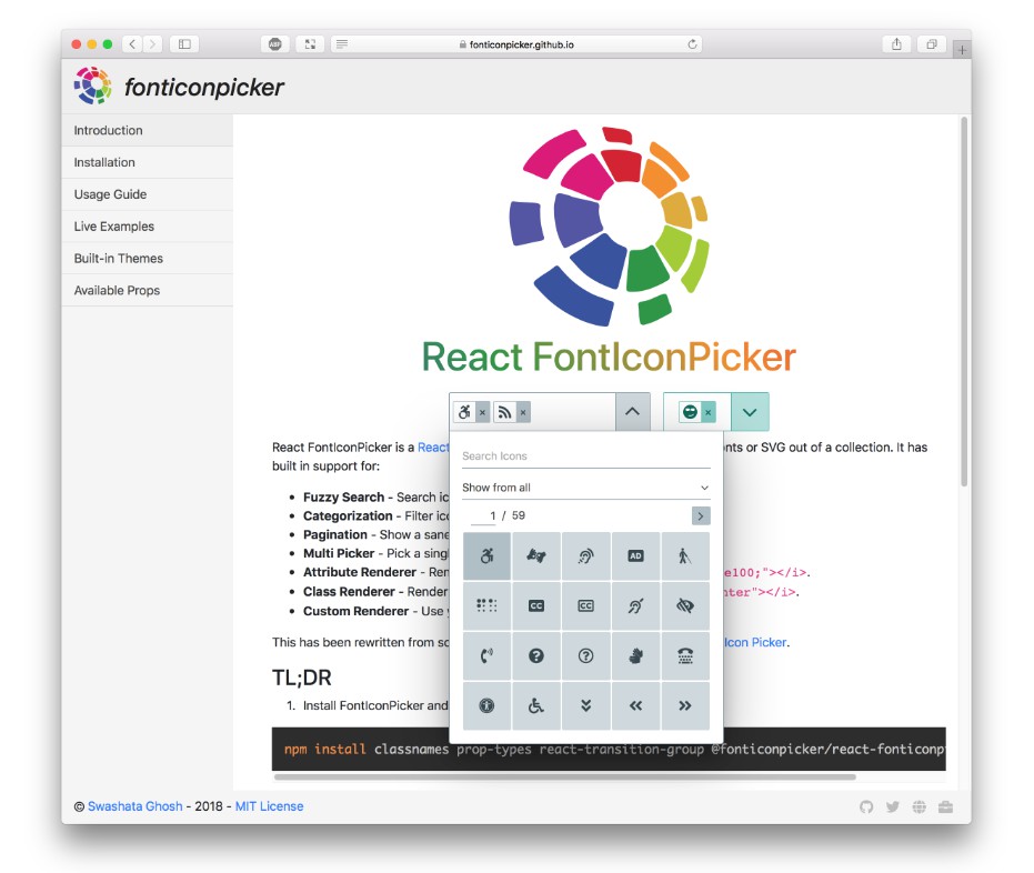
With FontIconPicker component you can present an UI where people can pick one or more fonts. In bare-bone it looks like this.
Installation
NPM or YARN
NPM is the preferred way of installation. You can find it from here.
From your project do
npm i @fonticonpicker/react-fonticonpicker
Also install the peer dependencies yourself.
npm i react react-dom classnames prop-types react-transition-group
And require the file.
ES6
import FontIconPicker from '@fonticonpicker/react-fonticonpicker';
ES5
const FontIconPicker = require('@fonticonpicker/react-fonticonpicker');
And use it as React Component. Check the documentation site for more example.
CDN
For some reason, if you'd prefer the CDN, then it is available at unpkg.com.
Place them in your HTML document, along with UMD builds of peer dependencies.
Download Source
We distribute production version of source file through github releases. Head over there
and download fonticonpicker.react.zip file.
Usage
Here is an example for use with the create-react-app.
From your project directory do:
yarn add classnames prop-types react-transition-group @fonticonpicker/react-fonticonpicker
Now edit your App.js file to include the following.
import React, { Component } from 'react';
import FontIconPicker from '@fonticonpicker/react-fonticonpicker';
import logo from './logo.svg';
import './App.css';
import '@fonticonpicker/react-fonticonpicker/dist/fonticonpicker.base-theme.react.css';
import '@fonticonpicker/react-fonticonpicker/dist/fonticonpicker.material-theme.react.css';

class App extends Component {
  constructor(props) {
    super(props);
    this.state = {
      value: 'fipicon-angle-left',
    };
  }
  handleChange = (value) => {
    this.setState({ value });
  }
  render() {
    const props = {
      icons: ['fipicon-angle-left', 'fipicon-angle-right', 'fipicon-angle-up', 'fipicon-angle-down'],
      theme: 'bluegrey',
      renderUsing: 'class',
      value: this.state.value,
      onChange: this.handleChange,
      isMulti: false,
    };
    return (
      <div className="App">
        <header className="App-header">
          <img src={logo} className="App-logo" alt="logo" />
          <h1 className="App-title">Welcome to React</h1>
        </header>
        <FontIconPicker {...props} />
      </div>
    );
  }
}

export default App;
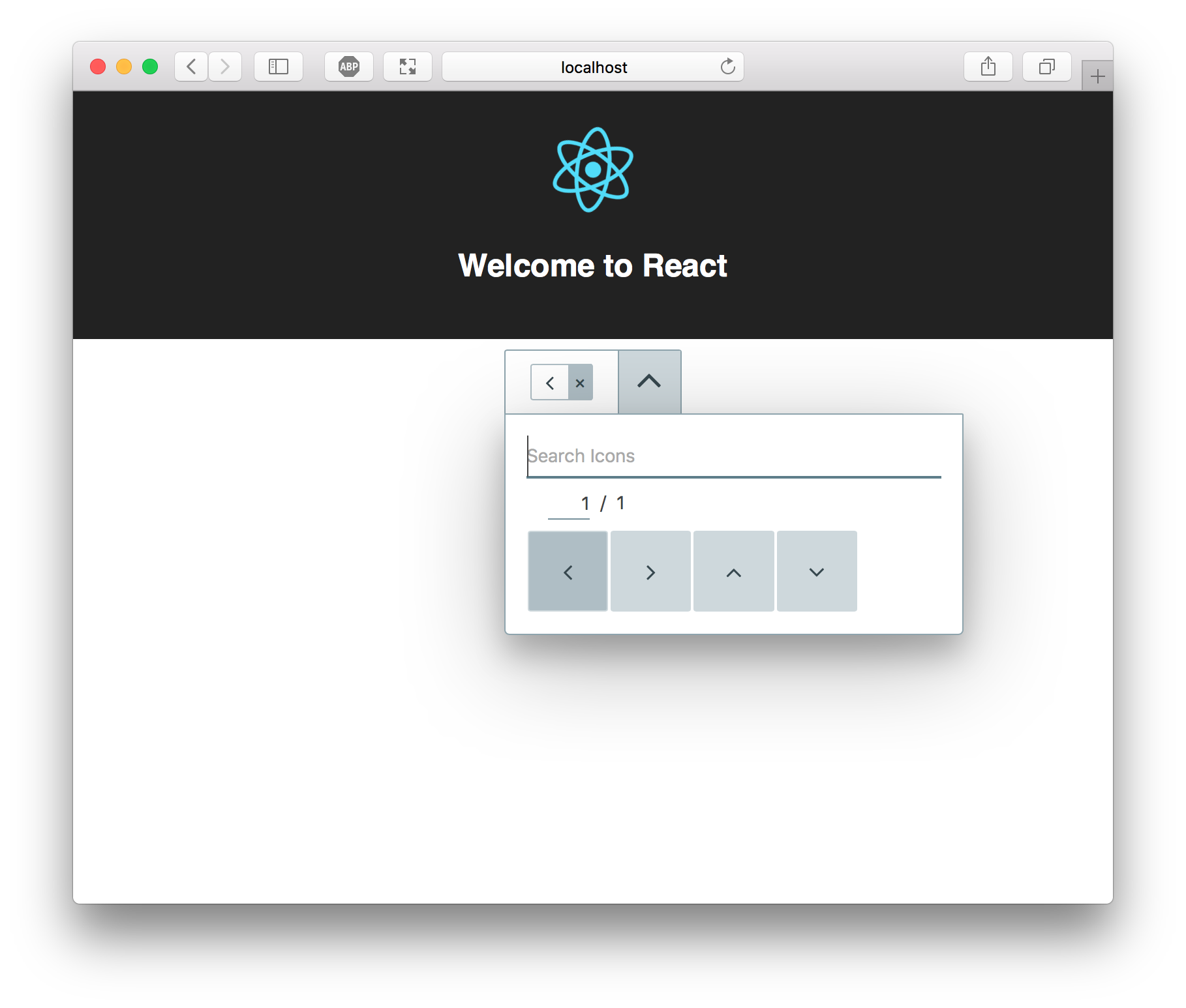
This will render a basic FontIconPicker component. For advanced usage, follow
the documentation.
Props
| Prop | Type | Required | Default |
|---|---|---|---|
| icons | object of array or array |
yes | N/A |
| onChange | func |
yes | N/A |
| search | object of array or array |
no | null |
| iconsPerPage | number | no | 20 |
| theme | string |
no | 'default' |
| showCategory | bool |
no | true |
| showSearch | bool |
no | true |
| value | array or string |
no | null |
| isMulti | bool |
no | false |
| renderUsing | string |
no | 'class' |
| convertHex | bool |
no | true |
| renderFunc | func |
no | null |
| appendTo | string |
no | false |
| allCatPlaceholder | string |
no | 'Show from all' |
| searchPlaceholder | string |
no | 'Search Icons' |
| noIconPlaceholder | string |
no | 'No icons found' |
| noSelectedPlaceholder | string |
no | 'Select icon' |
Development Environment
Development & Build is done with the help of webpack.
First fork and git clone the repo on your machine.
git clone [email protected]:<username>/react-fonticonpicker.git
Now install all the dependencies. Make sure you have nodejs
version 9 or higher.
npm install
Now run the server with
npm start
This will open a webpack dev server with hot reload. You can access the server
from http://localhost:7770.
Now make changes in the component and see it live. Also add unit tests and
integration tests where applicable.
If your changes invalidates snapshots, then make sure to update them too (with
good reasons).
When doing a PR, try not to build the docs or the dist. It will create unnecessary
merge conflict.
Other npm commands at disposal:
npm run test: Runseslintfollowed bystylelintandjesttests.npm run start: Runs a dev server with hot reload.npm run docs: Builds the docs for production.npm run build: Builds the UMD & CSS files for distribution.