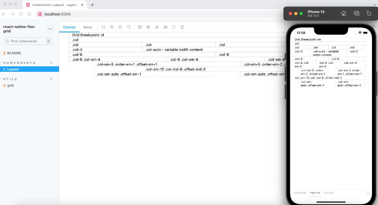
react-grid-system
React Grid System component.
Installation
- Install the latest version of react and react-grid-system:
npm install --save react @trendmicro/react-grid-system
- At this point you can import
@trendmicro/react-grid-systemand its styles in your application as follows:
import {
    Provider as GridSystemProvider,
    Container, Row, Col,
    Visible, Hidden
} from '@trendmicro/react-grid-system';

// Be sure to include styles at some point, probably during your bootstraping
import '@trendmicro/react-grid-system/dist/react-grid-system.css';
Recommended Setup
Create a common components directory including the GridSystem component, as shown below:
components/
  GridSystem/
    index.js
components/GridSystem/index.js
import '@trendmicro/react-grid-system/dist/react-grid-system.css';
export {
      Provider,
      Container, Row, Col,
      Visible, Hidden
} from '@trendmicro/react-grid-system';
Then, import components like below:
import {
      Provider as GridSystemProvider,
      Container, Row, Col,
      Visible, Hidden
} from './components/GridSystem';
Usage
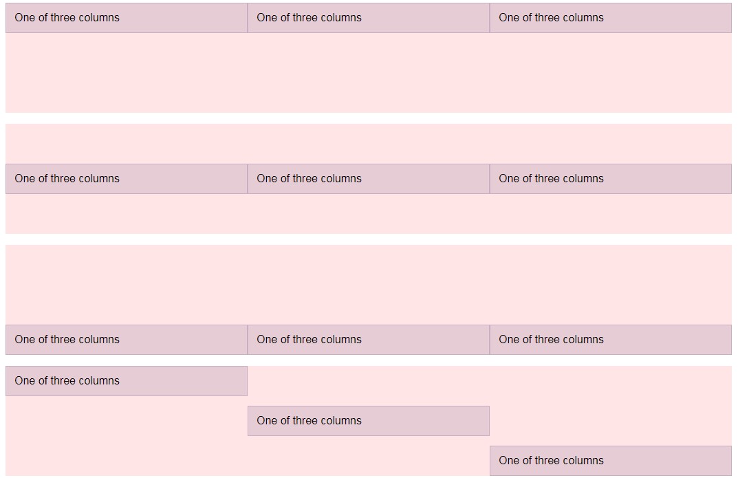
<Container fluid gutterWidth={0}>
    <Row>
        <Col xs md={8}>col-md-8</Col>
        <Col width={6} md={4}>col-6 col-md-4</Col>
    </Row>
    <Row>
        <Col width={6} md={4}>col-6 col-md-4</Col>
        <Col width={6} md={4}>col-6 col-md-4</Col>
        <Col width={6} md={4}>col-6 col-md-4</Col>
    </Row>
    <Row>
        <Col width={6}>col-6</Col>
        <Col width={6}>col-6</Col>
    </Row>
</Container>
Provider
You can wrap <Container />, <Row />, and <Col /> in <Provider /> to pass grid system config through context.
<Provider
    breakpoints={[576, 768, 992, 1200, 1600]}
    containerWidths={[540, 720, 960, 1140, 1440]}
    columns={12}
    gutterWidth={0}
    layout="flexbox"
>
    <Container fluid>
        <Row>
            <Col>col</Col>
            <Col>col</Col>
            <Col>col</Col>
        </Row>
    </Container>
    <Container
        fluid
        columns={24}
        gutterWidth={30}
        layout="floats"
    >
        <Row>
            <Col>col</Col>
            <Col>col</Col>
        </Row>
    </Container>
</Provider>
Responsive Utilities
Use responsive utilities for showing and hiding content based on current viewport.
Hidden
Make an element hidden when the viewport is at the given breakpoint.
<Hidden xs sm>
    Hidden on extra small and small
</Hidden>
<Hidden md lg>
    Hidden on medium and large
</Hidden>
Visible
Make an element visible when the viewport is at the given breakpoint.
<Visible xs>
    Visible on extra small
</Visible>
<Visible sm>
    Visible on small
</Visible>
<Visible md>
    Visible on medium
</Visible>
<Visible lg>
    Visible on large
</Visible>
<Visible xl>
    Visible on extra large
</Visible>
<Visible xxl>
    Visible on double extra large
</Visible>
ScreenClass
Render content based on the screen class.
<ScreenClass>
    {screenClass => <div>{screenClass}</div>}
</ScreenClass>
<ScreenClass
    render={screenClass => <div>{screenClass}</div> }
/>
API
Properties
Provider
| Name | Type | Default | Description |
|---|---|---|---|
| breakpoints | Number[] | [576, 768, 992, 1200, 0] | The breakpoints (minimum width) of devices in screen class sm, md, lg, xl, and xxl. |
| containerWidths | Number[] | [540, 720, 960, 1140, 0] | The container widths in pixels of devices in screen class sm, md, lg, xl, and xxl. |
| columns | Number | 12 | The number of columns. |
| gutterWidth | Number | 0 | The horizontal padding (called gutter) between two columns. A gutter width of 30 means 15px on each side of a column. |
| layout | One of: 'flexbox' 'floats' |
'flexbox' | The grid system layout. |
Container
| Name | Type | Default | Description |
|---|---|---|---|
| fluid | Boolean | false | True makes the container full-width, false fixed-width. |
| xs | Boolean | false | True makes container fluid only in xs, not present means fluid everywhere. |
| sm | Boolean | false | True makes container fluid only in sm, not present means fluid everywhere. |
| md | Boolean | false | True makes container fluid only in md, not present means fluid everywhere. |
| lg | Boolean | false | True makes container fluid only in lg, not present means fluid everywhere. |
| xl | Boolean | false | True makes container fluid only in xl, not present means fluid everywhere. |
| xxl | Boolean | false | True makes container fluid only in xxl, not present means fluid everywhere. |
| columns | Number | inherited | The number of columns. |
| gutterWidth | Number | inherited | The horizontal padding (called gutter) between two columns. A gutter width of 30 means 15px on each side of a column. |
| layout | One of: 'flexbox' 'floats' |
inherited | The grid system layout. |
Row
| Name | Type | Default | Description |
|---|
Col
| Name | Type | Default | Description |
|---|---|---|---|
| width | Number or 'auto' | The width of the column for all screen classes. Note: 'auto' is only supported with the flexbox layout. |
|
| xs | Number, Boolean or 'auto' | The width of the column for screen class xs.Note: 'auto' and true are only supported with the flexbox layout. |
|
| sm | Number, Boolean or 'auto' | The width of the column for screen class sm.Note: 'auto' and true are only supported with the flexbox layout. |
|
| md | Number, Boolean or 'auto' | The width of the column for screen class md.Note: 'auto' and true are only supported with the flexbox layout. |
|
| lg | Number, Boolean or 'auto' | The width of the column for screen class lg.Note: 'auto' and true are only supported with the flexbox layout. |
|
| xl | Number, Boolean or 'auto' | The width of the column for screen class xl.Note: 'auto' and true are only supported with the flexbox layout. |
|
| xxl | Number, Boolean or 'auto' | The width of the column for screen class xxl.Note: 'auto' and true are only supported with the flexbox layout. |
|
| offset | { xs, sm, md, lg, xl, xxl } | The offset of this column for all screen classes. | |
| pull | { xs, sm, md, lg, xl, xxl } | The amount this column is pulled to the left for all screen classes. | |
| push | { xs, sm, md, lg, xl, xxl } | The amount this column is pushed to the right for all screen classes. |
Visible
| Name | Type | Default | Description |
|---|---|---|---|
| xs | Boolean | false | Visible on extra small devices. |
| sm | Boolean | false | Visible on small devices. |
| md | Boolean | false | Visible on medimum devices. |
| lg | Boolean | false | Visible on large devices. |
| xl | Boolean | false | Visible on extra large devices. |
| xxl | Boolean | false | Visible on double extra large devices. |
Hidden
| Name | Type | Default | Description |
|---|---|---|---|
| xs | Boolean | false | Hidden on extra small devices. |
| sm | Boolean | false | Hidden on small devices. |
| md | Boolean | false | Hidden on medimum devices. |
| lg | Boolean | false | Hidden on large devices. |
| xl | Boolean | false | Hidden on extra large devices. |
| xxl | Boolean | false | Hidden on double extra large devices. |
ScreenClass
| Name | Type | Default | Description |
|---|---|---|---|
| render | Function(screenClass) | The render function that returns a React element. |
