Plx - React Parallax component
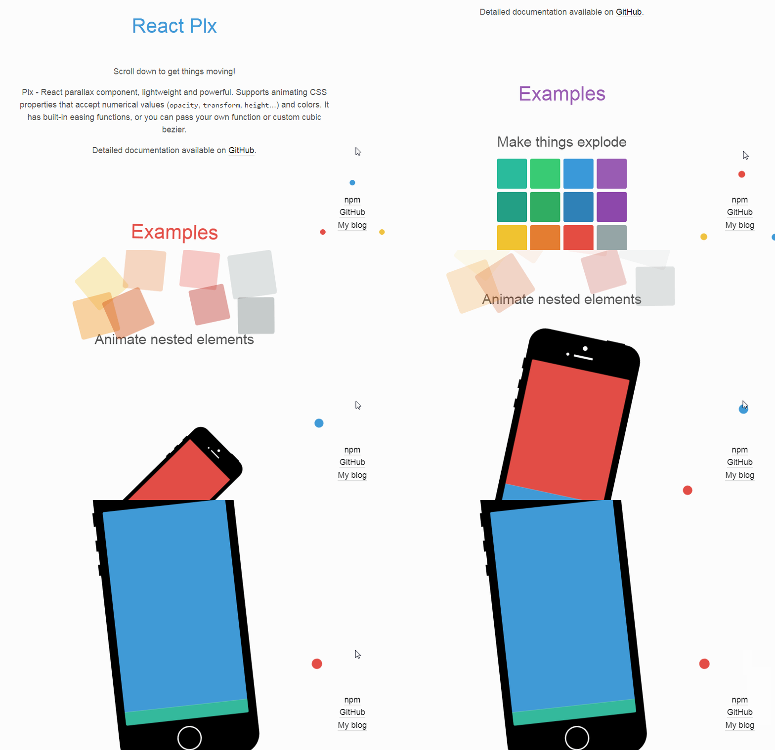
Plx - React parallax component, lightweight and powerful. Supports animating CSS properties that accept numerical values (opacity, transform, height...) and colors. It has built-in easing functions, or you can pass your own function or custom cubic bezier.
React component, for creating on scroll effects aka. parallax.
Lightweight, yet powerful.
-
v1.0.0 introduced breaking changes
startanddurationare reworked, andendprop is introduced.
Check updated parallaxData documentation.
Quick start
Get it from npm
$ npm install --save react-plx
Import and use it in your React app.
import React, { Component } from 'react';
import Plx from 'react-plx';

class Example extends Component {
  render() {
    return (
      <Plx
        className='MyAwesomeParallax'
        parallaxData={ ... } // your parallax effects, see beneath
      >
        /* Your content */
      </Plx>
    );
  }
}
Table of contents
What is this?
This is React component which makes creating on scroll effects (aka parallax) easy. If you are not sure what it does, demo should help.
It is lightweight, and beside react, react-dom and prop-types has no dependencies, now it has small bezier-easing package. As listening to scroll event is not performant, this component uses different approach. Interval is set (every 16ms to get 60fps) to check if scroll position is changed, and if it is, it broadcasts custom event. All of the Plx components are sharing the scroll manager singleton. Interval is set when the first component is created, and cleared when last one is unmounted. Interval time can be changed through the props, but it is shared across the components.
Elements outside of viewport are not animated. This is done by using getBoundingClientRect, but there is a known bug in iOS with getBoundingClientRect and position fixed. If you get into the same problems, you can force rendering by passing animateWhenNotInViewport={ true }.
Still you need to avoid common "don't dos" when making a parallax page:
- Avoid
background-size: cover - Don’t animate massive images or dramatically resize them
- Avoid animating 100 things at once
- Only use properties that are cheap for browsers to animate - opacity and transform (translate, rotate, skew, scale)
Read this great article to find out more (that is where I got my initial inspiration).
Of course, you can break any of these rules, but test for performance to see if it works for you.
Component is written as ES module, so it will work with webpack and other module bundlers (which is standard for React apps anyway). Tested with react-create-app and my boilerplate, Marvin.
Read more about how it works in this blog post.
Props
-
className string
CSS class name (it will be applied along with
Plxclass name). -
style object
CSS style object, please note that properties used in parallax will be overridden by component.
-
tagName string, default
divHTML tag to be used for wrapper element.
-
animateWhenNotInViewport bool, default
falseIf set to true element will be animated even when it is not in the viewport.
This is helpful with fixed elements in iOS due to know bug withgetBoundingClientRectin iOS. -
disabled boolean
When
truedisabled animation completely. -
freeze bool, default
falseWhen
trueanimation will be stopped at current state when condition is met. -
parallaxData array of items (item structure described beneath), required
Main data, describes parallax segments.
Any other props will be passed to the component (for example this is useful for aria-* props).
parallaxData
-
start number, string, HTMLElement, required
Scroll position where parallax effect should start.
Can one of the following:- Number - value in pixels
- String
- Value in px, vh or % (
50px,50%,25vh). Percentage is calculated out of max page scroll. - CSS Selector (
.my-element,#some-id) to be used withdocument.querySelector. "self"component's element will be used
- Value in px, vh or % (
HTMLElement, given element will be used.
For element, selector and "self" animation will start when that element enters the viewport. You can use
startOffsetprop to offset start position.Example:
start: 100 // starts when scroll hits 100px
start: 'self' // starts when plx's element enters the viewport
start: '.start-element' // starts when .start-element enters the viewport
PLEASE NOTE that
parallaxDatashould be sorted bystartvalue! -
end number, string, HTMLElement
Scroll position where parallax effect should end.
It has higher priority thanduration.
Can one of the following:- Number - value in pixels
- String
- Value in px, vh or % (
50px,50%,25vh). Percentage is calculated out of max page scroll. - CSS Selector (
.my-element,#some-id) to be used withdocument.querySelector. "self"component's element will be used
- Value in px, vh or % (
HTMLElement, given element will be used.
For element, selector and "self" animation will end when that element enters the viewport. You can use
endOffsetprop to offset end position.Example:
end: 300 // ends when scroll hits 300px end: 'self' // ends when plx's element enters the viewport end: '.end-element' // ends when .end-element enters the viewport -
duration number, string, HTMLElement
How long should effect last (it will finish
when scroll position equalsstart+duration).
It will be used ifendis not defined.
Can one of the following:- Number - value in pixels
- String
- Value in px, vh or % (
50px,50%,25vh). Percentage is calculated out of max page scroll. - CSS Selector (
.my-element,#some-id) to be used withdocument.querySelector.
- Value in px, vh or % (
HTMLElement, given element will be used.
For element and selecto animation will start when that element enters the viewport. You can use
startOffsetprop to offset start.Any other string will be considered CSS selector
and it will be used withdocument.querySelector.
Animation will stop when animated element hits top
of the element passed as duration prop.Example:
duration: 300 // animation will last for 300px duration: '.duration-element' // animation will last for .duration-element's height -
startOffset number, string
Start offset, can be a number or string value in px, vh or % (
50px,50%,25vh). -
endOffset number, string
End offset, can be a number or string value in px, vh or % (
50px,50%,25vh). -
easing string, function or array, default: 'linear'
Easing function, you can pass the name (string) to choose one of the built-in functions.
Built-in easing functions are:- ease
- easeIn
- easeOut
- easeInOut
- easeInSine
- easeOutSine
- easeInOutSine
- easeInQuad
- easeOutQuad
- easeInOutQuad
- easeInCubic
- easeOutCubic
- easeInOutCubic
- easeInQuart
- easeOutQuart
- easeInOutQuart
- easeInQuint
- easeOutQuint
- easeInOutQuint
- easeInExpo
- easeOutExpo
- easeInOutExpo
- easeInCirc
- easeOutCirc
- easeInOutCirc
Cubic beziers are supported, pass an array to it with four points of your custom bezier (you can copy CSS beziers).
easing: [0.25, 0.1, 0.53, 3]You can even pass custom function which accepts one argument, which will be number from 0 to 1.
// Define your custom easing const myCustomEasing = (x) => { return x * x; }; ... // and then pass it to Plx easing: myCustomEasing -
name string (without spaces)
Name used in animation state CSS classes
-
properties array of items (item structure described beneath), required
List of properties to be animated
properties
-
property string, required
CSS property to be animated, works only on properties which accept numerical values (e.g.
opacity,height...).
Fortransformuse function names instead (e.g.translateX,scale,rotate...).
Same goes for filters.Supported transform functions are:
- translateX
- translateY
- translateZ
- skew
- skewX
- skewY
- skewZ
- rotate
- rotateX
- rotateY
- rotateZ
- scale
- scaleX
- scaleY
- scaleZ
Supported colors are:
- backgroundColor
- borderBottomColor
- borderColor
- borderLeftColor
- borderRightColor
- borderTopColor
- color
- fill
- strokeColor
Supported CSS filters are:
- blur
- brightness
- contrast
- grayscale
- hueRotate
- invert
- opacityFilter (as it shares the same name as CSS
opacity) - saturate
- sepia
To keep you parallax effects performant, I strongly advice not to use anything but opacity and transforms.
Some filters should be cheap as well, withblurbeing the most expensive out of supported filters. -
startValue number (or string for color), required
Start value for the effect. Property will have this value when scroll position equals
parallaxData.start.
For colors supported formats are:#123,#001122,rgb(0,0,255)andrgba(0,0,255,0.5). -
endValue number (or string for color), required
End value for the effect. Property will have this value when scroll position equals
parallaxData.end.
For colors supported formats are:#123,#001122,rgb(0,0,255)andrgba(0,0,255,0.5).Between
parallaxData.startandparallaxData.endvalue will transition relative to scroll position. -
unit string
CSS unit (e.g.
%,rem,em...) to be applied to property value. By default component is using pixels and degrees for rotation and skew.
Example of props
These are the exact props used in this example.
const exampleParallaxData = [
  {
    start: 0,
    end: 300,
    properties: [
      {
        startValue: 0,
        endValue: 90,
        property: "rotate"
      },
      {
        startValue: 1,
        endValue: 1.5,
        property: "scale"
      },
      {
        startValue: 1,
        endValue: 0.75,
        property: "opacity"
      }
    ]
  },
  {
    start: 350,
    duration: 300,
    properties: [
      {
        startValue: "#3cb99c",
        endValue: "rgba(50,50,200,0.8)",
        property: "backgroundColor"
      },
      {
        startValue: 0,
        endValue: 100,
        property: "translateY"
      },
      {
        startValue: 0.75,
        endValue: 1,
        property: "opacity"
      }
    ]
  },
  {
    start: 700,
    duration: 1000,
    properties: [
      {
        startValue: 100,
        endValue: 0,
        property: "translateY"
      },
      {
        startValue: 1.5,
        endValue: 2,
        property: "scale"
      },
      {
        startValue: 90,
        endValue: 0,
        property: "rotate"
      },
      // Blur is not performant
      // Used just as an example for CSS filters
      {
        startValue: 0,
        endValue: 20,
        property: "blur"
      }
    ]
  }
];
Animation state CSS classes
Component will also apply CSS classes that match current animation state.
Classes are:
-
Plx--above
scroll position is above first start position (animation isn't started yet) -
Plx--above
scroll position is below last end position (animation is finished) -
Plx--active
scroll position is below first start and last end position (animation is in progress, including between states) -
Plx--in Plx--in-{n}
scroll position is inn-th segment (Plx--in-0,Plx--in-1...).
Ifnameprop is passed (see above) it will be used instead of index (Plx--in-superDuperName). -
Plx--between Plx--between-{a}-and-{b}
scroll position is between segmentsaandb(Plx--between-0-and-1,Plx--between-1-and-2...)
Ifnameprop is passed (see above) it will be used instead of index (Plx--between-superDuperName-and-anotherName).
active class is applied along with both in and between classes.
Browser support
Modern browsers and IE10+.
IE9 should work if you provide a polyfill for requestAnimationFrame. But I'm not supporting IE9.
