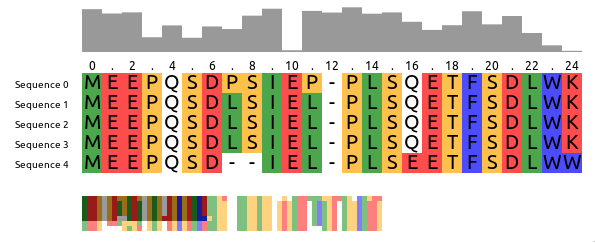
react-msa-viewer
react-msa-viewer is a performant, extendable, highly-customizable, production-ready React Component that renders a Multiple Sequence Alignment (MSA).
WARNING: Work in progress - use with caution
Getting started
import MSAViewer from '@plotly/react-msa-viewer';

function MSA() {
  const options = {
    sequences: [
      {
        name: "seq.1",
        sequence: "MEEPQSDPSIEP-PLSQETFSDLWKLLPENNVLSPLPS-QA-VDDLMLSPDDLAQWLTED"
      },
      {
        name: "seq.2",
        sequence: "MEEPQSDLSIEL-PLSQETFSDLWKLLPPNNVLSTLPS-SDSIEE-LFLSENVAGWLEDP"
      },
      {
        name: "seq.3",
        sequence: "MEEPQSDLSIEL-PLSQETFSDLWKLLPPNNVLSTLPS-SDSIEE-LFLSENVAGWLEDP"
      },
    ],
    colorScheme: "zappo",
  };
  return (
    <MSAViewer {...options} />
  );
}
Installation
For npm users, run:
npm i --save @plotly/react-msa-viewer
For yarn users, run:
yarn add @plotly/react-msa-viewer
Use your own layout
<MSAViewer> acts a Context Provider for all MSA subcomponents.
Hence, it will automatically take care of synchronization between all MSA components in its tree:
import {
  Labels,
  MSAViewer,
  OverviewBar,
  PositionBar,
  SequenceOverview,
  SequenceViewer,
} from '@plotly/react-msa-viewer';

function MSA() {
  const options = {
    sequences: [
      {
        name: "seq.1",
        sequence: "MEEPQSDPSIEP-PLSQETFSDLWKLLPENNVLSPLPS-QA-VDDLMLSPDDLAQWLTED"
      },
      {
        name: "seq.2",
        sequence: "MEEPQSDLSIEL-PLSQETFSDLWKLLPPNNVLSTLPS-SDSIEE-LFLSENVAGWLEDP"
      },
      {
        name: "seq.3",
        sequence: "MEEPQSDLSIEL-PLSQETFSDLWKLLPPNNVLSTLPS-SDSIEE-LFLSENVAGWLEDP"
      },
    ],
  };
  return (
    <MSAViewer {...options}>
      <SequenceOverview method="information-content"/>
      <div style={{display: "flex"}} >
        <div>
          <SequenceViewer/>
          <br/>
          <OverviewBar/>
          <PositionBar/>
        </div>
        <Labels/>
      </div>
    </MSAViewer>
  );
}
Usage in Vanilla JS
Using the react-msa-viewer with React is highly recommended.
However, it can be used in Vanilla JS:
<html>
<meta charset="utf-8" />
<script src="https://cdnjs.cloudflare.com/ajax/libs/react/15.4.2/react.min.js"></script>
<script src="https://cdnjs.cloudflare.com/ajax/libs/react-dom/15.4.2/react-dom.min.js"></script>
<script src="https://cdnjs.cloudflare.com/ajax/libs/prop-types/15.5.2/prop-types.js"></script>
<script src="https://unpkg.com/@plotly/react-msa-viewer/dist/index.umd.min.js"></script>
<body>
  <div id="my-msa" />
  <script>
  var options = {
    sequences: [
      {
        name: "seq.1",
        sequence: "MEEPQSDPSIEP-PLSQETFSDLWKLLPENNVLSPLPS-QA-VDDLMLSPDDLAQWLTED"
      },
      {
        name: "seq.2",
        sequence: "MEEPQSDLSIEL-PLSQETFSDLWKLLPPNNVLSTLPS-SDSIEE-LFLSENVAGWLEDP"
      },
      {
        name: "seq.3",
        sequence: "MEEPQSDLSIEL-PLSQETFSDLWKLLPPNNVLSTLPS-SDSIEE-LFLSENVAGWLEDP"
      },
    ],
    colorScheme: "zappo",
   };
  ReactDOM.render(
    React.createElement(ReactMSAViewer.MSAViewer, options),
    document.getElementById('my-msa')
  );
  </script>
</body>
</html>
See an example on CodePen.
Props
Warning: these properties are still susceptible to a change at any moment.
MSAViewer (component)
A general-purpose layout for the MSA components
When children are passed it acts as a Context Provider for the msaStore,
otherwise it provides a default layout and forwards it props the respective
components.
Props
barAttributes
Attributes to apply to each bar.
type: object
barFillColor
Fill color of the OverviewBar, e.g. #999999
type: string
barMethod
Method to use for the OverviewBar:
information-content: Information entropy after Shannon of a column (scaled)conservation: Conservation of a column (scaled)
type: enum('information-content'|'conservation')
barStyle
Inline styles to apply to each bar.
type: object
colorScheme
Colorscheme to use. Currently the follow colorschemes are supported:
buried_index, clustal, clustal2, cinema, helix_propensity, hydro,
lesk, mae, nucleotide, purine_pyrimidine, strand_propensity, taylor,
turn_propensity, and zappo.
See msa-colorschemes for details.
type: custom
height
Height of the sequence viewer (in pixels), e.g. 500.
type: number
labelAttributes
Attributes to apply to each label.
type: object
labelComponent
Component to create labels from.
type: union(object|func)
labelStyle
Inline styles to apply to each label.
type: object
layout
Predefined layout scheme to use (only used when no child elements are provided).
Available layouts: basic, inverse, full, compact, funky
type: enum('basic'|'default'|'inverse'|'full'|'compact'|'funky')
markerAttributes
Attributes to apply to each marker.
type: object
markerComponent
Component to create markers from.
type: union(object|func)
markerStartIndex
At which number the PositionBar marker should start counting.
Typical values are: 1 (1-based indexing) and 0 (0-based indexing).
type: number
markerSteps
At which steps the position labels should appear, e.g. 2 for (1, 3, 5)
type: number
markerStyle
Inline styles to apply to each marker.
type: object
msaStore
A custom msaStore (created with createMSAStore).
Useful for custom interaction with other components
type: object
onResidueClick
Callback fired when the mouse pointer clicked a residue.
type: func
onResidueDoubleClick
Callback fired when the mouse pointer clicked a residue.
type: func
onResidueMouseEnter
Callback fired when the mouse pointer is entering a residue.
type: func
onResidueMouseLeave
Callback fired when the mouse pointer is leaving a residue.
type: func
position
Current x and y position of the viewpoint
in the main sequence viewer (in pixels).
This specifies the position of the top-left corner
of the viewpoint within the entire alignment,
e.g. {xPos: 20, yPos: 5}.
type: custom
sequenceBorder
Whether to draw a border.
type: bool
sequenceBorderColor
Color of the border. Name, hex or RGB value.
type: string
sequenceBorderWidth
Width of the border.
type: number
sequenceOverflow
What should happen if content overflows.
type: enum("hidden"|"auto"|"scroll")
sequenceOverflowX
What should happen if x-axis content overflows (overwrites "overflow")
type: enum("hidden"|"auto"|"scroll"|"initial")
sequenceOverflowY
What should happen if y-axis content overflows (overwrites "overflow")
type: enum("hidden"|"auto"|"scroll"|"initial")
sequenceScrollBarPositionX
X Position of the scroll bar ("top or "bottom")
type: enum("top"|"bottom")
sequenceScrollBarPositionY
Y Position of the scroll bar ("left" or "right")
type: enum("left"|"right")
sequenceTextColor
Color of the text residue letters (name, hex or RGB value)
type: string
sequenceTextFont
Font to use when drawing the individual residues.
type: string
sequences (required)
Sequence data.
sequences expects an array of individual sequences.
sequence: Raw sequence, e.g. MEEPQSDPSIEP (required)
name: name of the sequence, e.g. Sequence X
Example:
const sequences = [
  {
    name: "seq.1",
    sequence: "MEEPQSDPSIEP-PLSQETFSDLWKLLPENNVLSPLPS-QA-VDDLMLSPDDLAQWLTED",
  },
  {
    name: "seq.2",
    sequence: "MEEPQSDLSIEL-PLSQETFSDLWKLLPPNNVLSTLPS-SDSIEE-LFLSENVAGWLEDP",
  },
];
type: arrayOf[SequencePropType]
tileHeight
Height of the main tiles (in pixels), e.g. 20
type: number
tileWidth
Width of the main tiles (in pixels), e.g. 20
type: number
width
Width of the sequence viewer (in pixels), e.g. 500.
type: number
Labels (component)
Displays the sequence names.
Props
cacheElements
defaultValue: 10
font
Font of the sequence labels, e.g. 20px Arial
type: string
labelAttributes
Attributes to apply to each label.
type: object
labelComponent
Component to create labels from.
type: union(object|func)
labelStyle
Inline styles to apply to each label.
type: object
defaultValue: {}
style
Inline styles to apply to the Label component
type: object
OverviewBar (component)
Creates a small overview box of the sequences for a general overview.
Props
engine
Rendering engine: canvas or webgl (experimental).
type: enum('canvas'|'webgl')
defaultValue: "canvas"
fillColor
Fill color of the OverviewBar, e.g. #999999
type: string
defaultValue: "#999999"
height (required)
Width of the component (in pixels), e.g. 100
type: number
defaultValue: 50
method
Method to use for the OverviewBar:
information-content: Information entropy after Shannon of a column (scaled)conservation: Conservation of a column (scaled)
type: enum('information-content'|'conservation')
defaultValue: "conservation"
style
Custom style configuration.
type: object
width (required)
Width of the component (in pixels), e.g. 100
type: number
PositionBar (component)
Displays the sequence names with an arbitrary Marker component
Props
cacheElements
defaultValue: 10
font
Font of the sequence labels, e.g. 20px Arial
type: string
height
Height of the PositionBar (in pixels), e.g. 100
type: number
defaultValue: 15
markerAttributes
Attributes to apply to each marker.
type: object
markerComponent
Component to create markers from.
type: union(object|func)
markerSteps
At which steps the position labels should appear, e.g. 2 for (1, 3, 5)
type: number
defaultValue: 2
markerStyle
Inline styles to apply to each marker.
type: object
defaultValue: {}
startIndex
At which number the PositionBar marker should start counting.
Typical values are: 1 (1-based indexing) and 0 (0-based indexing).
type: number
defaultValue: 1
style
Inline styles to apply to the PositionBar component
type: object
defaultValue: { font: "12px Arial", }
SequenceOverview (component)
Props
engine
Rendering engine: canvas or webgl (experimental).
type: enum('canvas'|'webgl')
defaultValue: "canvas"
height (required)
Width of the component (in pixels), e.g. 100
type: number
defaultValue: 50
style
Custom style configuration.
type: object
tileHeight
Height of a tile in the OverviewBar, e.g. 5
type: number
defaultValue: 5
tileWidth
Width of a tile in the OverviewBar, e.g. 5
type: number
defaultValue: 5
width (required)
Width of the component (in pixels), e.g. 100
type: number
SequenceViewer (component)
Component to draw the main sequence alignment.
Props
border
Whether to draw a border.
type: bool
defaultValue: false
borderColor
Color of the border. Name, hex or RGB value.
type: string
defaultValue: "black"
borderWidth
Width of the border.
type: number
defaultValue: 1
cacheElements
Number of residues to prerender outside of the visible viewbox.
type: number
defaultValue: 20
onResidueClick
Callback fired when the mouse pointer clicked a residue.
type: func
onResidueDoubleClick
Callback fired when the mouse pointer clicked a residue.
type: func
onResidueMouseEnter
Callback fired when the mouse pointer is entering a residue.
type: func
onResidueMouseLeave
Callback fired when the mouse pointer is leaving a residue.
type: func
overflow
What should happen if content overflows.
type: enum("hidden"|"auto"|"scroll")
defaultValue: "hidden"
overflowX
What should happen if x-axis content overflows (overwrites "overflow")
type: enum("hidden"|"auto"|"scroll"|"initial")
defaultValue: "auto"
overflowY
What should happen if y-axis content overflows (overwrites "overflow")
type: enum("hidden"|"auto"|"scroll"|"initial")
defaultValue: "auto"
scrollBarPositionX
X Position of the scroll bar ("top or "bottom")
type: enum("top"|"bottom")
defaultValue: "bottom"
scrollBarPositionY
Y Position of the scroll bar ("left" or "right")
type: enum("left"|"right")
defaultValue: "right"
showModBar
Show the custom ModBar
type: bool
defaultValue: false
textColor
Color of the text residue letters (name, hex or RGB value)
type: string
defaultValue: "black"
textFont
Font to use when drawing the individual residues.
type: string
defaultValue: "18px Arial"
xGridSize
Number of residues to cluster in one tile (x-axis) (default: 10)
type: number
defaultValue: 10
yGridSize
Number of residues to cluster in one tile (y-axis) (default: 10)
type: number
defaultValue: 10
Creating your own MSA components
The React MSA Viewer uses an Redux store internally.
You can connect your components with it too.
import React, {Component} from 'react';
import {
  msaConnect,
  MSAViewer,
  SequenceViewer,
} from '@plotly/react-msa-viewer';

class MyFirstMSAPluginComponent extends React.Component {
  render() {
    const residue = "E";
    const style = {
      width: this.props.tileWidth,
      height: this.props.tileHeight,
      backgroundColor: this.props.colorScheme.getColor(residue),
    }
    return (
      <div style={style}>
        {residue}
      </div>
    );
  }
}

const mapStateToProps = state => {
  return {
    tileHeight: state.props.tileHeight,
    tileWidth: state.props.tileWidth,
    colorScheme: state.props.colorScheme,
  }
}

const MyFirstMSAPlugin = msaConnect(
  mapStateToProps,
)(MyFirstMSAPluginComponent);

function MyMSA() {
  return (
    <MSAViewer sequences={sequences}>
      <SequenceViewer />
      <br />
      <MyFirstMSAPlugin />
    </MSAViewer>
  );
}
However, for performance reasons you need to use a special mixin to listen for
position events.
import {
  withPositionStore,
  MSAViewer,
  SequenceViewer,
} from '@plotly/react-msa-viewer';


class MyFirstMSAPlugin extends React.Component {
  shouldRerender(newPosition) {
     return true;
  }
  render() {
    return (
      <div>
        x: {this.position.xPos}, y: {this.position.yPos}
      </div>
    );
  }
}

// inject the MSAPositionStore as this.position
withPositionStore(MyFirstMSAPlugin);

function MyMSA() {
  return (
    <MSAViewer sequences={sequences}>
      <SequenceViewer />
      <MyFirstMSAPlugin />
    </MSAViewer>
  );
}

ReactDOM.render(<MyMSA />, document.getElementById("my-msa"));
Alternatively, you can also listen to events.
Listen to events
The MSAViewer components (and its subcomponents) provide a variety of callbacks
like onResidueClick that can be used to plug with your code:
import {
  MSAViewer,
} from 'react-msa-viewer';

function MyMSA() {
  return <MSAViewer sequences={sequences} onResidueClick={console.log} />
}
Some events also trigger custom DOM events which might simply subscription
outside of React:
<html>
<meta charset="utf-8" />
<script src="https://cdnjs.cloudflare.com/ajax/libs/react/15.4.2/react.min.js"></script>
<script src="https://cdnjs.cloudflare.com/ajax/libs/react-dom/15.4.2/react-dom.min.js"></script>
<script src="https://cdnjs.cloudflare.com/ajax/libs/prop-types/15.5.2/prop-types.js"></script>
<script src="https://unpkg.com/@plotly/react-msa-viewer/dist/index.umd.min.js"></script>
<body>
  <div id="my-msa" />
  <script>
    var options = {
      sequences: [
        {
          name: "seq.1",
          sequence: "MEEPQSDPSIEP-PLSQETFSDLWKLLPENNVLSPLPS-QA-VDDLMLSPDDLAQWLTED"
        },
        {
          name: "seq.2",
          sequence: "MEEPQSDLSIEL-PLSQETFSDLWKLLPPNNVLSTLPS-SDSIEE-LFLSENVAGWLEDP"
        },
        {
          name: "seq.3",
          sequence: "MEEPQSDLSIEL-PLSQETFSDLWKLLPPNNVLSTLPS-SDSIEE-LFLSENVAGWLEDP"
        }
      ],
      colorScheme: "zappo"
    };
    var el = document.getElementById("my-msa");
    ReactDOM.render(React.createElement(ReactMSAViewer.MSAViewer, options), el);
    el.addEventListener('residueClick', (e) => console.log(e.detail));
  </script>
</body>
</html>
The custom DOM events bubble up the tree and contain their payload in.detail.
Sending actions
While the most common way to update the MSA is to update its properties, you
can also send a variety of actions to the MSAViewer.
import {
  MSAViewer,
} from 'react-msa-viewer';

class MyMSA extends React.Component {
  moveLeft = () => {
    this.msa.movePosition({yMovement: -10})
  }
  moveRight = () => {
    this.msa.movePosition({yMovement: 10})
  }
  jumpOrigin = () => {
    debugger;
    this.msa.movePosition({yPos: 0})
  }
  render() {
    return (
      <div>
        <MSAViewer sequences={sequences} ref={(ref) => this.msa = ref} />
        <button onClick={this.moveLeft}>Move left</button>
        <button onClick={this.moveRight}>Move right</button>
        <button onClick={this.jumpOrigin}>Jump to the origin</button>
      </div>
    );
  }
}
It's also possible to use actions to create a payload and dispatch it later:
import {
  MSAViewer,
} from 'react-msa-viewer';

class MyMSA extends React.Component {
  moveLeft = () => {
    const payload = actions.movePosition({yMovement: -10});
    this.msa.dispatch(payload);
  }
  moveRight = () => {
    const payload = actions.movePosition({yMovement: 10});
    this.msa.dispatch(payload);
  }
  jumpOrigin = () => {
    const payload = actions.updatePosition({yPos: 0});
    this.msa.dispatch(payload);
  }
  render() {
    return (
      <div>
        <MSAViewer sequences={sequences} ref={(ref) => this.msa = ref} />
        <button onClick={this.moveLeft}>Move left</button>
        <button onClick={this.moveRight}>Move right</button>
        <button onClick={this.jumpOrigin}>Jump to the origin</button>
      </div>
    );
  }
}
Development
Getting started
Get the code:
git clone https://github.com/plotly/react-msa-viewer
Install the project dev dependencies:
npm install