Better React Carousel – Typed
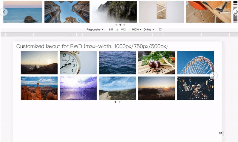
React responsive carousel component w/ grid layout to easily create a carousel like photo gallery, shopping product card or anything you want
Features
- RWD
- Multiple items
- Multiple rows
- Infinite loop
- Support any component as a item to put into grid
- Show/hide dots
- Show/hide arrow buttons
- Autoplay
- Enable/Disable
scroll-snapfor each item on mobile device - Customized layout (cols & rows) for different breakpoint
- Customized arrow button
- Customized dots
- Support SSR
Install
$ npm install better-react-carousel --save
Usage
Just import the Carousel component from better-react-carousel
and put your item into Carousel.Item
import React from 'react'
import Carousel from 'better-react-carousel'

const Gallery = () => {
  return (
    <Carousel cols={2} rows={1} gap={10} loop>
      <Carousel.Item>
        <img width="100%" src="https://picsum.photos/800/600?random=1" />
      </Carousel.Item>
      <Carousel.Item>
        <img width="100%" src="https://picsum.photos/800/600?random=2" />
      </Carousel.Item>
      <Carousel.Item>
        <img width="100%" src="https://picsum.photos/800/600?random=3" />
      </Carousel.Item>
      <Carousel.Item>
        {/* anything you want to show in the grid */}
      </Carousel.Item>
      {/* ... */}
    </Carousel>
  )
}
Props
| Prop | Type | Default | Description |
|---|---|---|---|
| cols | Number | 1 | Column amount rendered per page |
| rows | Number | 1 | Row amount rendered per page |
| gap | Number | String | 10 | Margin (grid-gap) for each item/grid in px or %, passed Number will turn to px unit |
| loop | Boolean | false | Infinite loop or not |
| scrollSnap | Boolean | true | true for applying scroll-snap to items on mobile |
| hideArrow | Boolean | false | Show/hide the arrow prev/next buttons |
| showDots | Boolean | false | Show dots indicate the current page on desktop mode |
| autoplay | Number | Autoplay timeout in ms; undefined for autoplay disabled |
|
| dotColorActive | String | ‘#795548’ | Valid css color value for active dot |
| dotColorInactive | String | ‘#ccc’ | Valid css color value for inactive dot |
| responsiveLayout | Array | Customized cols & rows on different viewport size | |
| mobileBreakpoint | Number | 767 | The breakpoint(px) to switch to default mobile layout |
| arrowLeft | Element | Customized left arrow button | |
| arrowRight | Element | Customized left arrow button | |
| dot | Element | Customized dot component with prop isActive |
|
| containerStyle | Object | Style object for carousel container |
responsiveLayout
Array of layout settings for each breakbpoint
Setting options
breakpoint: Number; Requried; Equals tomax-widthused in media query, in px unitcols: Number; Column amount in specific breakpointrows: Number; Row amount in specific breakpointgap: Number | String; Gap size in specific breakpointloop: Boolean; Infinite loop in specific breakpointautoplay: Number; autoplay timeout(ms) in specific breakpoint;undefinedfor autoplay disabled
e.g.
[
  {
    breakpoint: 800,
    cols: 3,
    rows: 1,
    gap: 10,
    loop: true,
    autoplay: 1000
  }
]
dot
Example
// your custom dot component with prop `isActive`
const MyDot = ({ isActive }) => (
  <span
    style={{
      display: 'inline-block',
      height: isActive ? '8px' : '5px',
      width: isActive ? '8px' : '5px',
      background: '#1890ff'
    }}
  ></span>
)

// set custom dot
<Carousel dot={MyDot} />
Example
Storybook (Don’t forget to try on different viewport size)
$ git clone https://github.com/DevPanther/better-react-carousel
$ cd better-react-carousel

$ npm ci
$ npm run storybook
Use case in real world
# clone & install packages
$ npm run dev
# open localhost:8080
LICENSE
MIT
