React-Trumbowyg
React wrapper for trumbowyg.
If you love library, please star it and upvote it on awesome-react-components.
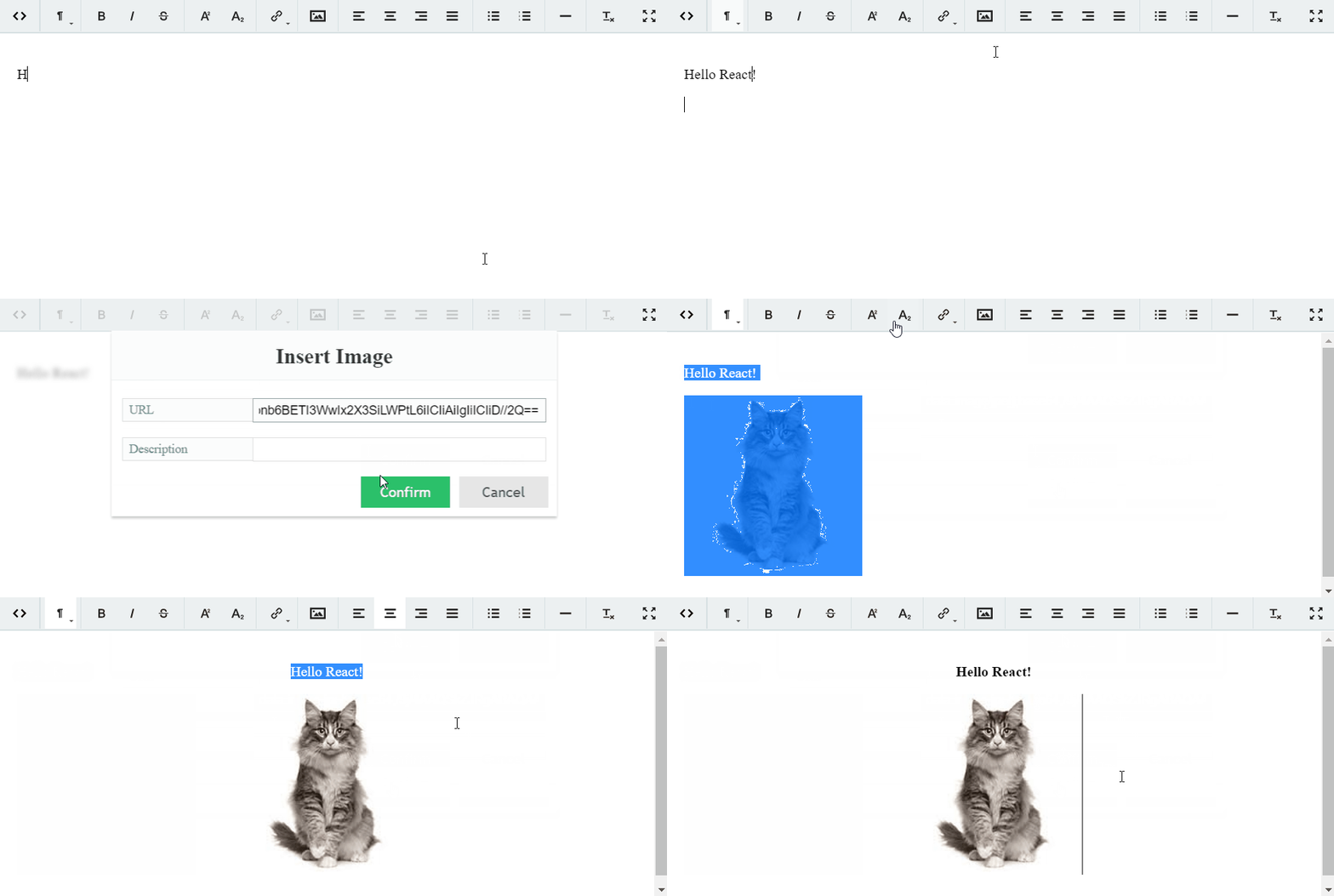
Live Demo
https://alex-d.github.io/Trumbowyg/
How do I add this to my project?
Install react-trumbowyg via npm:
> npm i react-trumbowyg --save
or build from source:
> npm install && npm build
Dependencies
React-Trumbowyg depends on Trymbowyg only.
Starter Guide
Trumbowyg requires some setup procedures before you can use it.
First of all, you need to install jQuery
> npm i jquery --save
If you are using webpack or another build system you need to expose jQuery to window as global variable.
Webpack example:
new webpack.ProvidePlugin({
    $: "jquery",
    jQuery: "jquery"
})
Secondly, you need to add Trymbowyg styles
import 'react-trumbowyg/dist/trumbowyg.min.css'
Finally, import React-Trymbowyg component
import Trumbowyg from 'react-trumbowyg'

<Trumbowyg id='react-trumbowyg'/>
That's it!
Examples
- examples-vanilla-js - vanilla js example
- examples-es6 - example with Babel and Webpack
Available Properties and Event Handlers
React-Trumbowyg expose all properties of Trumbowyg, and adds self as well
Trumbowyg properties
| Trumbowyg Prop | Default | Type |
|---|---|---|
| id | String |
|
| data | String |
|
| placeholder | String |
|
| buttons | Array<String> |
|
| semantic | true |
Bool |
| resetCss | false |
Bool |
| removeformatPasted | false |
Bool |
| autogrow | false |
Bool |
| disabled | false |
Bool |
Self properties
- shouldUseSvgIcons:boolean - if true, displays SVG icons, else show only text. (Default: true)
- svgIconsPath:string - path to SVG icons file. SVG file will be loaded with AJAX request. (Default: '')
- shouldInjectSvgIcons: boolean - React-Trumbowyg can inject SVG icons to body, so you can avoid loading it. If this prop is false, you should specify the path to your own svg icons in
svgIconsPathprop. (Default: true)
Event handlers
- onFocus - Event handler when the focus is on editor
- onBlur - Blur on editor
- onInit - Editor is initialized
- onChange - Change in editor
- onResize - Resize the editor on autogrow
- onPaste - Paste something in the editor
- onOpenFullScreen - Switch to fullscreen mode
- onCloseFullScreen - Leave editor's fullscreen mode
- onClose - Close the editor
Plugins
Thanks @ashleydb, for such a nice example:
It does work today. It may not look pretty, but it works. For example, I needed to add the tables plugin:
import React from 'react';

import Trumbowyg from 'react-trumbowyg';
// ADD THIS LINE. ADJUST THE BEGINNING OF THE PATH AS NEEDED FOR YOUR PROJECT
import '../../node_modules/trumbowyg/dist/plugins/table/trumbowyg.table';

export default class MyComponent extends React.Component {
    constructor(props) {
        super(props);
    }
    render() {
        return (
            <div>
                    <Trumbowyg id='react-trumbowyg'
                        buttons={
                            [
                                ['viewHTML'],
                                ['formatting'],
                                'btnGrp-semantic',
                                ['link'],
                                ['insertImage'],
                                'btnGrp-justify',
                                'btnGrp-lists',
                                ['table'], // I ADDED THIS FOR THE TABLE PLUGIN BUTTON
                                ['fullscreen']
                            ]
                        }
                        data={this.props.someData}
                        placeholder='Type your text!'
                        onChange={this.props.someCallback}
                        ref="trumbowyg"
                    />
            </div>
        );
    }
}
