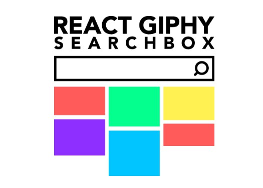
react-giphy-searchbox
Responsive and customizable search and select for Giphy's GIFs.
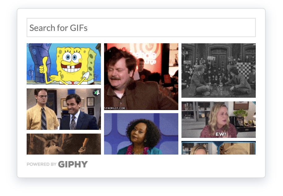
React Giphy Searchbox is a powerful react component that returns Giphy's GIF or Stickers in a Masonry grid layout. Initially the component displays trending GIFs from Giphy's feed, when the the user starts typing something in the search field it switches to searched results. When an image is selected, a GIF object is returned.
Getting started
Installation
yarn add react-giphy-searchbox
npm install react-giphy-searchbox --save
Basic example
import React from 'react'
import { render } from 'react-dom'
import ReactGiphySearchbox from 'react-giphy-searchbox'

const App = () => (
  <ReactGiphySearchbox
    apiKey="YOUR_API_KEY" // Required: get your on https://developers.giphy.com
    onSelect={item => console.log(item)}
  />
)

render(<App />, document.getElementById("root"))
Props
| Prop | Type | Desc |
|---|---|---|
apiKey |
string | REQUIRED: Giphy's API key. Get your on https://developers.giphy.com. |
onSelect |
function | REQUIRED A callback which is triggered whenever a GIF is selected. It returns a Gif object in the format specified for an image from Giphy's API. |
libray |
string | Giphy's library: choose between gifs or stickers. Default: gifs |
rating |
string | Filters results by specified rating. Default: g |
gifPerPage |
number | The maximum number of images to return per page. Default: 20 |
masonryConfig |
array | An array of objects describing the masonry's properties at different breakpoints. See specific chapter for further info. Default: [{ columns: 2, imageWidth: 120, gutter: 5 }] |
gifListHeight |
string | The height of the returned GIF list. Default: 300px |
messageError |
string | Generic error message when APIs call fails. Default: Oops! Something went wrong. Please, try again. |
messageLoading |
string | Loading message only for accessibility purposes. Default: Loading... |
messageNoMatches |
string | Message to tell users searched string returned empty array. Default: No matches found. |
loadingImage |
string | If you want to customize the loading spinner, use this prop to set an alternative src for the image. |
poweredByGiphy |
boolean | You can choose to display or not display the Powered by Giphy badge at the bottom. Note that you need to show it if you want a production Api key from Giphy. Default: true |
poweredByGiphyImage |
string | If you want to customize the Powered by Giphy badge, use this prop to set an alternative src for the image. |
searchPlaceholder |
string | Search input placeholder. Default: Search for GIFs |
wrapperClassName |
string | Additional CSS class for the <div> that wrap the whole component. |
searchFormClassName |
string | Additional CSS class for the <form> element. |
listWrapperClassName |
string | Additional CSS class for the <div> that wrap the GIFs list. |
listItemClassName |
string | Additional CSS class for the <button> that wrap the single image. |
imageBackgroundColor |
string | Set the Giphy's image item background color, useful when libray prop is set to stickers, since stickers have transparent background. Default: #eee |
Responsive options
masonryConfig prop allow you to define responsiveness of the component. This prop accept an array of objects describing the masonry's properties at different breakpoints.
Each object in the array has the following properties:
| Prop | Type | Description |
|---|---|---|
mq |
string | The minimum viewport width |
columns |
number | The number of vertical columns |
imageWidth |
number | The width (in px) of the image, and consequentially of the column |
gutter |
number | The space (in px) between the columns |
[
  { columns: 2, imageWidth: 140, gutter: 10 },
  { mq: '700px', columns: 3, imageWidth: 200, gutter: 10 },
  { mq: '1000px', columns: 4, imageWidth: 220, gutter: 10 },
]
When defining your properties, note the following:
- properties must be listed smallest to largest breakpoints in a mobile first approach;
- The size without the
mqproperty is assumed to be your smallest breakpoint, and must appear first.