preact-progress
Simple and lightweight (~590 bytes gzip) progress bar component for Preact.
Install
$ npm install --save preact-progress
:exclamation: Pro Tip: Use Yarn to install dependencies 3x faster than NPM!
<script src="https://unpkg.com/[email protected]/dist/preact-progress.min.js"></script>
Usage
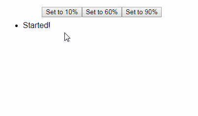
Provide a value; everything else is optional.
import { h } from 'preact';
import Progress from 'preact-progress';

onChange = (ctx, val) => console.log(`${val}% complete`);
onComplete = ctx => {ctx.base.style.opacity = 0};

<Progress
  id="loader" className="loader"
  value={ 16.3 } height="3px" color="#6cc644"
  onChange={ onChange }
  onComplete={ onComplete }
/>
Properties
value
Type: Number
Default: 0
The current progress; between 0 and 100. Mapped to a style:width percentage.
onStart
Type: Function
The callback function when progress bar mounts. Receives the current Progress component as its first argument & the current value as its second argument.
onChange
Type: Function
The callback function whenever the progress value updates. Receives the current Progress component as its first argument & the current value as its second argument.
onComplete
Type: Function
The callback function when progress bar has reached 100%. Receives the current Progress component as its only argument.
height
Type: String
Default: 4px
The height of the animated progress bar.
color
Type: String
Default: black
The color of the animated progress bar.
id
Type: String
Default: none
The id attribute to pass down.
className
Type: String
Default: none
The className attribute to pass down. Added to the wrapper element.