react-slide-out
Simple lightweight (<2kb) animated slider component.
Usability
import Slider from 'react-slide-out';
and include css file
import 'react-slide-out/lib/index.css';
Usage
After you imported libs, somewhere in your component's code:
.
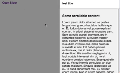
<a href='#' onClick={() => this.setState({isOpen: true}))}>Open Slider</a>
.
<Slider
title='test title'
footer={
<div style={{padding: '15px'}}>
<a href='#' onClick={() => this.setState({isOpen: false}))}>Close Slider</a>
</div>
}
isOpen={this.state.isOpen}
onOutsideClick={() => this.setState({isOpen: false}))}>
<div>...Some heavy scrollable content...</div>
</Slider>
props/options
isOpen
If passed slider will be render with slide-in animation
<Slider isOpen />
onOutsideClick
It will fire a function if passed when user clicks on "modalWrapper area" (dimmed area)
<Slider isOpen={this.state.isOpen} onOutsideClick={() => this.setState({isOpen: false})} />
title
If passed title will be rendered in header wrapper
<Slider title='test title' />
footer
If passed footer will be rendered
<Slider footer={<div>Some footer element</div>} />
verticalOffset
If passed slider and slider wrapper will be offset from top or bottom (e.g. useful when you have navigation/bottom bar and you don't want slider to render on top of it)
<Slider verticalOffset={{top: 30, bottom: 30}} /> // will render 30px from bottom and top
foldMode
If passed slider will be enter a "fold" mode, where instead of closing it will fold to certain width(140px default). Note: isOpen and onOutsideClick props will do nothing in this mode and
<Slider foldMode />
isFolded
Only works if in fold mode, obviously. Will fold modal to specified width or unfold it to natural width(default false)
<Slider foldMode isFolded />
foldWidth
Only works if in fold mode, represents the width modal will take if isFolded prop is set to true
<Slider foldMode isFolded foldWidth="200px" />
Example project
Clone/download the repo followed by npm (i) install && npm start, so you can check this superior component in local. If you have any comment, suggestion, issue, please report it, as I will try to keep this component alive.