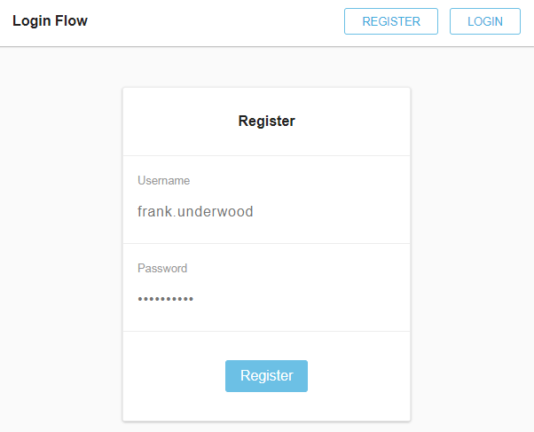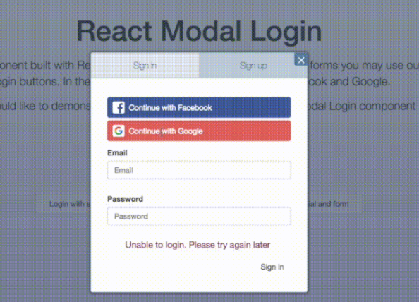
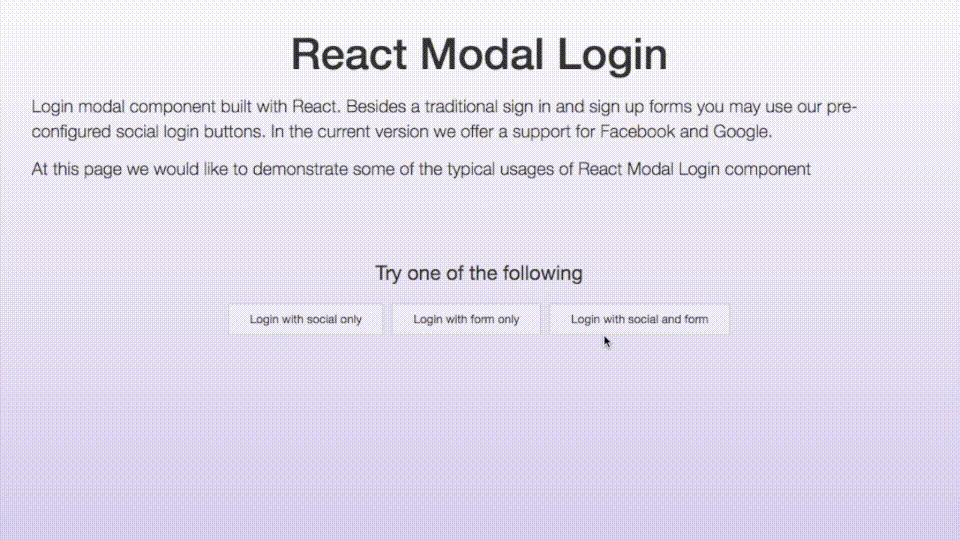
react-modal-login
Login modal component built with React. Besides a traditional sign in and sign up forms you may use our pre-configured social login buttons. In the current version we offer a support for Facebook and Google.
Since we intend to target the module for developers, we decided to offer bigger customization options. This requires some functions to be created in a parent component. Don't worry though. We will cover that topic further in this manual.
Installation
npm install --save react-modal-login
Social support
If you're willing to use social login buttons, you need to configure them first.
You may either keep those settings in a separate file or no, it's up to you.
For the sake of keeping everything in order, we demonstrate how to use it in
social-config.js file
Typical Facebook configuration
const facebook = {
  appId: 'YOUR FB APP ID GOES HERE',
  cookie: true,
  xfbml: true,
  version: 'v2.11',
  scope: 'email'
};

export const facebookConfig = facebook;
Typical Google configuration
const google = {
  client_id: 'YOUR GOOGLE APP ID GOES HERE',
  scope: "https://www.googleapis.com/auth/plus.login"
};

export const googleConfig = google;
Managing state in parent component
Just as I wrote at the upper part of this manual, our component is highly customizable. Thus, some of the methods
needed for basic functionality need to be passed down from the parent component. Just like in the example below.
If you would like to enjoy a full range of plugin's functionality you need to:
declare initial state- it is recommended to do this in a constructor function
  constructor(props) {
    super(props);

    this.state = {
      showModal: false,
      loading: false,
      error: null
    };

  }
You need to create methods to be passed to ReactModalLogin component such as:
openModal()- action to open the modal. For instance, you may bind this to click of the "sign in" button etc.closeModal()- action to close the modal. You need to pass it to the component later on to enable hiding the modal
by clicking close button or clicking in overlay wrapstartLoading()- action needed to serve the loading event. When there is an asynchronous action in component you may
be willing to make other elements inactivefinishLoading()- that action is indicating the end of loading and it's making all the elements inside the component
active againonTabsChange()- callback to clicking tab button. As provided in our example, you may use it to clean the error state
Most Likely you will be in the need of using social login callback actions. Those may execute some code in your app as well
as display the fail error:
onLoginSuccess()- success login callbackonLoginFail()- "login failed" callback. It is recommended to execute setState() function here which changes the error
state
Example
import React from 'react';
import ReactModalLogin from 'react-modal-login';

import {facebookConfig, googleConfig} from "social-config";

class Sample extends React.Component {

  constructor(props) {
    super(props);

    this.state = {
      showModal: false,
      loading: false,
      error: null
    };

  }

  openModal() {
    this.setState({
      showModal: true,
    });
  }

  closeModal() {
    this.setState({
      showModal: false,
      error: null
    });
  }

  onLoginSuccess(method, response) {
    console.log('logged successfully with ' + method);
  }

  onLoginFail(method, response) {
    console.log('logging failed with ' + method);
    this.setState({
      error: response
    })
  }

  startLoading() {
    this.setState({
      loading: true
    })
  }

  finishLoading() {
    this.setState({
      loading: false
    })
  }

  onTabsChange() {
    this.setState({
      error: null
    });
  }


  render() {

    return (
      <div>

        <button
          onClick={() => this.openModal()}
        >
          Open Modal
        </button>

        <ReactModalLogin
          visible={this.state.showModal}
          onCloseModal={this.closeModal.bind(this)}
          loading={this.state.loading}
          error={this.state.error}
          tabs={{
            onChange: this.onTabsChange.bind(this)
          }}
          loginError={{
            label: "Couldn't sign in, please try again."
          }}
          registerError={{
            label: "Couldn't sign up, please try again."
          }}
          startLoading={this.startLoading.bind(this)}
          finishLoading={this.finishLoading.bind(this)}
          providers={{
            facebook: {
              config: facebookConfig,
              onLoginSuccess: this.onLoginSuccess.bind(this),
              onLoginFail: this.onLoginFail.bind(this),
              label: "Continue with Facebook"
            },
            google: {
              config: googleConfig,
              onLoginSuccess: this.onLoginSuccess.bind(this),
              onLoginFail: this.onLoginFail.bind(this),
              label: "Continue with Google"
            }
          }}
        />
      </div>
    )
  }
}
Component's properties
-
mainWrapClass|string| - custom class of the whole component's wrapper (which contains both overlay and the popup itself) -
mainWrapId|string| - id of the whole component's wrapper -
initialTab|string| - (default "login") initial tab we'd like to mark as opened - "login" or "register" -
onAfterCloseModal|function| - action executing just after the closing of modal -
onBeforeCloseModal|function| - action executing just before the closing of modal -
onCloseModal|function| - function closing the modal -
overlayClass|string| - custom class of the popup wrap overlay -
visible|boolean| - boolean which determines whether popup should be visible or no -
additionalWrap|object| - that's the div which shows loader and error messages in case we don't include our custom formcontainerClass|string| - additionalWrap container custom classdisabled|boolean| - boolean determining if the additionalWrap should be disabled
-
closeBtn|object| - close button objectcontainerClass|string| - close button container custom class
-
form|object| - object of custom login/register form you may include in popup-
onLogin|function| - function executing when user click 'sign in' button -
onRegister|function| - function executing when user click 'sign up' button -
onRecoverPassword|function| - function executing when user click 'recover password' button -
loginContainerClass|string| - custom class of login form container -
registerContainerClass|string| - custom class of register form container -
recoverPasswordContainerClass|string| - custom class of password recovery form container -
bottomLoginContainer|element| - custom container below login inputs group -
bottomRegisterContainer|element| - custom container below register inputs group -
bottomRecoverPasswordContainer|element| - custom container below password recovery inputs group -
recoverPasswordSuccessLabel- |object| - Text being displayed when we successfully recover password
*labelClass|string| - custom class of the text
*label|string or element| - text of the text -
recoverPasswordAnchor- |object| - Forgotten password link visible on login tabanchorClass|string| - custom class of the linklabel|string or element| - text of the link
-
loginBtn- |object| - login buttonbuttonClass|string| - custom class of login buttonlabel|string or element| - text inside login button
-
registerBtn- |object| - register buttonbuttonClass|string| - custom class of register buttonlabel|string or element| - text inside register button
-
recoverPasswordBtn- |object| - recover password buttonbuttonClass|string| - custom class of recover password buttonlabel|string or element| - text inside recover password button
-
loginInputs|array| - Array of objects. Every each of them represents single login input fieldcontainerClass|string| - custom class of input wraptype|string| - HTML type of input (email, password, text, number etc.)inputClass|string| - custom class of the inputid|string| - input's idname|string| - input's nameplaceholder|string| - input's placeholderlabel|string or element| - label of the input
-
registerInputs|array| - Array of objects. Every each of them represents single register input fieldcontainerClass|string| - custom class of input wraptype|string| - HTML type of input (email, password, text, number etc.)inputClass|string| - custom class of the inputid|string| - input's idname|string| - input's nameplaceholder|string| - input's placeholderlabel|string or element| - label of the input
-
recoverPasswordInputs|array| - Array of objects. Every each of them represents single recovery password form input fieldcontainerClass|string| - custom class of input wraptype|string| - HTML type of input (email, password, text, number etc.)inputClass|string| - custom class of the inputid|string| - input's idname|string| - input's nameplaceholder|string| - input's placeholderlabel|string or element| - label of the input
-
-
loader|object| - loader svg objectcontainerClass|string| - loader container custom classdisabled|boolean| - boolean determining if the loader should be disabled
-
providers|object| - object containing social buttons providers data-
facebook- |object| - facebook button objectbtnClass|string| - button custom classconfig|object| - Facebook API config parameters used to init the modal
(for more info please see Facebook API config docs
and Facebook API scope docs)btn|element| - if you would like to insert custom button for facebook login include it hereonLoginSuccess|function(method, response)| - login success callback. It returns method which will be 'facebook'
and login success responseonLoginFail|function(method, response)| - login fail callback. It returns method which will be 'facebook'
and login fail responselabel|string or element| - text inside FB button
-
google- |object| - google button objectbtnClass|string| - button custom classconfig|object| - Google API config parameters used to init the modal
(for more info please visit Google developers page)btn|element| - if you would like to insert custom button for google login include it hereonLoginSuccess|function(method, response)| - login success callback. It returns method which will be 'google'
and login success responseonLoginFail|function(method, response)| - login fail callback. It returns method which will be 'google'
and login fail responselabel|string or element| - text inside Google button
-
-
loginError|object| - login error message objectcontainerClass|string| - login error container custom classlabel|string or element| - text of failed login message
-
registerError|object| - register error message objectcontainerClass|string| - register error container custom classlabel|string or element| - text of failed register message
-
recoverPasswordError|object| - recover password error message objectcontainerClass|string| - recover password error container custom classlabel|string or element| - text of failed recover password message
-
separator|object| - object of separator which sits between social login buttons and custom formcontainerClass|string| - separator custom classlabel|string or element| - text of separator
-
tabs|object| - sign in / sign up tabs objectcontainerClass|string| - tabs container custom classonChange|function| - callback which fires after the change of a tabloginLabel|string| - text of login labelregisterLabel|string| - text of register label
Notes
Social buttons API
Both Facebook and Google instances are initialized the first time you open popup modal. We decided to take such an attitude
to save some of the precious loading time when the user enters the website.
After the initialization is complete you have an access to:
- Facebook instance -
window.FB - Google instance -
window.gapi