react-pagify - Simple pagination for React
react-pagify provides a simple API for building your own custom paginator.
Usage
react-pagify consists of four React components: Context, Segment, Button, and Ellipsis.
Pagination logic can be handled through a package, such as segmentize. react-pagify doesn't tie you to any particular solution by design, though.
Context and Segment
Context accepts two props: segments and onSelect. A segment in turn consists of an object (segmentName -> [pageNumbers]). Segment accepts matching segmentName through a prop and then constructs divs based on that. It also binds onSelect automatically so that when you click an individual page div, the page number will be passed to it as a first parameter. The second one matches with DOM event.
The example below binds centerPage through Context and Segment:
...

import Paginator from 'react-pagify';

...

<Paginator.Context className="pagify-pagination"
  segments={{
    centerPage: [4]
  }} onSelect={(page) => console.log(page)}>
  <Paginator.Segment field="centerPage" />
</Paginator.Context>
Both Context and Segment accept custom props so you can customize className and attach custom behavior as needed. In the latter case the custom props are applied per each page div generated.
Usage with segmentize
react-pagify doesn't deal with pagination logic itself. Instead, you can use another package, such as segmentize, to deal with it. The following example demonstrates basic integration:
...

import Paginator from 'react-pagify';
import segmentize from 'segmentize';

...

<Paginator.Context className="pagify-pagination"
  segments={segmentize({
    page: 1,
    pages: 4,
    sidePages: 2
  })} onSelect={(page) => console.log(page)}>
  <Paginator.Segment field="previousPages" />
  <Paginator.Segment field="centerPage" />
  <Paginator.Segment field="nextPages" />
</Paginator.Context>
The idea is the same as earlier. In this case we bind fields that segmentize outputs. Each of those fields contains an array of data. Refer to segmentize documentation for available options.
Button
Given it's handy to be able to implement previous and next buttons, there's a little shortcut just for that:
...

import Paginator from 'react-pagify';

...

<Paginator.Context className="pagify-pagination"
  segments={{
    centerPage: [currentPage]
  }} onSelect={(page) => console.log(page)}>
  <Paginator.Button page={currentPage - 1}>Previous</Paginator.Button>
  <Paginator.Button page={currentPage + 1}>Next</Paginator.Button>
</Paginator.Context>
Ellipsis
Given it can be handy to be able to display ellipsis between pages of a paginator, there's a small utility known as Ellipsis just for this. Internally it uses comparison logic based on given previousField and nextField props. If there is room between these fields (say the values are [1, 2] and [4, 5]), it will render ellipsis. You can customize the outlook by passing custom children to it. Consider the example below:
...

import Paginator from 'react-pagify';
import segmentize from 'segmentize';

...

<Paginator.Context className="pagify-pagination"
  segments={segmentize({
    page: 1,
    pages: 4,
    sidePages: 2
  })} onSelect={(page) => console.log(page)}>
  <Paginator.Segment field="beginPages" />

  <Paginator.Ellipsis className="ellipsis"
    previousField="beginPages" nextField="previousPages">
    ***
  </Paginator.Ellipsis>

  <Paginator.Segment field="previousPages" />
  <Paginator.Segment field="centerPage" />
  <Paginator.Segment field="nextPages" />

  <Paginator.Ellipsis previousField="nextPages" nextField="endPages" />

  <Paginator.Segment field="endPages" />
</Paginator.Context>
See
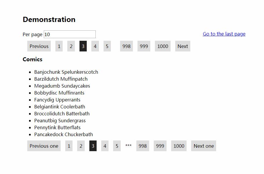
demo/for a full implementation of the ideas discussed.
Customize Tags
By default react-pagify uses divs for container, segments and ellipses, and spans for links. You can customize these tags and define custom props for htme:
...

import Paginator from 'react-pagify';

...

<Paginator.Context className="pagination"
  tags={{
    container: {
      tag: 'ul'
    },
    segment: {
      tag: 'li'
    },
    ellipsis: {
      tag: 'li'
    },
    link: {
      tag: 'a',
      props: {
        href: '#'
      }
    }
  }}
  segments={{
    centerPage: [4]
  }} onSelect={(page) => console.log(page)}>
  <Paginator.Segment field="centerPage" />
</Paginator.Context>