Orama
Plug and Play React Charts.
- Responsive layout
- Automatic data type extraction
- Freely composable marks
- Canvas rendering and caching optimizations
- Configurable theme
Orama has been powering Kensho charts in production for more than a year.
/horáō, "to see, spiritually and mentally" – a vision, focusing on the impact it has on the one beholding the vision.
Quick Start
$ npm install orama --save
import * as or from "orama"
- Get an array of objects:
[{key1, key2}, {key1, key2}, ...], or array of arrays for multi-lines and multi-areas. - Choose which marks to use:
<or.Lines/>,<or.Points/>,<or.Bars/>,<or.Areas/>, etc. - Choose which keys in the data map to which visual dimensions:
x,y,fill,stroke, etc.
import * as or from "orama"

var data = [
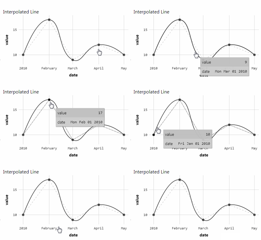
  {date: new Date("2010-01-01"), value: 10},
  {date: new Date("2010-02-01"), value: 17},
  {date: new Date("2010-03-01"), value: 9},
  {date: new Date("2010-04-01"), value: 12},
  {date: new Date("2010-05-01"), value: 20},
]

var MyChart = () =>
  <or.Chart>
    <or.Lines
      data={data}
      x="date" y="value"
    />
  </or.Chart>
API
Orama charts are all wrapped by the <or.Chart> tag, inside of which you can freely compose visual marks. The available marks are: <or.Lines/>, <or.Points/>, <or.Areas/>, <or.Guides/>, <or.Ranges/>, and <or.Text/>.
The data for each mark can be an array of objects [{}, {}] or an array of arrays of objects [ [{}, {}], [{}, {}] ]. You can use arrays of arrays to get multi-lines or multi-areas in the <or.Lines/> and <or.Areas/> marks. Values in the objects can be Numbers, Strings or Dates
Each key from the data objects can be mapped to a visual dimension on the marks. The available visual dimensions are: x, x0, x1, x2, y, y0, y1, y2, radius, fill, stroke, lineWidth, lineDash, alpha, text, textAlign, xOffset, and yOffset. Not all dimensions are available in all marks.
To map the values from the key date in the data objects to the x position of a <or.Points/> mark, you can do:
import * as or from "orama"

var data = [
  {date: new Date("2010-01-01")},
  {date: new Date("2010-02-01")},
  {date: new Date("2010-03-01")},
]

var MyChart = () =>
  <or.Chart>
    <or.Points
      data={data}
      x="date"
    />
  </or.Chart>
The values' types are automatically extracted from the data, and the data domain for each visual dimension is calculated using all marks inside of a chart. If a chart has both <or.Lines/> and <or.Points/> using the x dimension, the domain of the x dimension will be calculated using the data in both marks.
Most of the props accepted by the components follow a schema that combines the dimension name with a specific property. For example, to manually set the axis name for the x dimension you can pass the prop: xName="custom name", to set the fill dimension to a constant value (instead of mapping from the data) you can use the prop: fillValue="steelblue".
Throughout this documentation, we will refer to this use of dimension + property as [dim]PropertyName. All dimensions can be configured this way.
The dimension props can also be set specifically for during hover behavior, by adding hover before the name of the prop: hover[Dim]PropertyName.
<or.Chart/>
The chart component can be configured with the following properties:
| Prop | Description |
|---|---|
width |
Number Sets the width of the chart, if this property is not used the chart gets the dimension from its parent. |
proportion |
Number = 0.5 The height of the chart is calculated by multiplying the width by the proportion value. If height is defined, this value is ignored. |
height |
Number If height is not defined, its value is calculated by multiplying the width the proportion. If height is defined, the proportion is ignored. |
margin |
Object Overrides the margins of the chart. The margins are automatically calculated so that the axis labels can fit inside of the chart. <or.Chart margin={{top: 20, left: 20, bottom: 20, right: 20}} /> |
theme |
Object = DEFAULT_THEME Customizes the theme of the chart. See the theme object schema |
[dim]Name |
String The name to be used for the dimension axis label and tooltip. Defaults to the accessor key. |
[dim]ZeroBased |
boolean = false Sets if the domain of the dimension should include zero. |
[dim]Type |
String Overrides the type of the dimension. Accepted values are: linear, ordinal, time and log. |
[dim]Domain |
Array Overrides the domain of the dimension. <or.Chart xRange={[-10, 10]}/> |
[dim]Range |
Array Overrides the range of the dimension. <or.Chart radiusRange={[1, 20]}/> <or.Chart fillRange={["green", "blue"]}/> |
[dim]Nice |
boolean = false If sets to true extends the domain of dimension to nice round values. |
[dim]ShowTicks |
boolean = true Show or hide the axis ticks for the dimension. |
[dim]ShowGuides |
boolean = true Show or hide the axis guides for the dimension. |
[dim]ShowLabel |
boolean = true Show or hide the axis label for the dimension. |
[dim]TickSpace |
Number Overrides the sugested space between axis ticks. For numbers and dates, the tick count on the axis is calculated by dividing the size of the axis by the [dim]TickSpace prop. For strings, all values become ticks on the axis, since there's no way to select a representative subset of them on a timeline.The tickSpace defaults to 50 for the x dimension and 40 for the y dimension. |
[dim]TickCount |
Number Overrides the number of ticks used on the axis of the dimension. For axes with datatypes string of number, the [dim]TickCount is automatically calculated by dividing the size of the axis by the [dim]TickSpace prop. For strings, all values become ticks on the axis, since there's no way to select a representative subset of them on a timeline. |
[dim]TickFormat |
Function Overrides the function used to format the values of the dimension on the axis and tooltip. <or.Chart xTickFormat={d => Math.round(d)}/> |
[dim]TickOffset |
Number Overrides the distance between the tick text and the axis. |
[dim]LabelOffset |
Number Overrides the distance between the axis label text and the axis. |
Configuring the Tooltip
The tooltip can be configured by passing additional props to the Chart. You can also provide your own React component to be displayed as the tooltip.
| Prop | Description |
|---|---|
Tooltip |
React Component Override the tooltip component. |
tooltipExtraDimensions |
Array<{accessor: string, name: string, format: function}> Add extra dimensions to the tooltip. You can also pass an array of strings if you plan to use the default name and formatters. |
[dim]TooltipFormat |
function Override the value formatter for the specified key. |
tooltipShowKeys |
boolean = false Show or hide the keys row on the tooltip. |
Marks
Marks can be freely composed inside of the <or.Chart/>. Orama offers the following marks components: <or.Lines/>, <or.Points/>, <or.Areas/>, <or.Guides/>, <or.Ranges/>, and <or.Text/>.
Each mark needs a data input and at least one dimension accessor defined. The input data for the mark can be an array of objects or an array of arrays of objects, the latter denoting grouped data such as multi-lines or multi-areas. Accepted values for the data objects are: Number, String, and Date.
Configuring Marks
The available visual dimensions that can be used to map data values to the marks are: x, x0, x1, x2, y, y0, y1, y2, radius, fill, stroke, lineWidth, lineDash, alpha, text, textAlign, xOffset, and yOffset. Not all dimensions are available in all marks, see below for the specific dimensions supported by each mark.
All marks can be configured with the following props:
| Prop | Description |
|---|---|
data |
Array The input data for the mark component, see above for what format is accepted. |
[dim] |
String Sets the key data accessor for the specified dimension. |
[dim]Value |
Any A constant to be used for the dimension. <or.Points radiusValue={10}/> <or.Lines alphaValue={0.25}/> |
showHover |
boolean = true Sets the tooltip hover behaviour for the mark. |
<or.Lines/>
Mark for drawing lines or multi-lines. To draw multi-lines, use an array of arrays as the data input.
It accepts the following dimensions: x, y, fill, stroke, lineWidth, lineDash and alpha.
import * as or from "orama"

var data = [
  [
    {date: new Date("2010-01-01"), value: 10, name: "A"},
    {date: new Date("2010-02-01"), value: 17, name: "A"},
    {date: new Date("2010-03-01"), value: 9, name: "A"},
  ],
  [
    {date: new Date("2010-01-01"), value: 16, name: "B"},
    {date: new Date("2010-02-01"), value: 13, name: "B"},
    {date: new Date("2010-03-01"), value: 15, name: "B"},
  ]
]

var MyChart = () =>
  <or.Chart>
    <or.Lines
      data={data}
      x="date" y="value"
      stroke="name"
    />
  </or.Chart>
<or.Areas/>
Mark for drawing areas on the charts.
It accepts the following dimensions: x, x0, y, y0, radius, fill, stroke, lineWidth, lineDash and alpha.
To map the lower bound of the area to the data, use the x0 or y0 accessors.
import * as or from "orama"

var data = [
  {date: new Date("2010-01-01"), value: 10},
  {date: new Date("2010-02-01"), value: 17},
  {date: new Date("2010-03-01"), value: 3},
]

var MyChart = () =>
  <or.Chart yZeroBased>
    <or.Areas
      data={data}
      x="date" y="value"
    />
  </or.Chart>
<or.Points/>
Mark for drawing circles on the charts.
It accepts the following dimensions: x, y, radius, fill, stroke, lineWidth, lineDash and alpha.
import * as or from "orama"

var data = [
  {value1: 16, value2: 10, size: 1},
  {value1: 13, value2: 17, size: 5},
  {value1: 15, value2: 14, size: 10},
]

var MyChart = () =>
  <or.Chart>
    <or.Points
      data={data}
      x="value1" y="value2"
      radius="size"
    />
  </or.Chart>
<or.Bars/>
Mark for drawing bars on the charts.
It accepts the following dimensions: x, x1, x2, y, y1, y2, fill, stroke, lineWidth, lineDash and alpha.
You can define the exact start and end of the bars by using the x1, x2, y1 and y2 dimensions.
import * as or from "orama"

var data = [
  {type: "type 1", value: 10},
  {type: "type 2", value: 20},
  {type: "type 3", value: -7},
]

var MyChart = () =>
  <or.Chart yZeroBased>
    <or.Bars
      data={data}
      x="type" y="value"
    />
  </or.Chart>
<or.Guides/>
Mark for drawing vertical or horizontal guides on the charts.
It accepts the following dimensions: x, y, stroke, lineWidth, lineDash and alpha.
import * as or from "orama"

var data = [
  {x: 1}, {x: 5},
  {x: 8}, {x: 10},
  {y: 1}, {y: 5},
  {y: 8}, {y: 10},
]

var MyChart = () =>
  <or.Chart yZeroBased>
    <or.Guides
      data={data}
      x="x" y="y"
      strokeValue="steelblue"
      lineDashValue={[5,5]}
    />
  </or.Chart>
<or.Ranges/>
Mark for drawing vertical or horizontal ranges on the charts.
It accepts the following dimensions: x1, x2, y1, y2, fill, stroke, lineWidth, lineDash and alpha.
import * as or from "orama"

var data = [
  {start: 1, end: 5},
  {start: 10, end: 20},
  {start: 40, end: 50},
  {start: 60, end: 80},
]

var MyChart = () =>
  <or.Chart>
    <or.Ranges
      data={data}
      x1="start" x2="end"
      y1="start" y2="end"
      fillValue="lighgray"
    />
  </or.Chart>
<or.Text/>
Mark for text on the charts.
It accepts the following dimensions: x, y, alpha, text, textAlign, xOffset and yOffset.
import * as or from "orama"

var data = [
  {date: new Date("2010-01-01"), value: 10, letter: "A"},
  {date: new Date("2010-02-01"), value: 17, letter: "B"},
  {date: new Date("2010-03-01"), value: 9, letter: "C"},
]

var MyChart = () =>
  <or.Chart>
    <or.Points
      data={data}
      x="date" y="value"
    />
    <or.Text
      data={data}
      x="date" y="value"
      text="letter"
      fillValue="white"
      textAlignValue='center'
      yOffsetValue={5}
    />
  </or.Chart>
Chart theme configuration
The theme can be configured by passing a theme prop to the <or.Chart/> component. The theme will be merged with the DEFAULT_THEME:
const DEFAULT_THEME = {
  fontFamily: '-apple-system,system-ui,BlinkMacSystemFont,Segoe UI,Roboto,Helvetica Neue,Arial,sans-serif',
  fontFamilyMono: '"SFMono-Regular", Consolas, "Liberation Mono", Menlo, Courier, monospace',
  titleFontWeight: 'bold',
  fontSize: 14,
  lineHeight: 1.5,
  textFill: 'hsl(0, 0%, 0%)',

  backgroundFill: 'hsl(0, 0%, 100%)',
  plotBackgroundFill: 'hsl(0, 0%, 100%)',

  guideStroke: 'hsl(0, 0%, 80%)',
  guideLineWidth: 1,
  guideZeroStroke: 'hsl(0, 0%, 55%)',
  guideZeroLineWidth: 2,

  axisLabelFontSize: 14,
  axisLabelFontWeight: 'bold',
  axisTickFontSize: 12,
  axisTickTextFill: 'hsl(0, 0%, 0%)',

  tooltipFontSize: 13,
  tooltipTextFill: 'hsl(0, 0%, 0%)',
  tooltipTitleFontSize: 13,
  tooltipTitleFontWeight: 'bold',
  tooltipValueFontSize: 13,
  tooltipBackgroundFill: 'hsl(0, 0%, 80%)',
  tooltipEvenBackgroundFill: 'hsl(0, 0%, 75%)',
  tooltipBoxShadowFill: 'hsla(0, 0%, 0%, 0.5)',
  tooltipKeyBorderStroke: 'hsl(0, 0%, 40%)',

  plotFontSize: 13,
  plotFill: 'hsl(0, 0%, 20%)',
  plotLineWidth: 2,
  plotAlpha: 0.85,

  plotLinearRangeFill: ['#edf8b1', '#2c7fb8'],
  plotOrdinalRangeFill: [
    "#1b9e77", "#d95f02", "#7570b3", "#e7298a", "#66a61e", "#e6ab02", "#a6761d", "#666666"
  ],
}
How to apply the theme to the chart:
import * as or from "orama"

var data = [
  {date: new Date("2010-01-01"), value: 10},
  {date: new Date("2010-02-01"), value: 17},
  {date: new Date("2010-03-01"), value: 9},
  {date: new Date("2010-04-01"), value: 12},
  {date: new Date("2010-05-01"), value: 10},
]
var theme = {
  textFill: 'white',
  backgroundFill: 'black',
  plotBackgroundFill: 'hsl(0, 0%, 20%)',
  guideStroke: 'hsl(0, 0%, 30%)',
  guideZeroStroke: 'hsl(0, 0%, 55%)',
  plotFill: 'white',
}

var MyChart = () =>
  <or.Chart theme={theme}>
    <or.Points
      data={data}
      x="date" y="value"
    />
  </or.Chart>
