react-wordcloud
Simple React + D3 wordcloud component with powerful features.
NOTE: This component is not published.
 |
 |
Premise
- The component should be usable within an existing application. No routing needed.
- The data is already available. No fetching mechanism needed.
- The component should be distributable as
commonjs,umdandes6-module.
Installation
Be sure to use the latest version of node.js and npm.
Note: Currently the component is not published via npm.
- Install:
npm i --save react-wordcloud - Install peerDependencies that are listed in
package.json.
Usage / Props
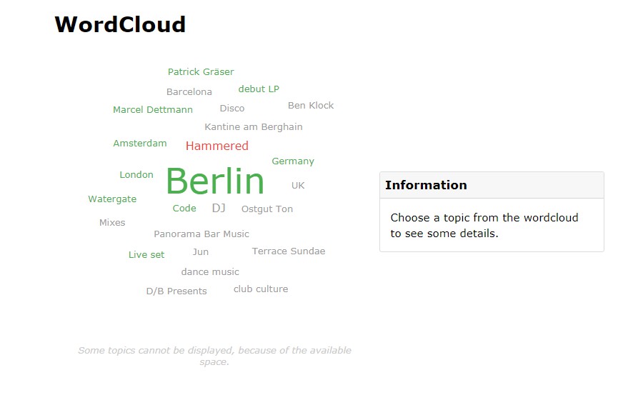
To run the component with the default props, it is enough to include the WordCloud component with some topics:
  <WordCloud
    topics={topics}
  />
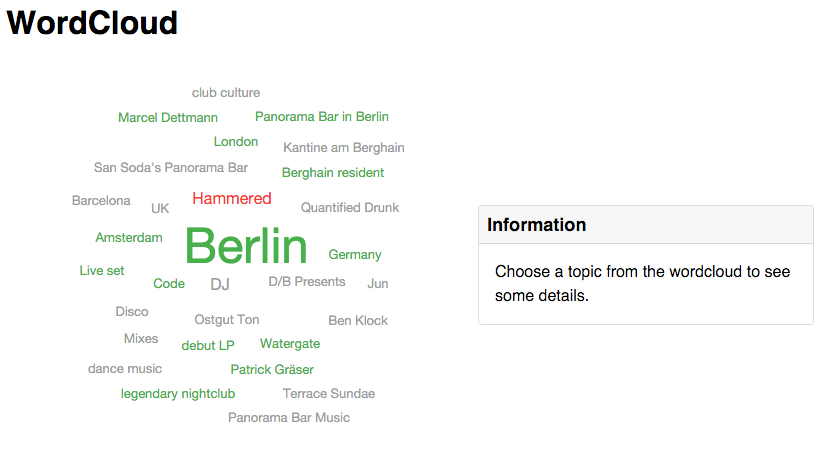
WordCloud inherits the components Cloud and Sidebar. If you want to be more flexible it is possible to load that components individually:
import {
WordCloud,
Cloud,
Sidebar
} from `react-wordcloud`
...
render() {
<Cloud
fontName={"Impact"}
fontSizes={[13, 16, 20, 26, 35, 49]}
height={500}
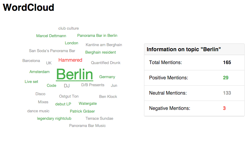
onSelectTopic={() => console.log('Topic selected!')}
topics={topics}
width={500}
/>
}
...
WordCloud
| Prop | Default | Type | Description |
|---|---|---|---|
| fontName | Sans-Serif |
string |
Fontname used for the Cloud component |
| fontSizes | [13, 16, 20, 26, 35, 49] |
int[] |
Available fontsizes for the Cloud component |
| height | 400 |
int |
Height of component |
| topics | [] |
object[] |
Content of topics.json |
| width | 400 |
int |
Width of component |
Cloud
| Prop | Default | Type | Description |
|---|---|---|---|
| fontName | - | string |
Fontname used for the Cloud component |
| fontSizes | - | int[] |
Available fontsizes for the Cloud component |
| height | - | int |
Height of component |
| onSelectTopic | - | function |
Eventhandler |
| selectedTopic | - | object |
Selected item object |
| topics | - | object[] |
Content of topics.json |
| width | - | int |
Width of component |
Sidebar
| Prop | Default | Type | Description |
|---|---|---|---|
| topic | null |
object |
Topic object |
Development
To develop the component it is recommend to use the example.
- Install dependencies
npm icd examplenpm i
- Start webpack-dev-server inside
/example, which uses the sources if available:npm start - Open browser: http://localhost:8080/webpack-dev-server/
Structure
-
/components:- Individual components with isolated markup
- Could contain each other
- Rarely have their own state. Better to write as functional components
-
/utils:- Functions which are used by some components
- Could easily be tested
Dependencies
Have a look at the package.json.
Test
- Install dependencies:
npm i - Run tests:
npm test
Example
To run the example, open http://purii.github.io/react-wordcloud-demo/ or follow these steps:
- Install dependencies
npm icd examplenpm i
- Start webpack-dev-server inside
/example, which uses the sources if available:npm start - Open browser: http://localhost:8080/
Publish
- Install dependencies:
npm i - Build bundles for
umd,commonjsandes6-module:npm run bundle - The css file will be located in
/dist/wordcloud.min.css - Note the peerDependencies