react-toggletip
Simple toggletip and tooltip for your react apps.
Features
- works on all mainstream browsers
- css only tooltip without additional javascript dependencies
- uses
ariaattributes for accessibility and to work with screen readers - works on icons and other elements
- supports multiline tooltips
Installation
$ npm install --save react-toggletip
or if you are using yarn
$ yarn add react-toggletip
Documentation
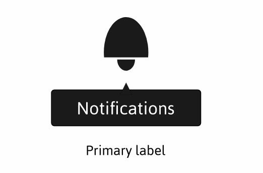
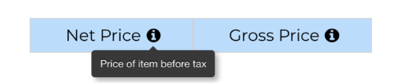
ToggleTip component will render a info icon by default. The default icon can be overridden with props given below. If you want to display tooltips over custom content, wrap ToggleTip around the content.
| Name | Type | Description |
|---|---|---|
| content | String or array of strings | The tooltip content. Pass array of strings if you want multiline tooltips |
| placement | string | one of bottom-right, bottom, bottom-left,right,left,top-right,top,top-left |
| animated | boolean | Disable tooltip animations. Default: true |
| icon | node | Replace info icon with custom icon |
| children | node | Display tooltip on top of custom content instead of icons |