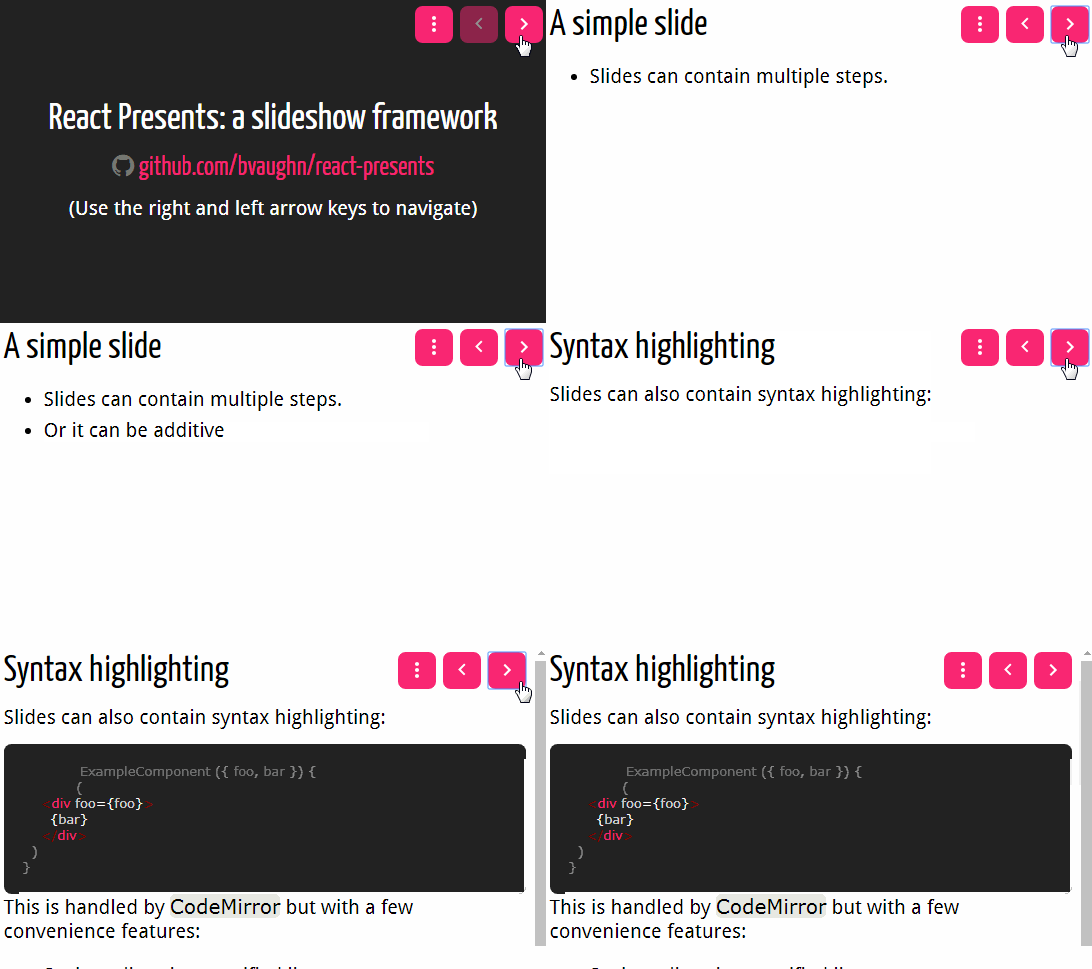
react-presents
React slideshow framework.
Getting started
Install react-presents using npm.
npm install react-presents --save
ES6, CommonJS, and UMD builds are available with each distribution. For example:
// Import the components you want like so:
import { Presentation, Slide } from 'react-presents'
Alternately you can load a global-friendly UMD build which exposes a global ReactPresents object:
<script src="path/to/react-presents/dist/umd/react-presents.js"></script>
Now you're ready to start using the components.
For an example of a the kind of presentations that can be created with react-presents, check out my Connect Tech 2016 presentation on windowing with React: bvaughn.github.io/connect-tech-2016.
Example Usage
Creating a Slide
Presentation slides are simple to create. You can use TitleSlide and ContentSlide with some predefined styles, or simply create a slide with custom layout by wrapping its content in div with 100% height and width. Below is a couple of example slides:
/* SomeSlide.js */
import React from 'react'
import { ContentSlide, Step } from 'react-presents'

export default () => (
  <ContentSlide>
    <h1>A simple slide</h1>
    <p>Slides can contain multiple steps.</p>
    <ul>
      <Step index={1} exact><li>Sub-text can appear only for a specific step</li></Step>
      <Step index={2}><li>Or it can be additive</li></Step>
      <Step index={3}><li>(By default it is additive)</li></Step>
      <Step index={4} maxIndex={5}><li>They can also be shown for a range</li></Step>
    </ul>
  </ContentSlide>
)
Automatically Loading Slides
Using a bundler like Webpack, you can auto-load slides using an approach like follows:
Webpack 2
/* Application.js */
const slides = require.context('./path/to/slides/', false, /\.js$/)
  .keys()
  .map((filename) => filename.replace('./', './path/to/slides/'))
  .map((path) => require(path).default)
Webpack 3
/* Application.js */
const slides = []
const context = require.context('./path/to/slides/', false, /\.js$/)
context
  .keys()
  .forEach(key => slides.push(context(key).default))
Creating a Nav Menu
Once you have an array of loaded slides, you can auto-populate the options for a nav menu using an approach like so:
/* Application.js */
const options = slides
  .map((slide, index) => ({
    label: slide.title,
    value: index
  }))
  .filter((option) => option.label)
Note that the above approach assumes that slides have a static title attribute, eg:
/* SomeSlide.js */
import React from 'react'
import { ContentSlide } from 'react-presents'

const slide = () => (
  <ContentSlide>
    <h1>{slide.title}</h1>
    {/* Your content goes here */}
  </ContentSlide>
)

slide.title = 'The first slide'

export default slide
Also note that react-select is used beneath the hood so the options array you construct must be compatible with it.
Creating a presentation
Assuming you have an array of slides and options for the drop-down nav, you can create a presentation like follows:
import React from 'react'
import { Presentation, Slide, DropDownNav } from 'react-presents'

export default () => (
  <Presentation>
    {slides.map((Component, index) => (
      <Slide
        component={Component}
        key={index}
      />
    )).concat(
      <DropDownNav
        key='DropDownNav'
        options={options}
      />
    )}
  </Presentation>
)
A default theme is provided with react-presents. You can disable this theme by specifying the disableTheme property:
<Presentation disableTheme>
  {slides}
</Presentation>
Api
Code
Syntax highlighting powered by react-codemirror.
| Property | Type | Required | Description |
|---|---|---|---|
| className | string | Optional CSS class name to attach to root code mirror node | |
| codeMirrorOptions | object | Configuration obect to pass to CodeMirror | |
| dimLines | array | Array of line-number ranges for lines that should be dimmed | |
| highlightLines | array | Array of line-number ranges for lines that should be highlighted | |
| value | string | ✓ | String to highlight |
ContentSlide
Slide container with basic formatting. Intended for slides with moderate amounts of content.
| Property | Type | Required | Description |
|---|---|---|---|
| children | node | Any valid React node |
Presentation
Main presentation component, a collection of slides.
| Property | Type | Required | Description |
|---|---|---|---|
| children | any | ✓ | Any React node (typically slides) |
| disableTheme | bool | Do not set default theme/styles | |
| router | any | Specific react-router implementation to use; HashRouter is used by default |
Slide
An individual slide. Slides are automatically mapped to urls (based on their position within the larger collection of slides). Each slide must specify either a React component or a render callback.
| Property | Type | Required | Description |
|---|---|---|---|
| component | node | Any valid React node | |
| render | function | Function that returns a React element |
Step
Helper component for deferring sections of a slide's content. This component allows a single slide to be broken down into multiple steps (eg bullet points).
| Property | Type | Required | Description |
|---|---|---|---|
| children | node | ✓ | Any valid React node |
| exact | bool | ✓ | Only show content when the slide's current step index is exactly the index specified |
| index | number | Don't show child content until the current step index is at least equal to this | |
| maxIndex | number | Don't show child content if the current step index exceeds this |
TitleSlide
Slide container with basic formatting. Intended for sparse content, title slides.
| Property | Type | Required | Description |
|---|---|---|---|
| children | node | Any valid React node |


