react-stars
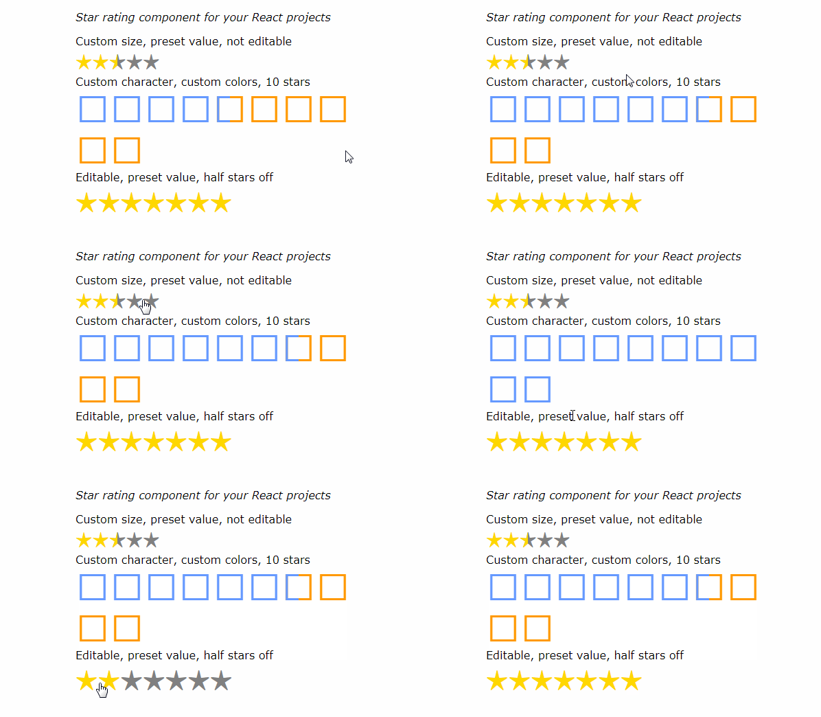
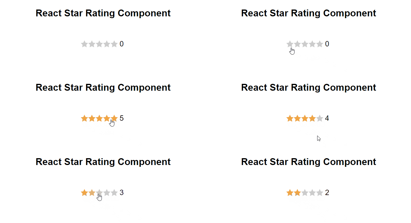
A simple star rating component for your React projects (now with half stars and custom characters)

Get started quickly
Install react-stars package with NPM:
npm install react-stars --save
Then in your project include the component:
import ReactStars from 'react-stars'
import React from 'react'
import { render } from 'react-dom'

const ratingChanged = (newRating) => {
  console.log(newRating)
}

render(<ReactStars
  count={5}
  onChange={ratingChanged}
  size={24}
  color2={'#ffd700'} />,

  document.getElementById('where-to-render')
);
API
This a list of props that you can pass down to the component:
| Property | Description | Default value | type |
|---|---|---|---|
className |
Name of parent class | null |
string |
count |
How many total stars you want | 5 | number |
value |
Set rating value | 0 | number |
char |
Which character you want to use as a star | ★ | string |
color1 |
Color of inactive star (this supports any CSS valid value) | gray |
string |
color2 |
Color of selected or active star | #ffd700 |
string |
size |
Size of stars (in px) | 15px |
string |
edit |
Should you be able to select rating or just see rating (for reusability) | true |
boolean |
half |
Should component use half stars, if not the decimal part will be dropped otherwise normal algebra rools will apply to round to half stars | true |
boolean |
onChange(new_rating) |
Will be invoked any time the rating is changed | null |
function |
Help improve the component
Build on your machine:
# Clone the repo
git clone [email protected]:n49/react-stars.git
# Go into project folder
cd react-stars
# Install dependancies
npm install
Build the component:
npm build
Run the examples (dev):
npm run dev-example
Build the examples (production):
npm run build-example
Then in your browser go to: http://127.0.0.1:8080/example
Requirements
You will need to have React in your project in order to use the component, I didn't bundle React in the build, because it seemed like a crazy idea.
Todo
- Make better docs
- Better state management
- Write tests


